

MONCLOS
Brand Identity Development
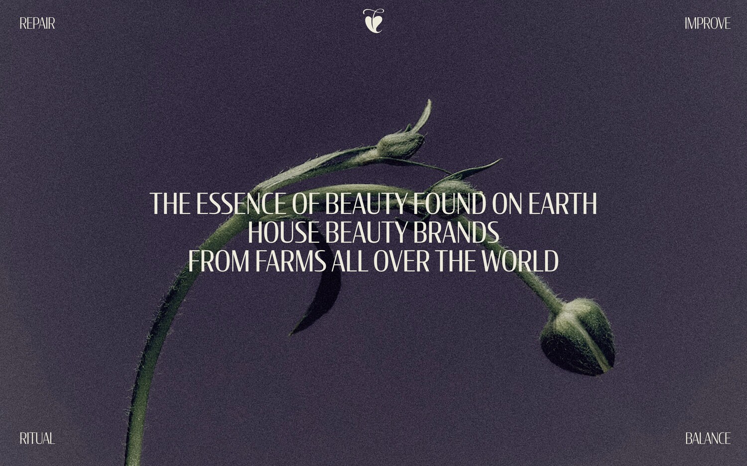
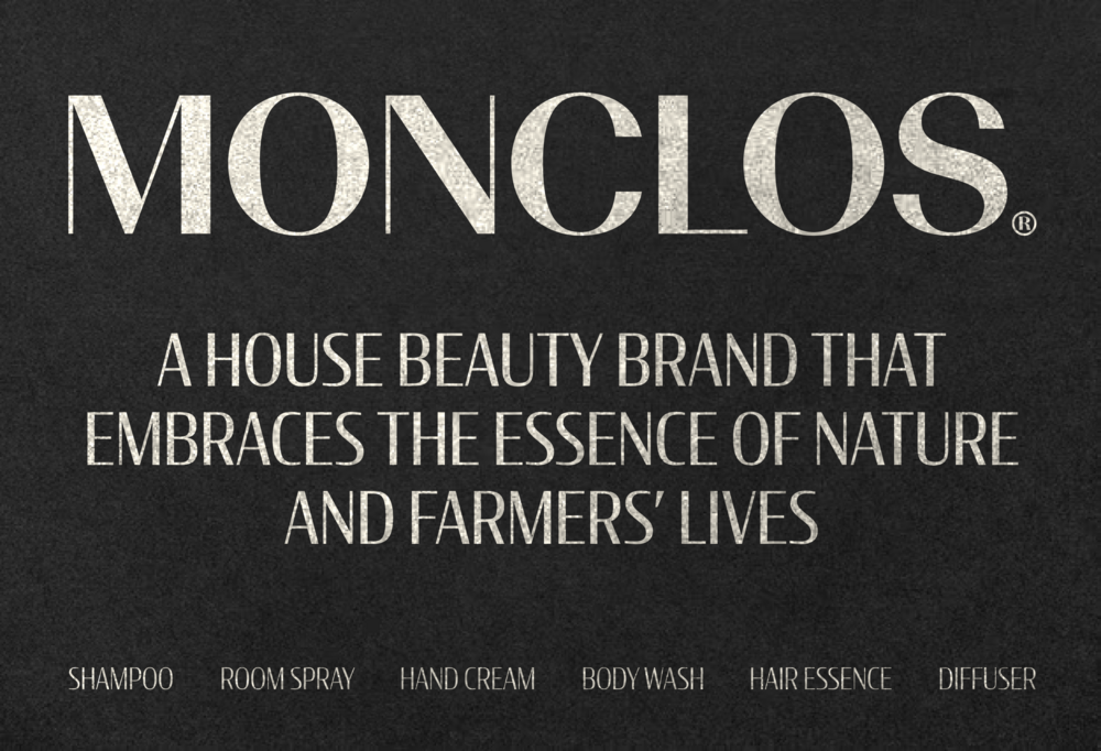
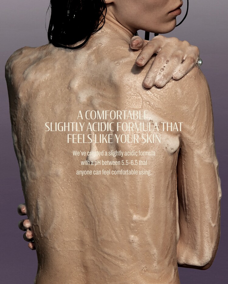
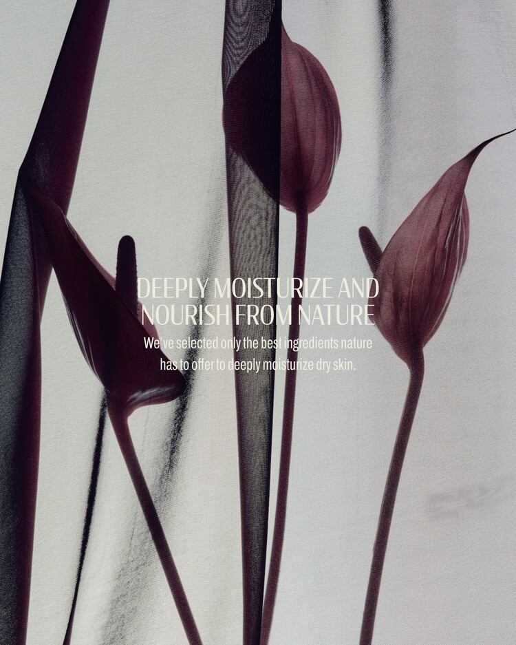
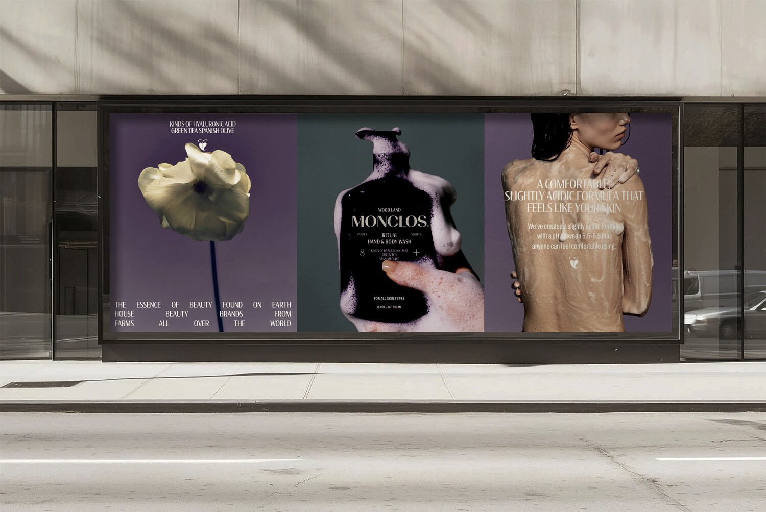
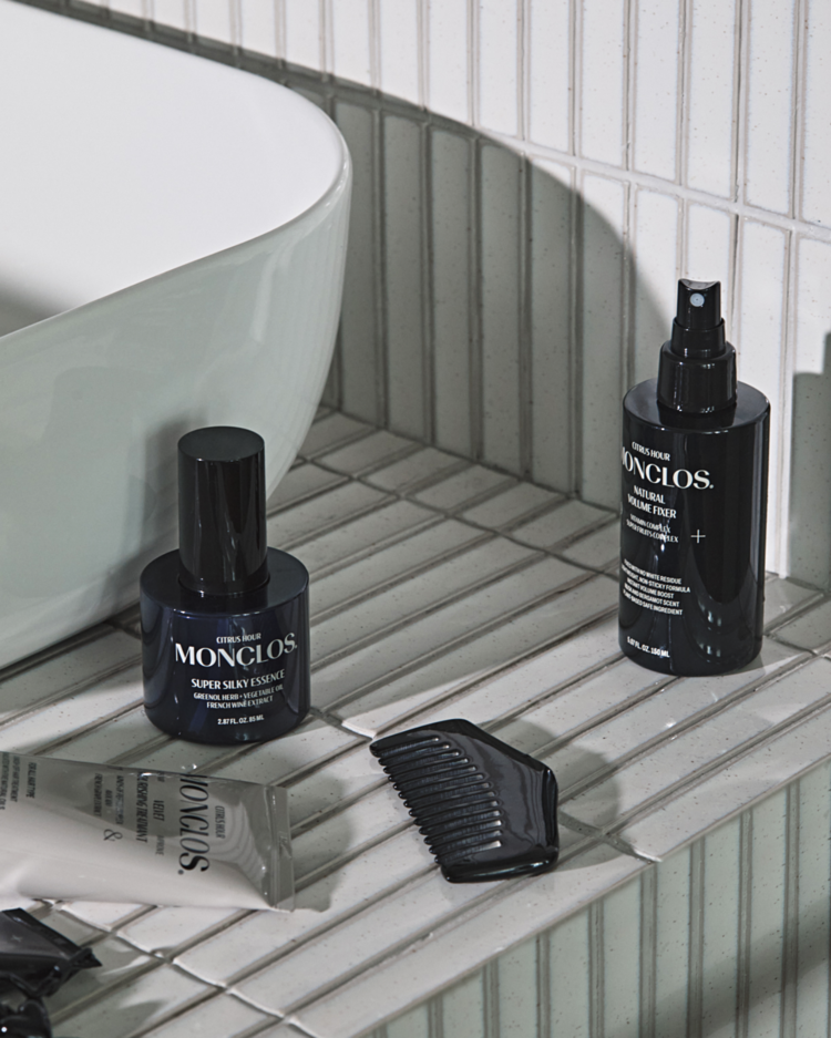
MONCLOS is a house beauty brand that offers consumers the most effective and eco-friendly personal care lines available, utilizing meaningful, natural ingredients sourced from village farms around the world.
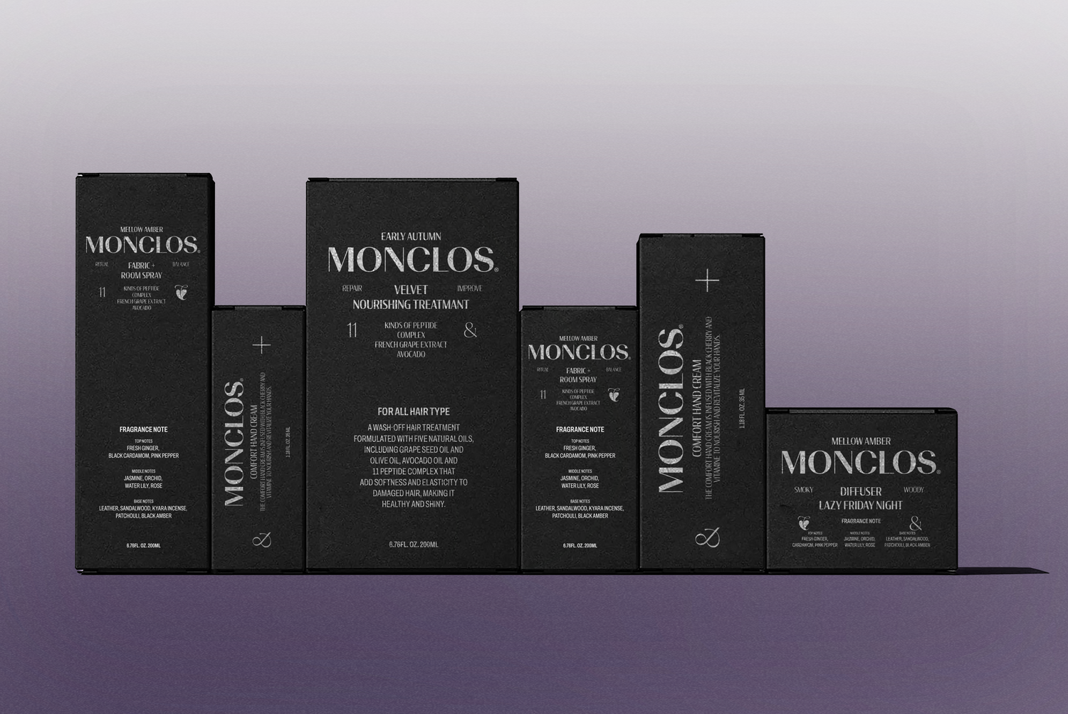
Starting with body wash and haircare products, the brand was well established in the market, recognized by the public for its quality and efficacy, but the lack of a defined visual hierarchy and a unique visual language was limiting its definiteness.
Tom & Nick revised the visual elements and established a typeface and brand tone and mood to reinforce MONCLOS' commitment to naturalness and its expertise in sourcing ingredients from a global network of farms.
몽클로스는 전 세계 빌리지 농장에서 공수한 유의한 품질의 자연 원료를 활용하여, 소비자들에게 가장 효과적이고 친환경적인 퍼스널 케어 라인을 선보이는 하우스 뷰티 브랜드입니다.
바디워시와 헤어케어 제품으로 시작해 뛰어난 품질과 효능으로 대중에게 인정받으며 시장에 안정적으로 자리잡았으나, 정립되지 않은 시각 위계와 고유의 시각언어의 부재로 인해 확정성에 제한을 체감하고 있었습니다.
탐앤닉은 MONCLOS가 가진 자연주의에 대한 진심과 전세계 농장 네트워크를 통한 원료에 대한 전문성을 고도화하고자 시각 엘리먼트들을 교정하고, 서체 및 브랜드 톤앤무드를 정립했습니다.
BRAND MARK DESIGN
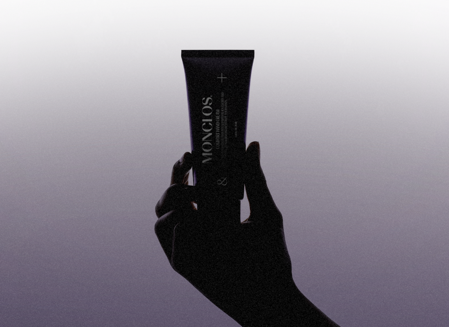
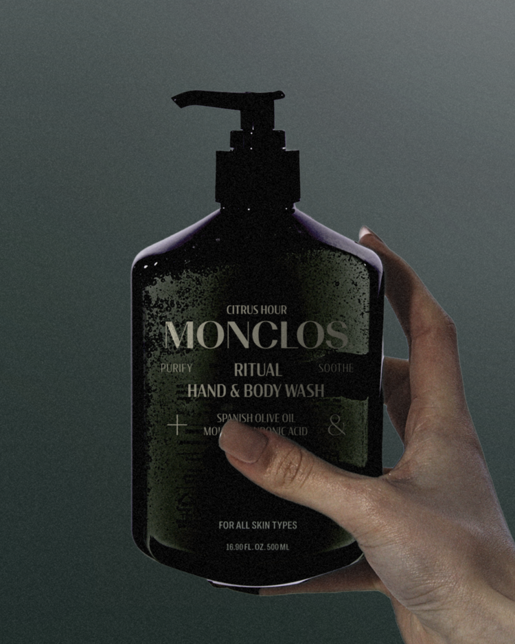
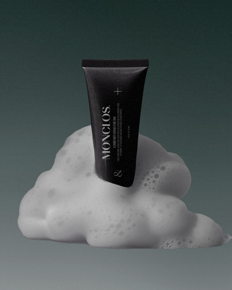
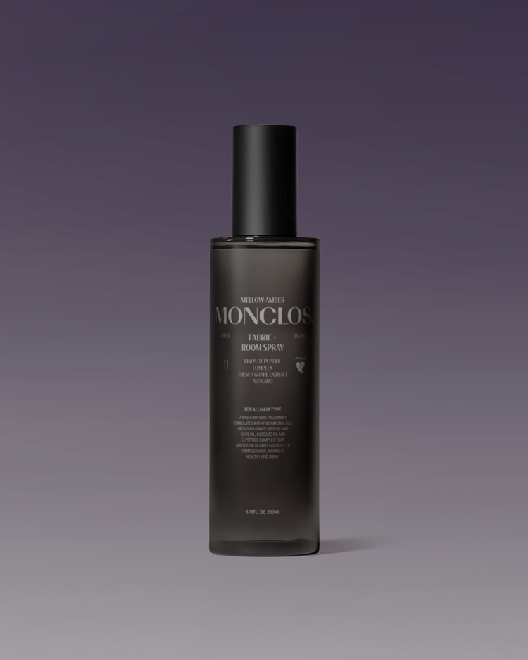
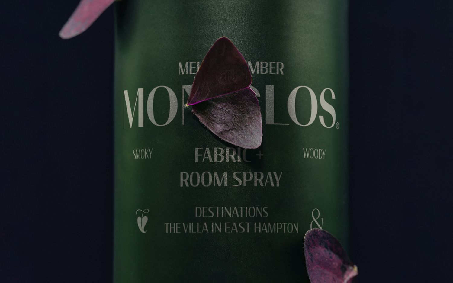
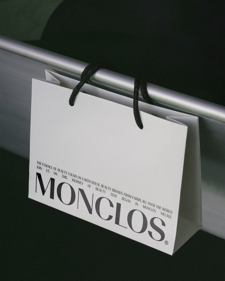
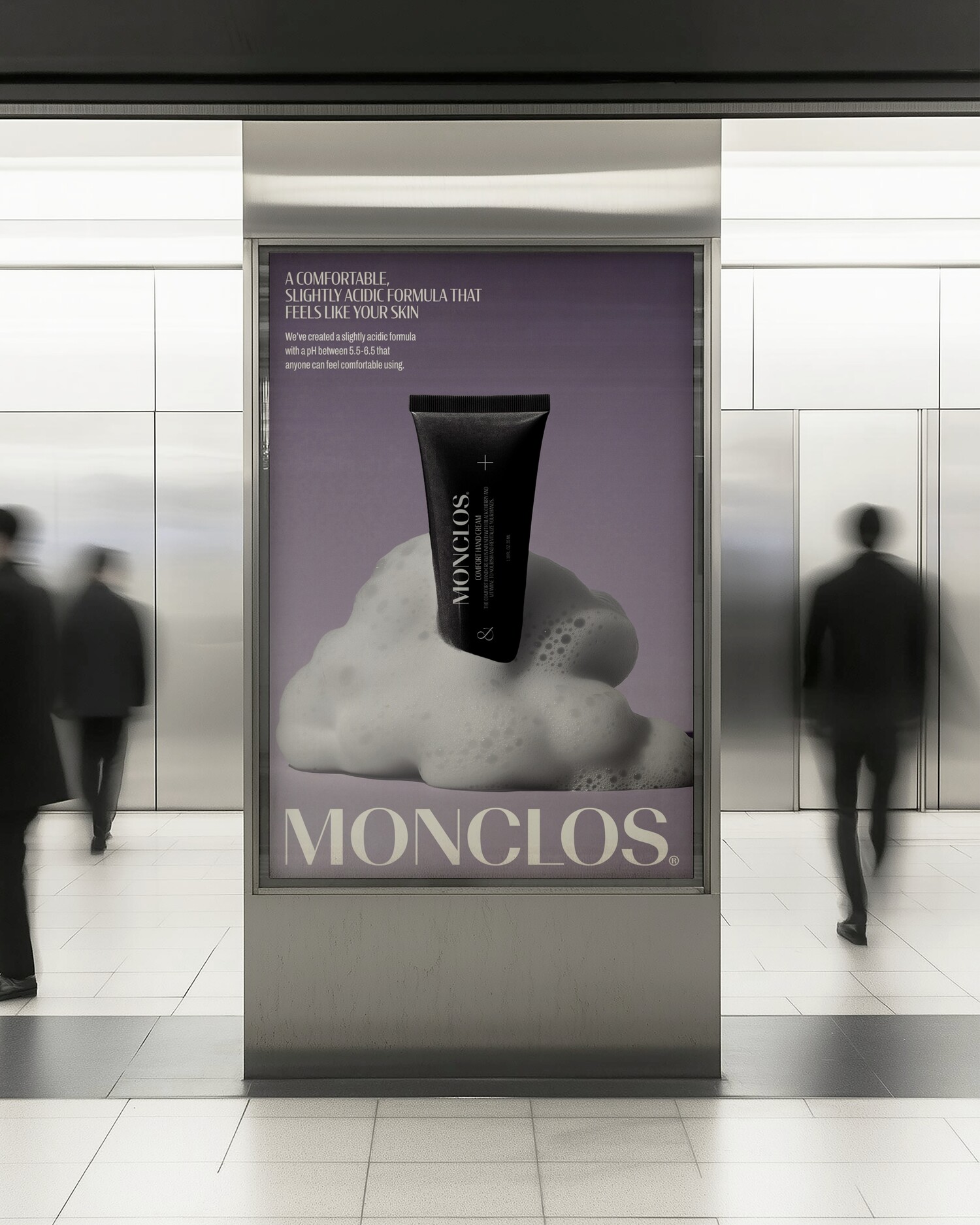
The original logo, which was developed with a rough texture to capture the naturalistic concept and farmer heritage, was limited in its ability to convey a professional impression. In addition, all of the brand's packaging systems were developed around the brand mark, and given the need to maintain the perceived impression of the brand, the silhouette was refined to a more sophisticated and professional look.
자연주의 컨셉과 농부의 해리티지를 담아 러프한 텍스처로 개발되었던 기존의 로고는 전문적인 인상을 표현하기에 한계가 존재했습니다. 또한, 브랜드의 모든 패키지 시스템이 브랜드 마크를 중심으로 개발되었으며, 고객들이 인지하고 있는 인상을 유지해야 하는 상황임을 고려하여 외형적으로 율동성이 강한 실루엣을 보다 정교하고 전문성있는 모습으로 개선했습니다.
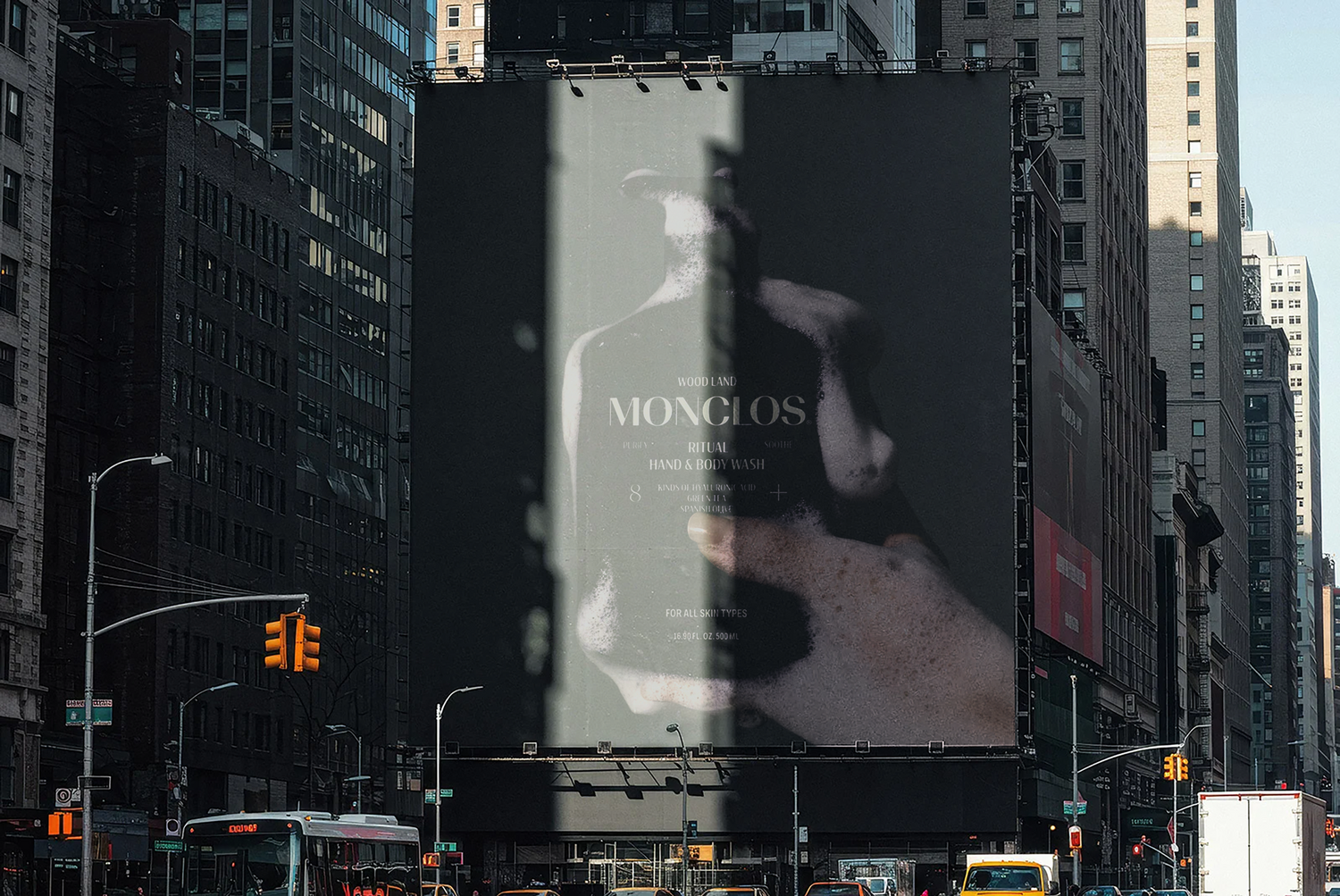
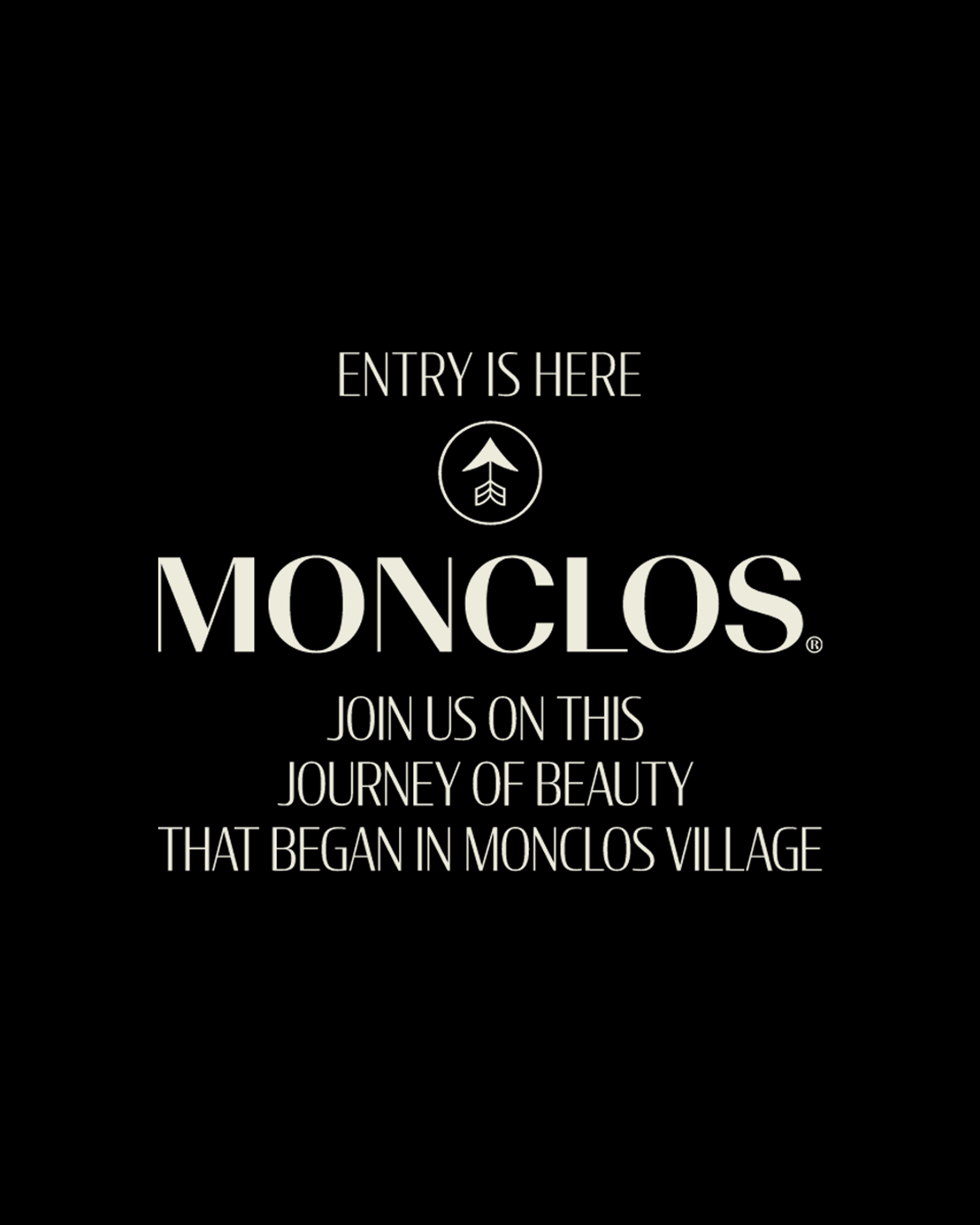
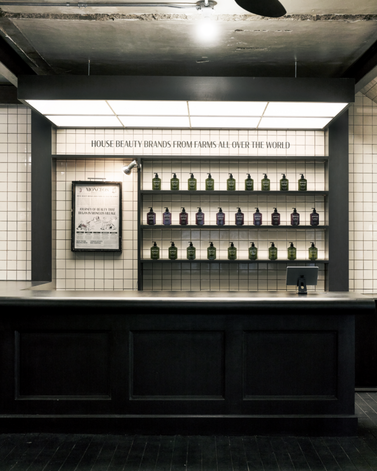
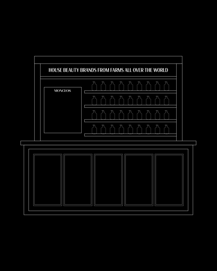
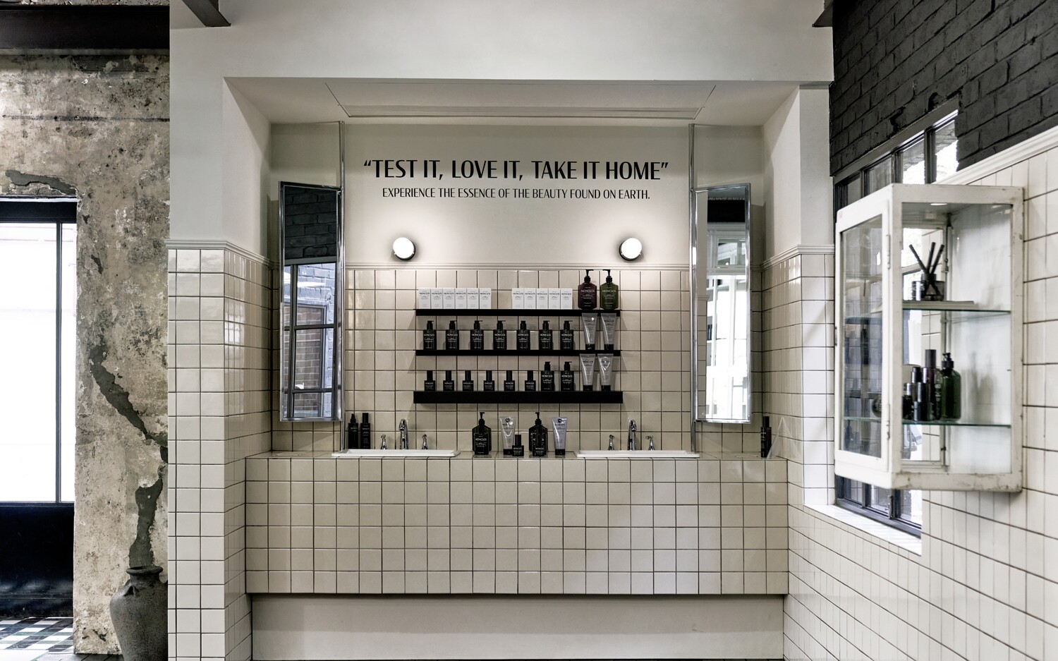
SHOWROOM SIGNAGE DESIGN
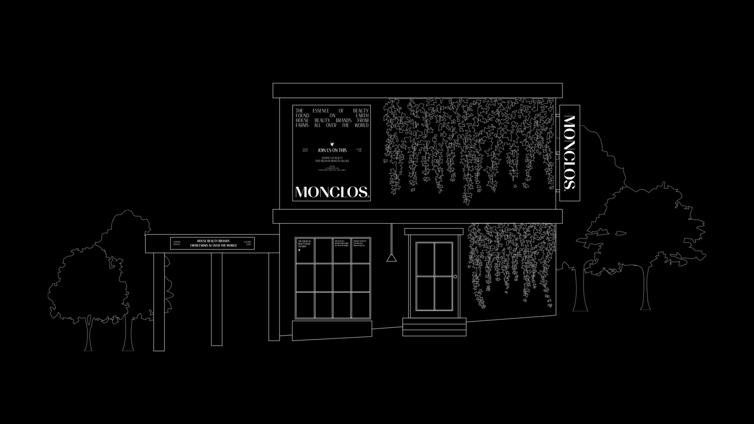
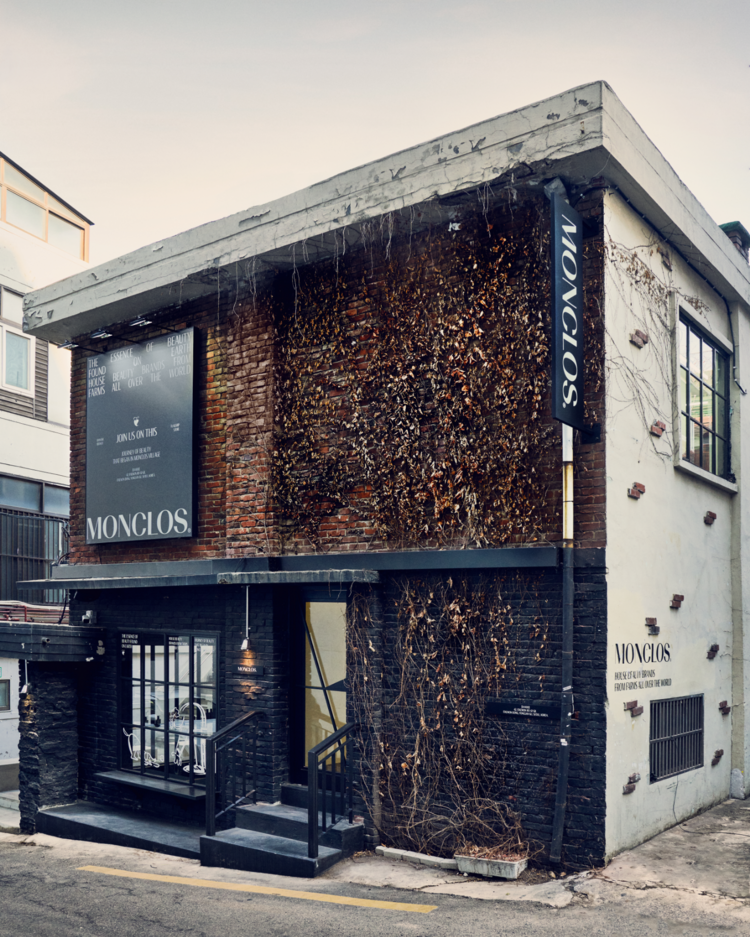
The new Hannam-dong showroom, which is opening to coincide with the brand renewal, utilizes an old construction villa and is designed to carry on Montclos Village’s long heritage and well-made spirit of growing and harvesting ingredients in-house. A variety of sign graphics and artwork were developed through a cohesive impression layout system to ensure that the new identity is actively exposed throughout the space.
브랜드 리뉴얼에 맞춰 새롭게 오픈하는 한남동 쇼룸은 오랜된 구축 빌라를 활용하여 몽클로스 빌리지의 오랜 해리티지와 원료를 직접 기르고 수확하는 웰메이드 정신을 계승 할 수 있도록 디자인 되었습니다. 공간 곳곳에 새로운 아이덴티티가 적극적으로 노출 될 수있도록 다양한 사인 그래픽과 아트월을 일관된 인상의 레이아웃 시스템을 통해 개발되었습니다.
MONCLOS Brand Development
2024
Client: KIDO Corp
-
Tom&Nick.Inc
Brand Strategy : Kim Dong Wan [Tom]
Creative Direction : Hong Hyun Doo [Nick]
Brand Design : Hwang Sun Wook, Kim A Rim, Lee Min Seok, Jung Chan Hee, Jo Hye Min, Kim Sol Hee, An Ye Seul
ⓒ 2025. Tom&Nick.Inc