

Overview
어도리쉬는 ‘안심하고 편안하게 착용할 수 있는 언더웨어’를 지향하며 스마트스토어를 기반으로 탄탄한 판매력과 입지를 구축해 왔습니다. 하지만 매출 성과 대비 낮은 브랜드 인지도와 차별화된 포지셔닝의 부재로 인해 성장의 한계에 직면해 있었습니다. 특히 ‘편안함’이 시장의 보편적 가치가 되며 제품 간 변별력이 약화된 상황에서, 어도리쉬 역시 명확한 브랜드 정체성의 미비로 인해 향후 브랜드가 나아가야 할 차별화된 기준점을 확보하는 데 어려움이 있었습니다. 이에 본 프로젝트는 어도리쉬만의 USP를 재정의하여 브랜드 정체성을 강화하고, 일관된 브랜드 시스템과 고유의 연상 이미지를 구축하는 것을 목적으로 진행되었습니다.
Adorish has built a solid sales track record and a strong market presence based on Smart Store, aiming to deliver “underwear that you can wear with peace of mind and comfort.” However, the brand faced a growth ceiling due to low brand awareness relative to its sales performance and a lack of differentiated positioning. In particular, as “comfort” became a standard market norm, product differentiation waned. Without a clear brand identity, Adorish struggled to establish a distinct benchmark for its future direction. Therefore, this project was launched to redefine Adorish's unique selling proposition (USP), reinforce its brand identity, and establish a consistent brand system along with a signature brand association.
Strategy
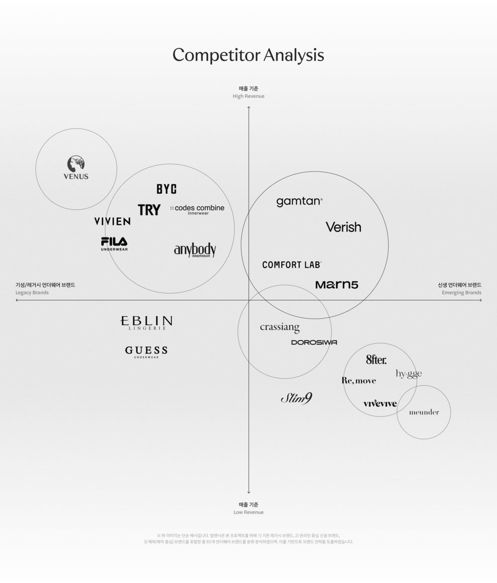
볼륨과 와이어 중심이었던 여성 언더웨어 시장은 최근 몇 년간 심리스, 브라렛 등 편안함을 강조한 제품으로 빠르게 이동했습니다. 하지만 편안함이 새로운 기준이 되면서 대부분의 브랜드가 유사한 제품과 메시지를 사용하게 되었고, 브랜드 간 차별화는 점차 어려워졌습니다. 우리는 시장과 소비자 분석을 통해 편안한 착용감과 자연스러운 볼륨을 동시에 원하는 소비자 니즈가 형성되고 있으며, 아직 경쟁 브랜드들이 충분히 점유하지 못한 영역임을 확인했습니다. 이러한 변화에 따라 ‘편안함 vs 볼륨’이라는 기존의 이분법을 넘어, 편안함과 볼륨을 동시에 구현하는 경험을 브랜드의 새로운 기회 영역으로 정의했습니다.
In recent years, the women's underwear market has rapidly shifted from volume and wire-centric products to those emphasizing comfort, such as seamless bras and bralettes. However, as comfort became the new standard, most brands began adopting similar products and messaging, making brand differentiation increasingly difficult. Through market and consumer analysis, we identified an emerging consumer demand for both comfortable fit and natural volume—an untapped territory that competing brands had not yet fully claimed. In response to this shift, we went beyond the traditional dichotomy of "comfort vs. volume" and defined the simultaneous delivery of both comfort and volume as the brand's new opportunity space.
Brand Core Value
시장의 기회 영역에 따라 브랜드가 제공해야 할 가치를 서포트(Support)와 컴포트(Comfort)로 재정의하고, 두 가치를 하나의 경험으로 연결하는 핵심 개념으로 ‘텐션(Tension)’을 도출했습니다. 국내에서 ‘텐션감’이 원단의 쫀쫀함을 표현하는 말로도 쓰이는 만큼, 우리의 ‘텐션’은 압박감이 아니라 가슴을 편안하게 감싸주고 자연스러운 볼륨을 만들어주는 이상적인 긴장감을 의미합니다. 따라서 볼륨과 편안함을 동시에 충족시키는 키워드인 ‘텐션’을 제품의 기능적 차별성과 확장성, 브랜드의 가치를 연결하는 핵심 속성으로 설정하고, 이를 기준으로 브랜딩 전략을 수립합니다.
Based on these market opportunities, we redefined the brand’s core values into “Support” and “Comfort”, establishing “Tension”. as the overarching concept that unifies both into a single cohesive experience. In Korea, the term tension often describes a fabric’s supple elasticity. In our context, “Tension” does not mean uncomfortable tightness, but rather the ideal level of gentle hold that comfortably supports the bust while enhancing natural shape. Therefore, we set “Tension”—a key driver satisfying both volume and comfort—as the core attribute bridging product functionality, scalability, and brand value, using it as the anchor for our overall branding strategy.In recent years, the women's underwear market has rapidly shifted from volume and wire-centric products to those emphasizing comfort, such as seamless bras and bralettes. However, as comfort became the new standard, most brands began adopting similar products and messaging, making brand differentiation increasingly difficult. Through market and consumer analysis, we identified an emerging consumer demand for both comfortable fit and natural volume—an untapped territory that competing brands had not yet fully claimed. In response to this shift, we went beyond the traditional dichotomy of "comfort vs. volume" and defined the simultaneous delivery of both comfort and volume as the brand's new opportunity space.
Communication Structure
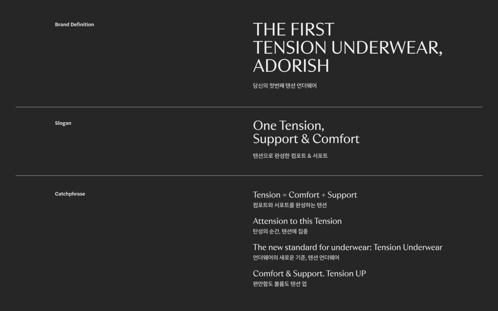
도출된 핵심 키워드인 ‘텐션(Tension)’을 브랜드 정의부터 슬로건, 캐치프레이즈까지 유기적으로 연결되는 메시지 구조로 체계화했습니다. 볼륨과 편안함 둘 중 하나만 택하는 방식에서 벗어나, ‘텐션 하나로 완성되는 컴포트와 서포트’라는 명확한 메시지로 커뮤니케이션 언어를 규정했습니다. 이를 통해 소비자 접점 전반에서 브랜드의 차별화된 핵심 가치를 직관적으로 체감하고 행동으로 이어질 수 있도록 커뮤니케이션 전략 구조를 완성했습니다.
We structured the core keyword “Tension” into an organic messaging framework, seamlessly connecting the Brand Definition, Slogan, and Catchphrases. Moving away from forcing a choice between volume and comfort, we defined our communication language around a clear, unified message: “Support & Comfort Completed by One Tension.” Through this approach, we established a strategic communication structure that enables consumers to intuitively experience the brand's unique value across all touchpoints and drives them to action.
Wordmark & Symbol
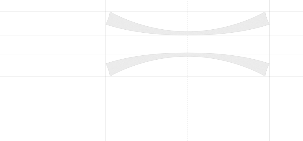
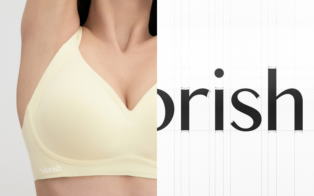
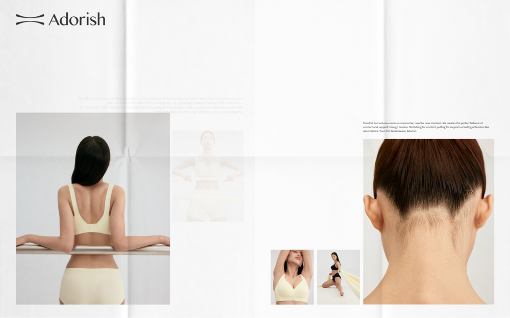
워드마크와 심볼은 텐션감 있는 원단을 늘렸을 때 나타나는 곡선적 특징과 장력을 모티프로 설계되었습니다. 부드럽게 확장되는 곡선과 플레어 형태로 마감되는 캐릭터 라인은 ‘텐션 언더웨어 브랜드’로서의 정체성을 시각적으로 투영한 결과물입니다.
The wordmark and symbol were designed with motifs drawn from the curvature and tension created when stretching highly elastic fabric. The smoothly expanding curves and flared terminal character lines visually project the brand’s identity as a specialized “Tension Underwear Brand.”
Key Visual
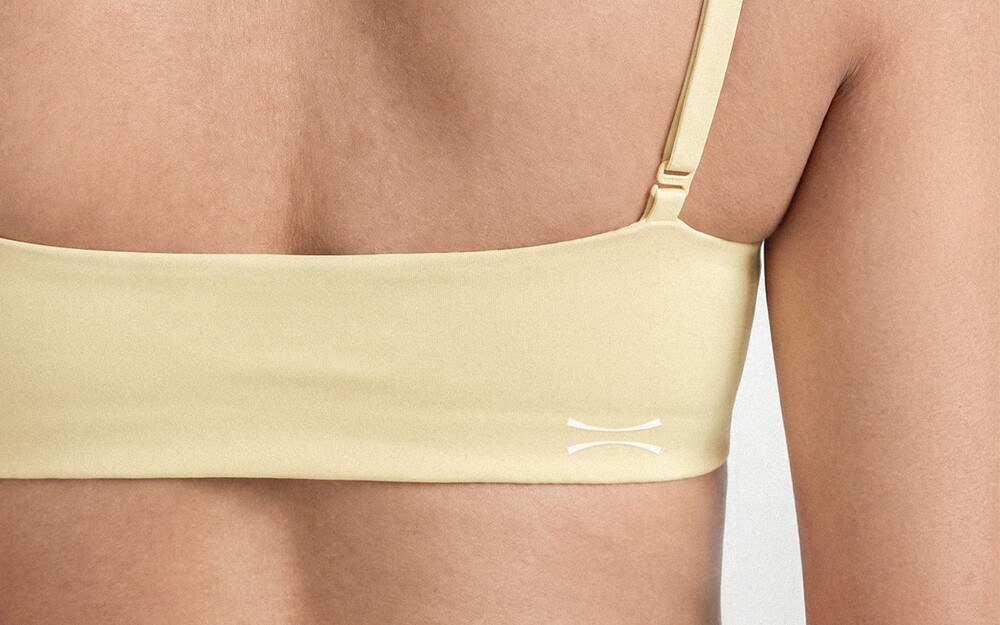
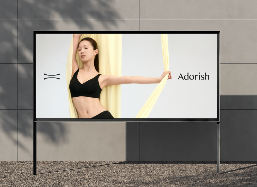
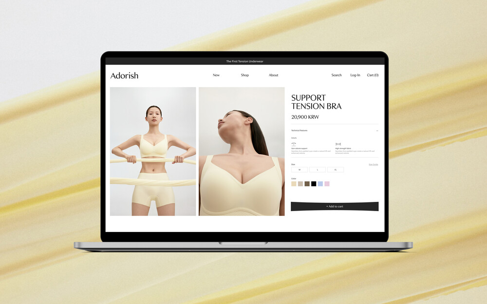
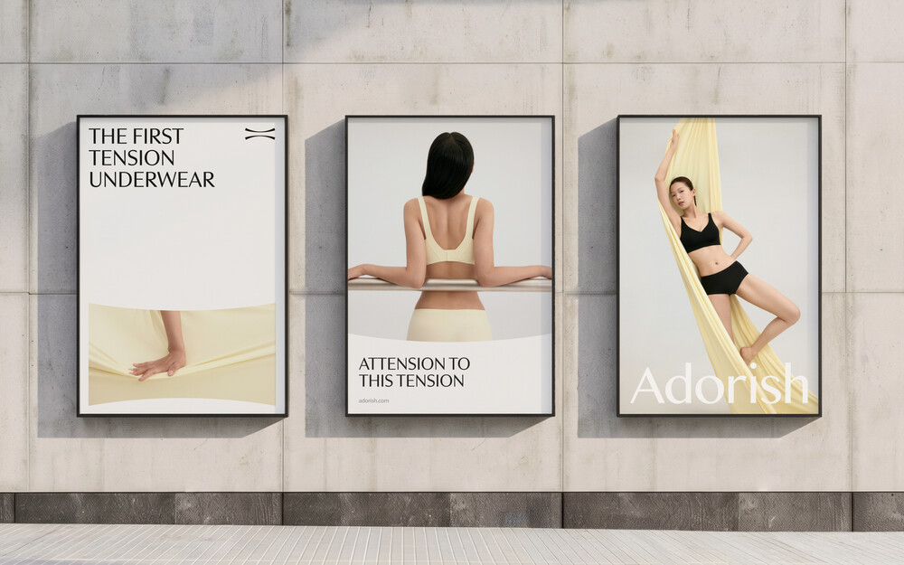
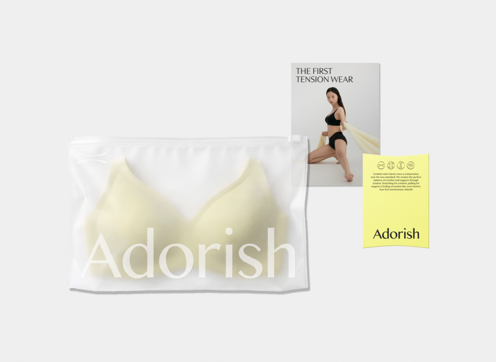
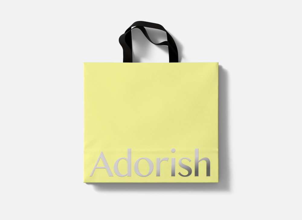
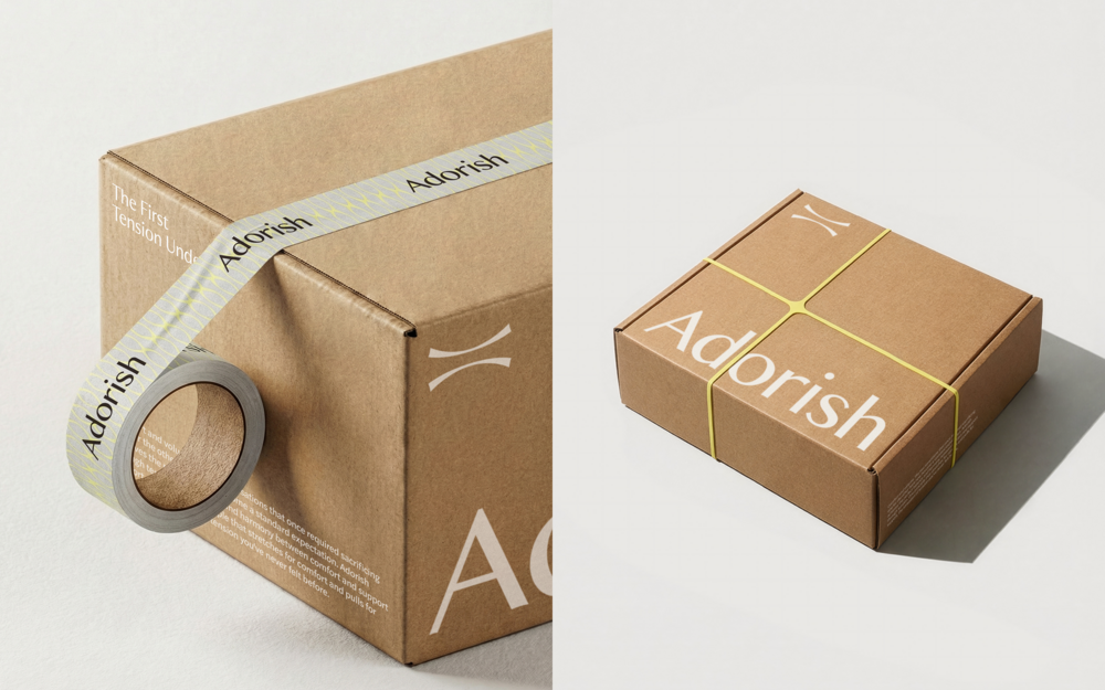
어도리쉬의 그래픽 모티프는 브랜드가 지향하는 ‘컴포트’와 ‘서포트’ 사이의 완벽한 텐션을 시각화한 결과물입니다. 원단의 부드러운 곡선과 팽팽한 긴장감에서 착안한 이 모티프는 온·오프라인 브랜드 시스템 전반에 확장 적용되어, 패키지, 콘텐츠, 에플리케이션 등 다양한 매체에서 어도리쉬만의 '텐션감'을 일관되게 전달합니다.
Adorish’s graphic motif visually captures the brand's ideal balance between comfort and support. Derived from the soft curves and taut tension of stretched fabric, this motif extends across the entire online and offline brand system, consistently conveying Adorish’s signature "tension" through diverse touchpoints such as packaging, digital content, and visual applications.
Key Visual
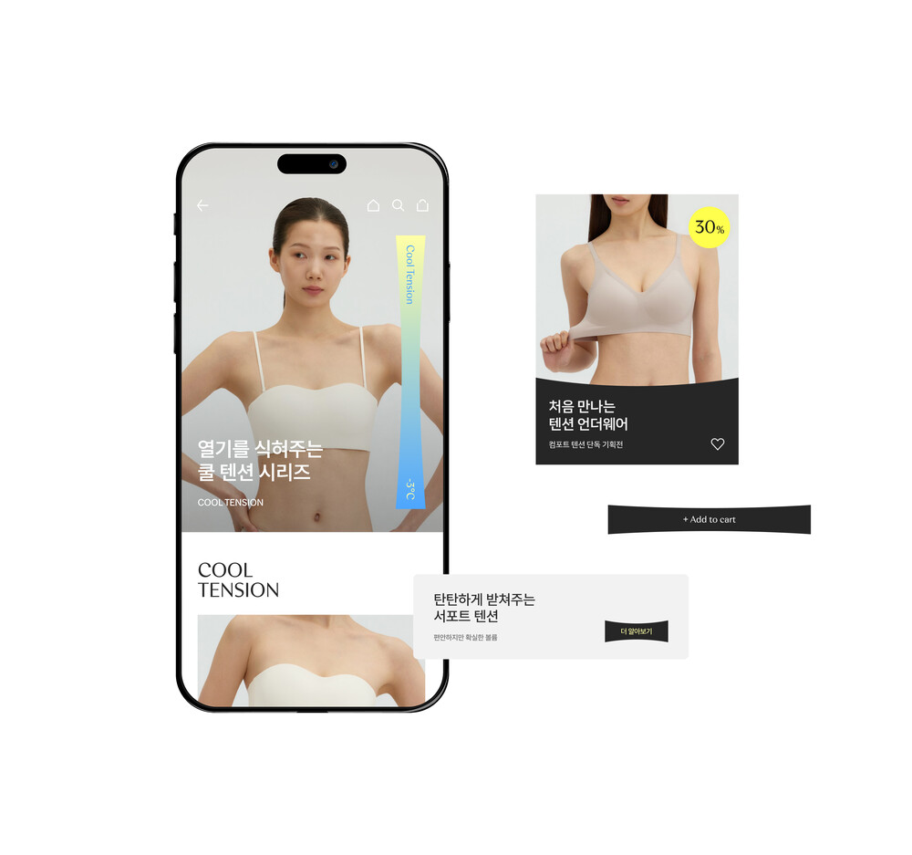
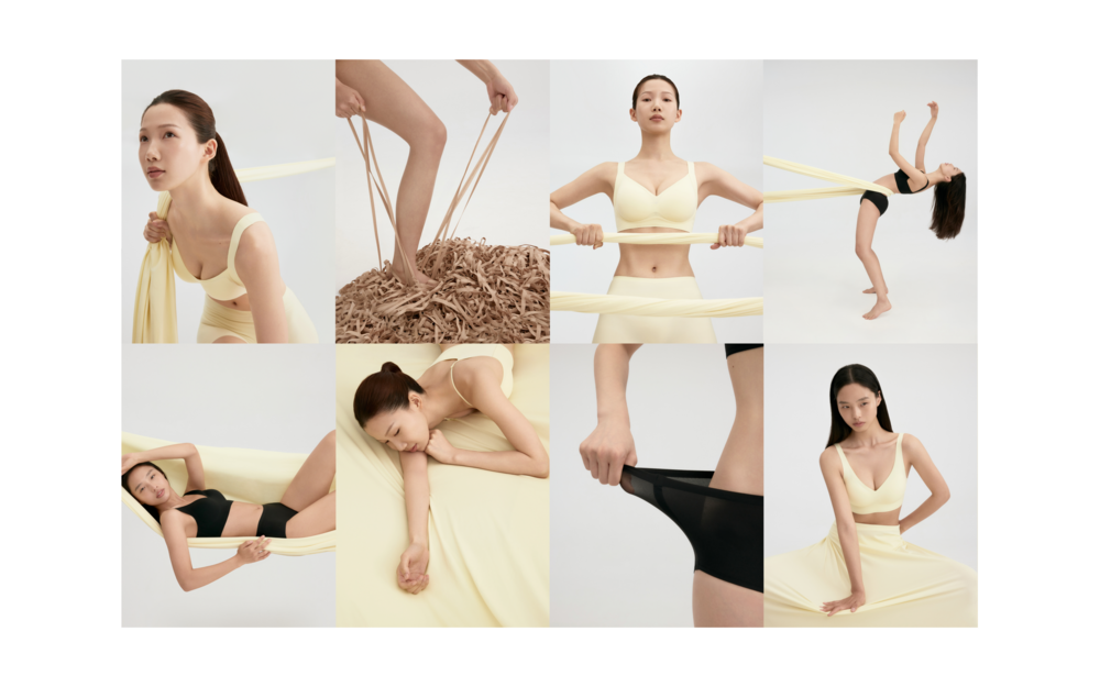
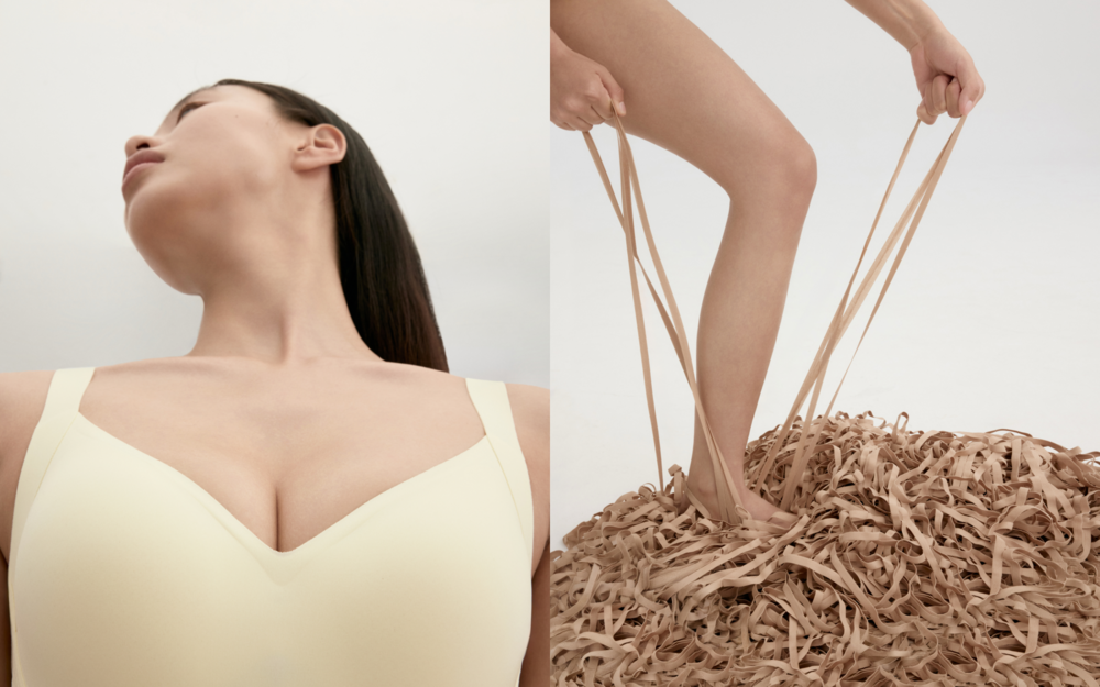
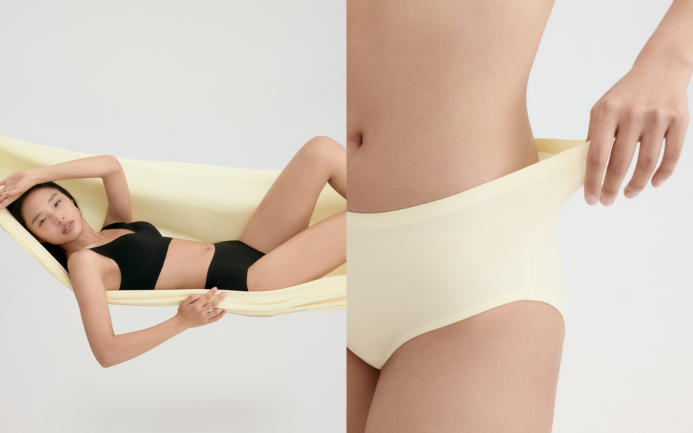
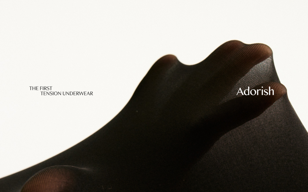
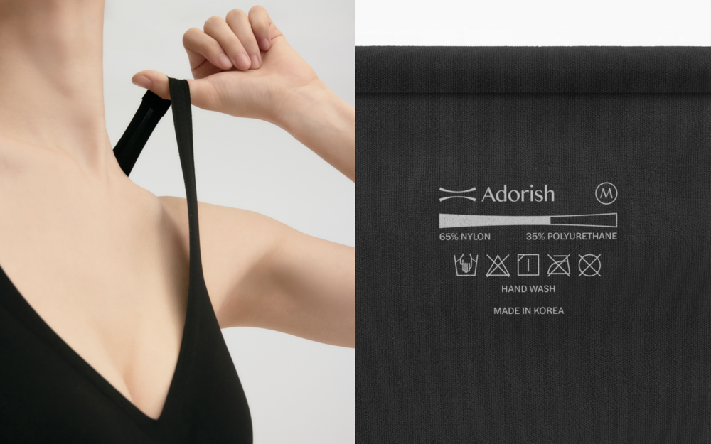
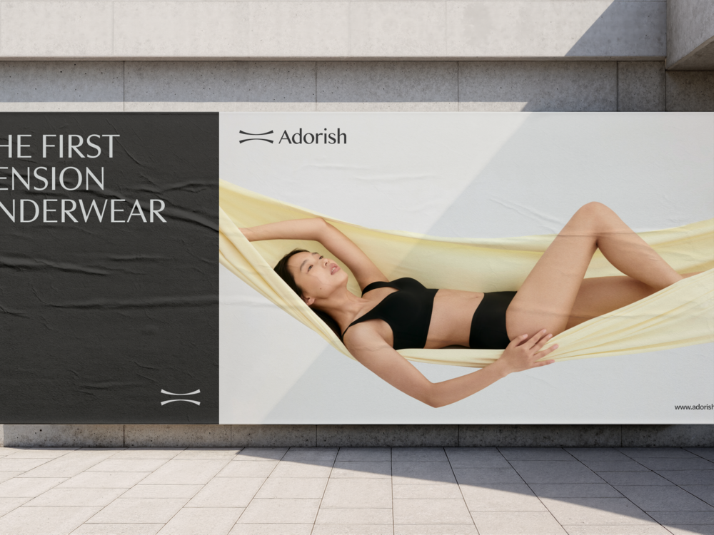
‘텐션’은 어도리쉬의 브랜드 정체성을 시각화하는 가장 강력한 언어입니다. 사진과 영상 연출에서 또한 단순히 제품을 보여주는 데에 그치지 않고, 모델의 포즈와 오브제를 활용해 편안함을 담은 ‘컴포트 텐션’과 팽팽한 지지력을 보여주는 ‘서포트 텐션’을 대비하여 표현했습니다. 특히 원단이 당겨지는 순간과 선명한 조직감의 클로즈업 샷을 포착하여 유연함, 복원력, 섬세한 텍스처를 감각적으로 전달합니다. 이를 통해 '텐션'이라는 핵심 키워드의 기능적 가치와 미학적 완성도를 동시에 보여줍니다.
“Tension” is the most powerful visual language expressing Adorish’s brand identity. Beyond standard product shots, our photography and video direction leveraged dynamic poses and props to contrast the ease of “Comfort Tension” with the taut hold of “Support Tension.” By capturing the exact moment of fabric stretching alongside vivid texture close-ups, we sensuously convey flexibility, resilience, and fine material details. This simultaneously highlights the functional value and aesthetic sophistication of Adorish’s core concept, “Tension.”
Adorish Brand Identity Development
ClientㅣAddrest Corp.
BX DesignㅣTom&Nick Inc.
Strategy DirectorㅣKim Dongwan [Tom]
StrategistㅣJung Chanhee [Dan], Kim Arim [Aimee], Jang Hayoon [Yoon]
Brand DesignerㅣJung Chanhee [Dan], An Yeseul [Anne], Mun Dasom [Som], Kang Seungmo [Mo]
Photo DirectionㅣFig.000