


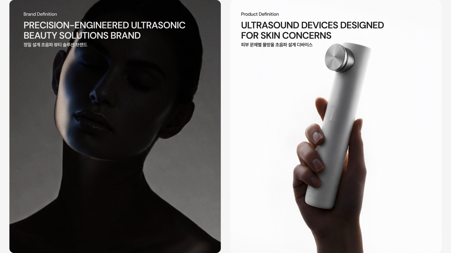
* The image of this device is a generative AI image created for conceptual guidance.
BRAND IDENTITY DEVELOPMENT
2025 Nov - 2026 Jul
THERAWAVE is a home beauty device brand whose name combines Therapy and Wave, representing technological waveforms designed to restore and rejuvenate the skin. Unlike conventional beauty devices that primarily stimulate the skin’s surface, THERAWAVE focuses on developing frequency technology that penetrates deep into the dermis. This commitment led to the creation of its proprietary Continuous Cross Ultrasound technology. Built upon the engineering expertise of a professional medical device manufacturer, THERAWAVE has also secured Korea’s only official certification and performance validation in its category, establishing a clear technological advantage within the market.
Despite these strengths, the brand’s market communication had been centered on abstract and emotional expressions of beauty rather than its core technology. As a result, consumers were unable to fully recognize THERAWAVE’s proprietary innovations and differentiated assets, limiting the brand’s ability to communicate its competitive advantage effectively.
This project therefore focused on redefining THERAWAVE’s technological strengths through a comprehensive analysis of the competitive landscape, and translating them into a strategic brand identity and a distinctive market positioning that clearly communicates the brand’s unique value.
THERAWAVE는 Therapy와 Wave의 합성어로, 피부를 치료하고 회복시키는 기술적 파장을 의미하는 홈 뷰티 디바이스 브랜드입니다. 피부 표면에 자극을 주는 기존 뷰티 디바이스와 달리, 피부 속 진피층까지 도달하는 주파수 기술 개발에 집중하며 독자적인 '컨티뉴어스 교차 초음파(Continuous Cross Ultrasound)' 기술을 구축했습니다. 또한 전문 의료장비 제조사의 기술력을 기반으로 국내 유일의 공식 인증 및 성능 검증을 확보하며, 시장 내 차별화된 기술 경쟁력을 확보했습니다.
그러나 이러한 기술적 우위에도 불구하고 시장 내 커뮤니케이션은 추상적이고 감성적인 아름다움 중심으로 전개되고 있었습니다. 그 결과 소비자는 THERAWAVE의 핵심 기술력과 차별화된 자산을 충분히 인지하지 못했고, 브랜드가 보유한 경쟁 우위 역시 효과적으로 전달되지 못했습니다. 이에 본 프로젝트는 경쟁 환경 분석을 바탕으로 THERAWAVE의 기술적 강점을 재정의하고, 이를 명확하게 전달할 수 있는 전략적 브랜드 아이덴티티와 차별화된 시장 포지셔닝을 구축하는 데 중점을 두었습니다.
Brand Strategy
An analysis of the current competitive landscape revealed that leading brands primarily compete through quantitative specifications, such as the number of ultrasonic frequencies, treatment sequences, and operating time. While these metrics effectively capture consumer attention, they also shift the focus toward numerical comparisons between devices rather than the intrinsic value of the technology itself. As a result, consumers are often left with little understanding of the actual differences in efficacy.
To address this, we redefined THERAWAVE’s core USP with a new strategic perspective: having multiple frequencies is merely the baseline—what truly matters is how precisely those frequencies are engineered and delivered. Rather than emphasizing a greater number of functions or frequency modes, we positioned THERAWAVE around its sophisticated ultrasound architecture, designed to induce measurable skin responses through precision engineering. This strategic shift established a differentiated market position rooted not in specification, but in technological performance.
현재 시장의 주요 플레이어를 분석한 결과, 소비자의 관심을 끄는 메시지는 초음파 개수, 조사 순서, 조사 시간 등 정량적 스펙 중심으로 형성되어 있었습니다. 그러나 이러한 경쟁 구도는 브랜드의 본질적인 가치보다 디바이스 간 수치 비교에 집중하게 만들었고, 소비자가 실제 효능의 차이를 이해하는 데에는 한계가 있었습니다.
이에 우리는 THERAWAVE의 핵심 USP를 재정의하며, "주파수의 종류를 확보하는 것은 기본이며, 중요한 것은 이를 정확하게 전달하기 위한 초음파 설계"라는 새로운 관점을 제안했습니다. 단순히 더 많은 기능이나 주파수를 강조하는 것이 아니라, 실질적인 피부 반응을 이끌어내는 정밀한 초음파 설계에 집중함으로써 차별화된 시장 전략을 구축했습니다.
Visual Identity
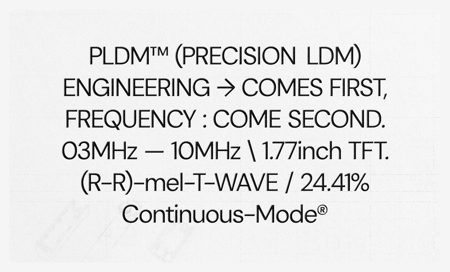
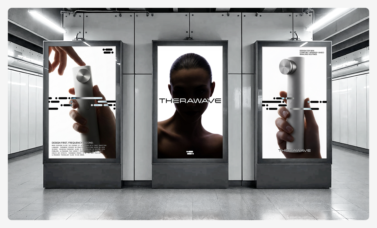
We redefined THERAWAVE’s brand essence by developing a visual identity that communicates its core technology with greater clarity and immediacy. PLDM™ (Precision LDM) is THERAWAVE’s proprietary patented technology, developed from LDM (Local Dynamic Micro-massage)—the droplet ultrasound technology used in professional dermatological devices. By delivering continuous ultrasonic frequencies without interruption, PLDM™ stimulates the skin’s natural response, making it the brand’s defining technological asset. Moving beyond the conventional approach of separating and delivering multiple frequency “modes,” we repositioned PLDM™ as the foundation of the brand. Around this core technology, we developed a distinctive visual language that intuitively expresses the continuous flow and transmission of ultrasound, creating a unique brand identity that makes THERAWAVE’s technological differentiation instantly recognizable.
THERAWAVE의 브랜드 에센스를 재정의하며, 핵심 기술력이 소비자에게 직관적으로 전달될 수 있는 시각적 아이덴티티를 구축했습니다. PLDM™(Precision LDM)은 피부과 전문 장비에 적용되는 물방울 초음파(LDM) 기술을 기반으로 개발된 독자 특허 기술로, 끊김 없는 주파수 전달을 통해 피부 자체의 반응을 유도하는 THERAWAVE의 핵심 기술입니다. 기존의 주파수 종류를 구분해 발산하는 '모드' 중심의 접근 방식에서 벗어나, PLDM™을 브랜드의 핵심 기술 자산으로 재정의하고 이를 중심으로 초음파의 흐름과 전달 원리를 직관적으로 시각화하여 THERAWAVE만의 고유한 브랜드 시각 언어를 개발했습니다.
Brand Logo
: Wordmark&Symbol
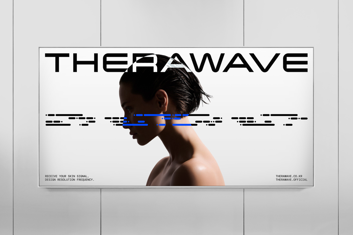
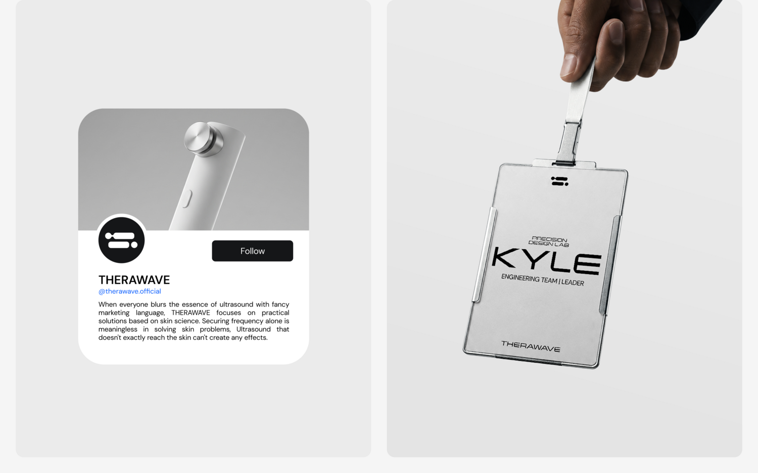
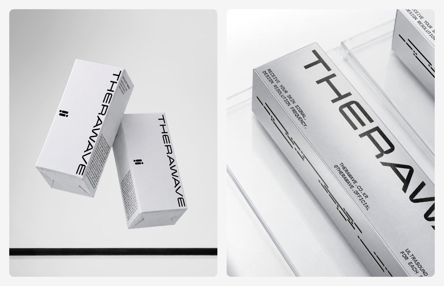
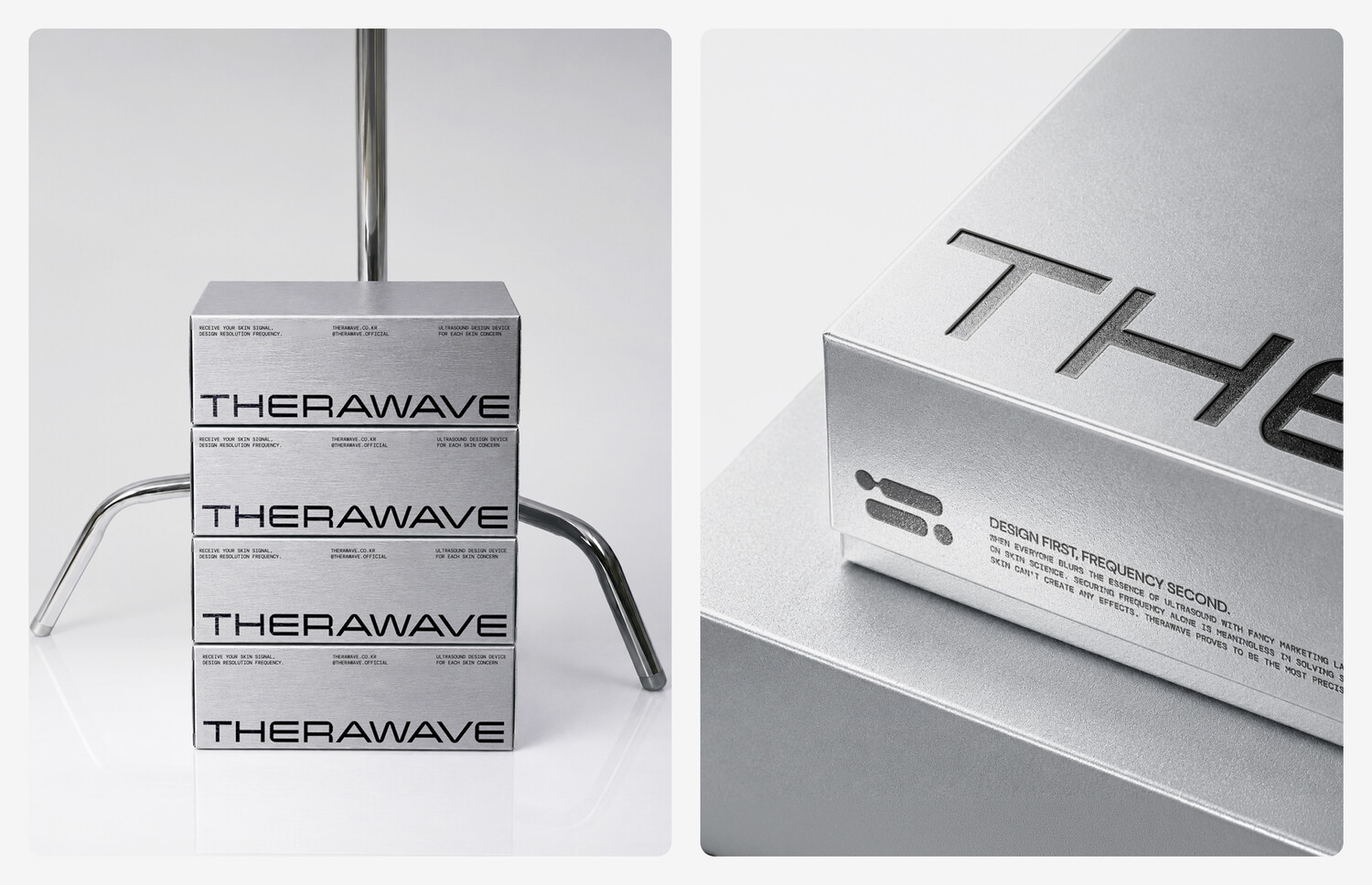
To communicate THERAWAVE’s patented technology—engineered to stimulate the skin through precisely designed ultrasonic delivery—we developed a signature symbol that represents the brand’s core USP. Inspired by the smallest unit of an ultrasonic signal, the symbol visualizes the skin’s core treatment targets while establishing a functional visual system that communicates tailored solutions for different skin concerns. This transformed THERAWAVE’s technological expertise into a cohesive and recognizable visual language.
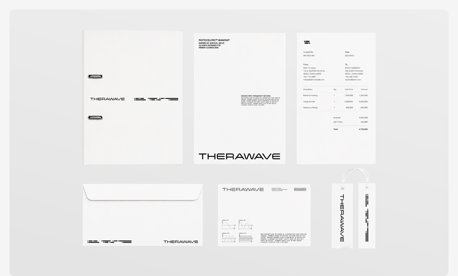
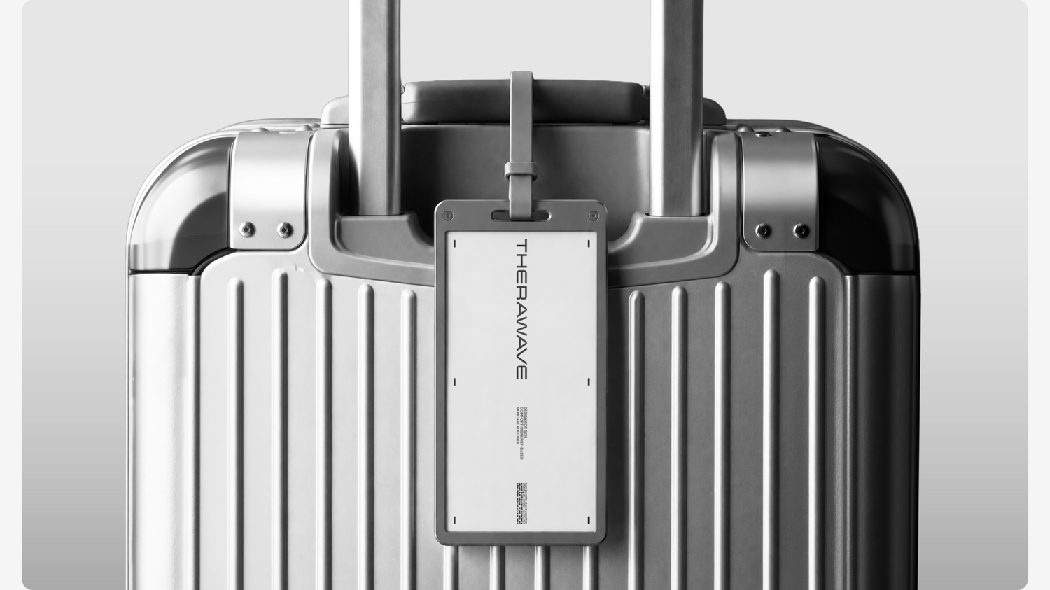
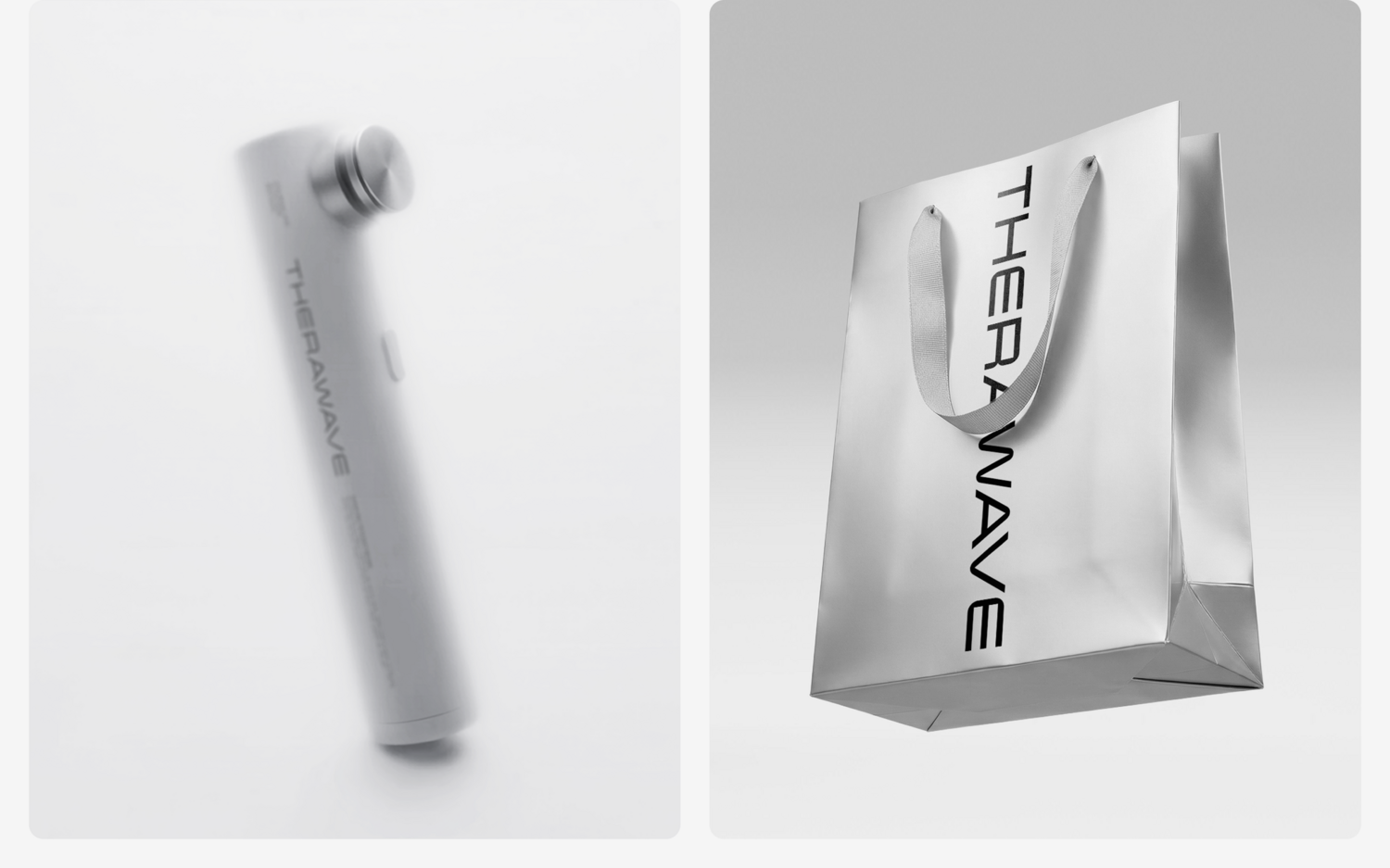
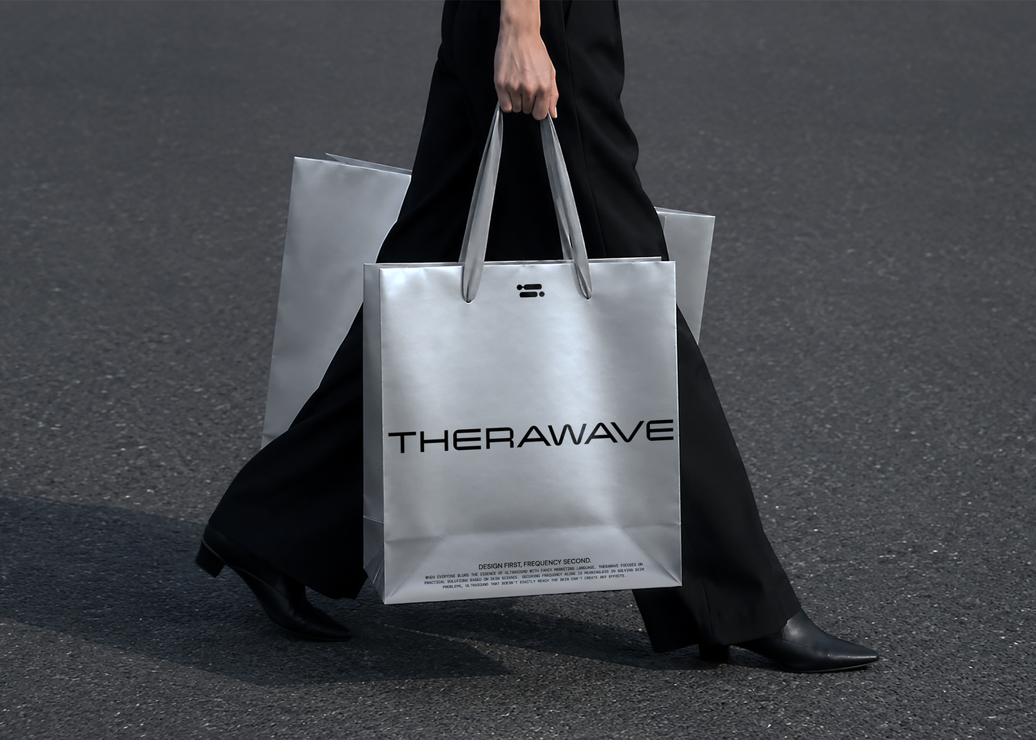
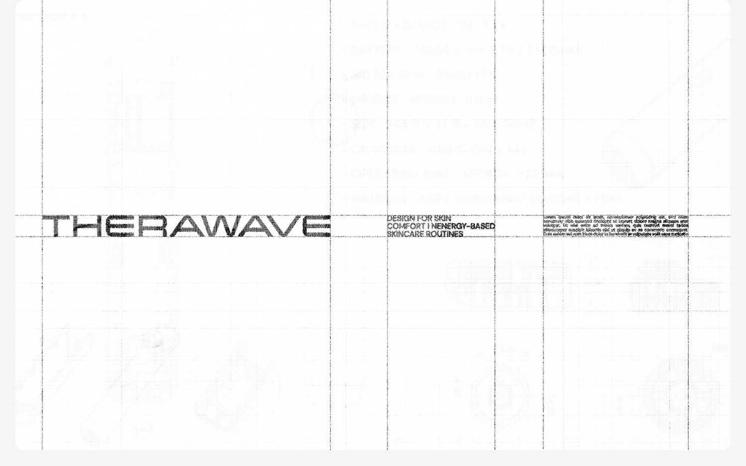
In addition, we moved beyond the previous wordmark, which emphasized abstract concepts of beauty, by developing a precision-engineered wordmark that reflects the brand’s technological credibility and meticulous engineering. By incorporating the structural characteristics of THERAWAVE’s devices into the letterforms, we created a unified design language that seamlessly connects the products and the brand, while establishing a scalable identity system that can be consistently applied across the entire device lineup.
조사 설계를 통해 개발된 주파수가 피부에 직접 반응을 유도하는 특허 기술을 직관적으로 전달하기 위해, 브랜드의 핵심 USP를 상징하는 심볼을 개발했습니다. 초음파 신호의 최소 단위를 모티프로 피부 속 핵심 타깃을 시각화하고, 각 피부 고민에 맞는 솔루션을 제시하는 기능적 비주얼 시스템을 구축하여 브랜드의 기술력을 하나의 시각 언어로 완성했습니다. 또한 기존의 추상적 아름다움을 강조하던 워드마크에서 벗어나, 기술적 신뢰성과 정밀한 설계를 반영한 엔지니어링 중심의 워드마크를 개발했습니다. 디바이스의 구조적 특성을 워드마크에 적용하여 제품과 브랜드가 하나의 디자인 언어로 연결되고, 다양한 디바이스에 일관성 있게 적용 가능한 브랜드 자산으로 확장했습니다.
Client(Project Owner)
Therawave Inc.
Tom&Nick.Inc
Brand Strategy / Brand Identity / Verbal Identity / Creative Direction / Identity Design / Application Design
Strategy Director
Kim Dong Wan [Tom]
Brand Strategist
Jung Chan Hee [Danie]
Creative Director
Hong Hyun Doo [Nick]
Brand Designer
Hwang Sun Wook [Sun]
Kim Sol hee [Sol]
©2026