

Brand Overview
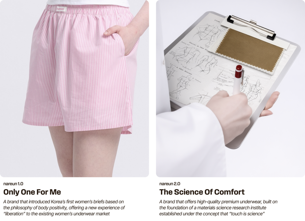
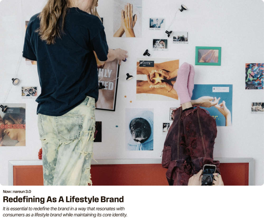
Nareun introduced Korea’s first women’s trunk underwear, offering a sense of liberation and ease that had not previously existed in the women’s underwear market. Built on a brand philosophy centered on women’s body health, the brand achieved strong early growth. Later, under the theme “The Science of Comfort,” Nareun expanded into adjacent categories based on the concept of a material science research lab. However, supplier-driven messaging and unfocused product expansion failed to generate strong consumer resonance, gradually diluting the brand’s core value. Recognizing these limitations, Nareun sought to redefine its brand value and explore a new direction as a lifestyle brand.
나른은 국내 최초로 여성용 트렁크를 출시하며 기존 여성 언더웨어 시장에 없던 해방감과 여유로운 착용 경험을 제안했고, 여성 신체 건강을 중심에 둔 브랜드 철학을 기반으로 초기 성장을 이루었습니다 이후 ‘The Science of Comfort(촉감은 과학)’이라는 테마 아래 '소재 과학 연구소' 콘셉트를 기반으로 인접 카테고리까지 확장했으나, 공급자 중심의 컨셉과 방향성 없는 제품 확장은 소비자의 공감을 충분히 얻지 못했고 브랜드의 본질적 가치를 점차 흐리게 만들었습니다. 이에 나른은 이러한 한계를 인지하고 브랜드의 가치를 다시 정의하며, 라이프스타일 브랜드로서 새로운 방향성을 모색하고자 했습니다.
Brand Definition
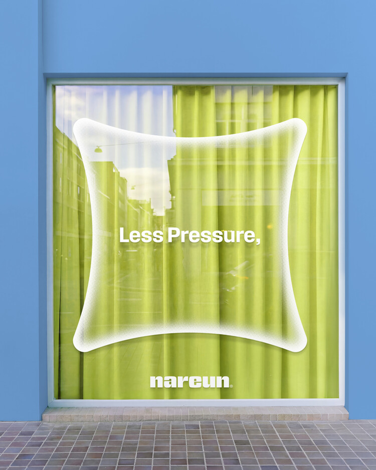
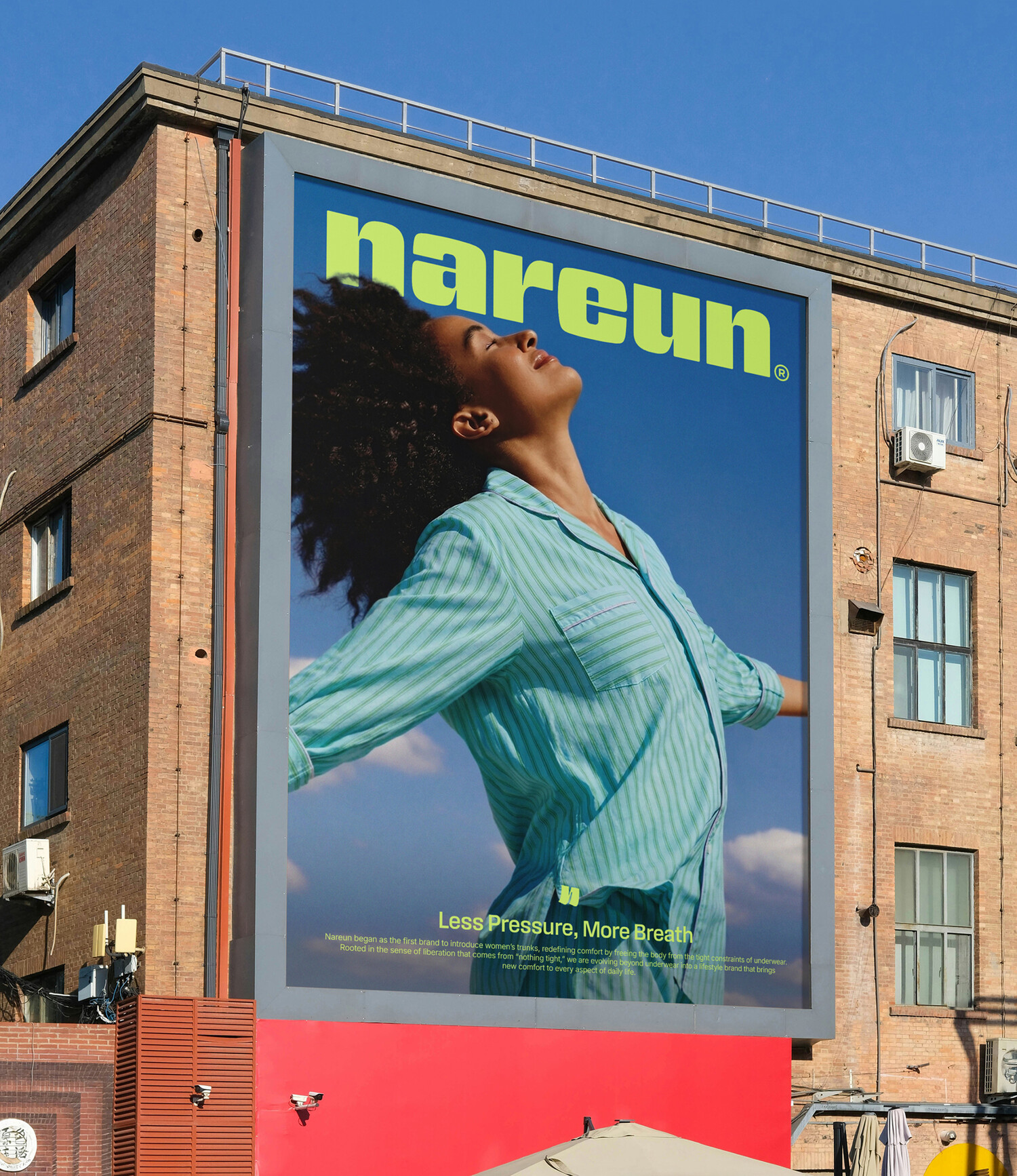
In this project, Nareun returned to its core and refocused on the unique value only the brand can deliver. By redefining its original USP, liberation from physical pressure, it articulated a renewed brand essence: “Less Pressure, More Breath.” This statement goes beyond product functionality. It reflects Nareun’s attitude toward life by reducing unnecessary pressure and creating more room for ease in everyday moments. Based on this direction, the brand repositioned itself as a lifestyle label.
이번 프로젝트에선 다시 브랜드의 본질로 돌아가, 나른만이 제공할 수 있는 가치에 집중했습니다. 압박에서 벗어나 해방감을 제공했던 초기 브랜드의 USP를 재정의하며, ‘Less Pressure, More Breath’라는 브랜드 에센스를 도출했습니다. 이는 단순히 제품 기능을 설명하는 문장이 아니라 나른이 지향하는 삶의 태도를 담은 메시지로, 일상 전반에서 불필요한 압박은 덜어내고 여유는 더한다는 방향 아래 라이프스타일 브랜드로의 확장을 선언합니다.
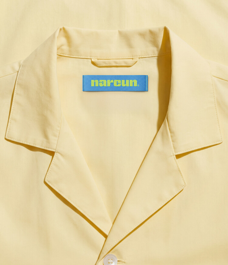
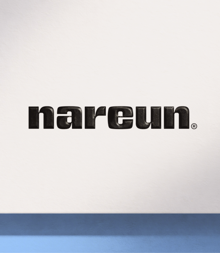
Brand Logo
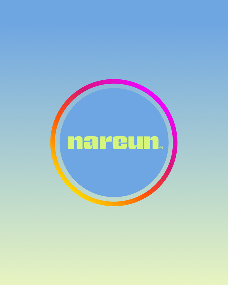
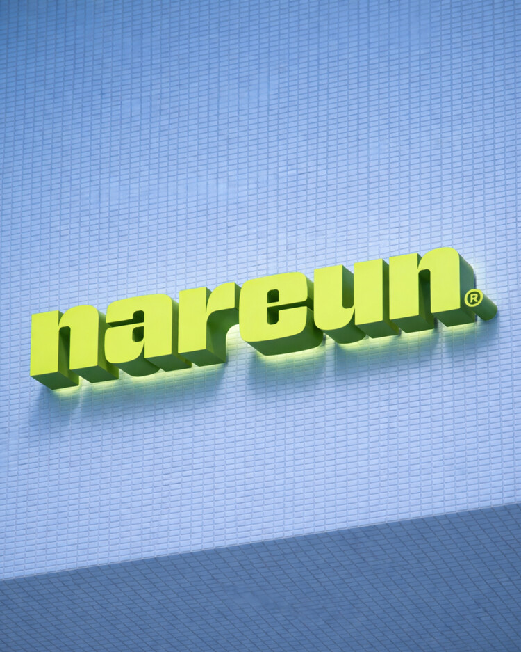
The wordmark, shaped as if gently inflated by a deep breath, visually expresses nareun’s sense of “Breath.” With a form that feels both solid and fluid, it reflects the brand’s attitude of relieving pressure. The symbol, structured around an N inspired by the image of fabric lightly flowing in the wind, encapsulates the brand’s essence of liberation and ease for both body and mind. Together, the logo serves as a visual asset that condenses the philosophy of “Less Pressure, More Breath,” consistently conveying the values of liberation and ease that nareun proposes.
숨을 크게 들이쉬었을 때 부풀어 오르는 듯한 형태의 워드마크는 나른이 지향하는 ‘호흡’의 감각을 시각적으로 드러냅니다. 단단하면서도 유연한 인상을 통해 압박을 덜어내는 브랜드의 태도를 담았으며, 심볼은 바람에 가볍게 날리는 천의 이미지를 모티프로 한 N의 형상으로 신체의 해방과 몸과 마음에 여유를 더하는 브랜드의 에센스를 함축합니다. 이처럼 로고는 ‘Less Pressure, More Breath’라는 철학을 응축한 시각적 자산으로, 나른이 제안하는 해방과 여유의 가치를 일관되게 전달합니다.
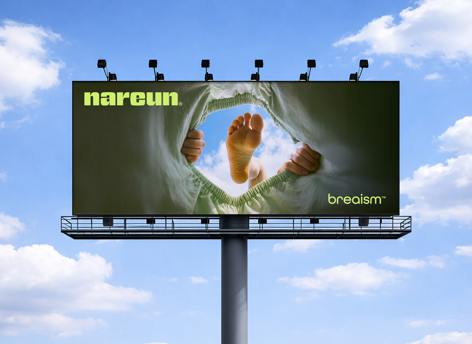
Product Planning
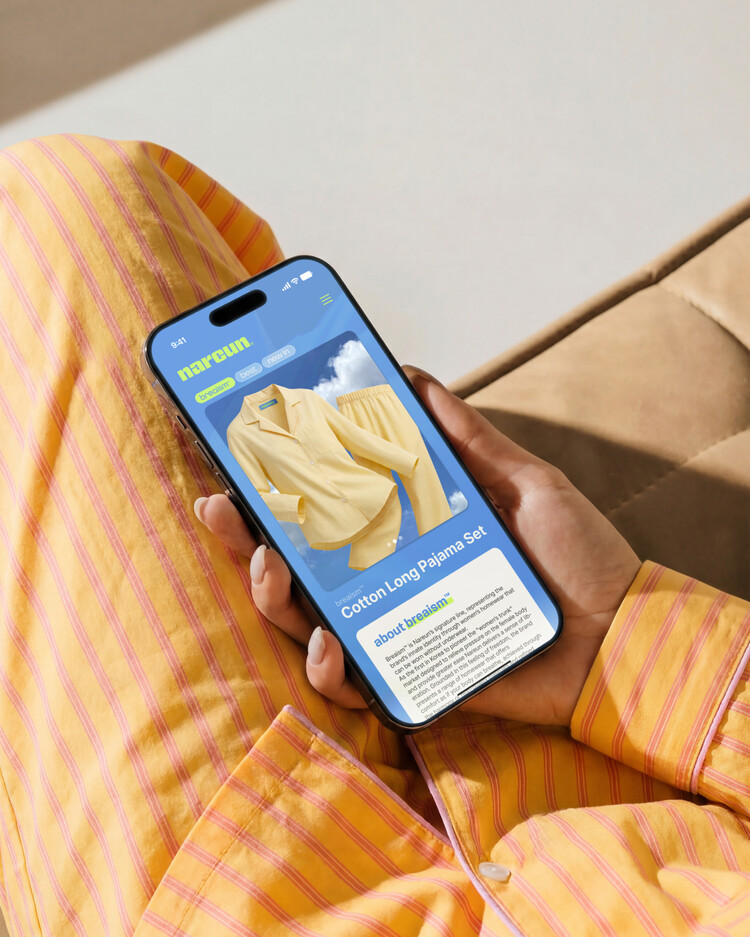
: Core line (Breaism™)
All product planning at Narun begins with the brand definition, and we adhere to the principle of expanding in a direction that remains true to it. Under this standard, we have structured our product lineup into the Core Line, which relieves physical pressure and provides a sense of liberation, and the Support Line, which adds a touch of leisure to everyday life. The Core Line is a product group that most directly embodies the value of “Less Pressure,” featuring items such as trunks and padded pajamas; we have defined this as Breaism™.
By combining “Breath,” meaning respiration, with “ism,” denoting a philosophy, the naming itself intuitively conveys that these are products designed to relieve pressure, making it Narun’s signature functional line.
나른의 모든 제품 기획은 브랜드 정의에서 시작되며, 우리는 그 본질을 충실히 따르는 방향으로 확장해 나가는 원칙을 고수합니다. 이러한 기준에 따라, 우리는 신체적 압박을 덜어주고 해방감을 선사하는 ‘코어 라인(Core Line)’과 일상에 여유로운 감성을 더하는 ‘서포트 라인(Support Line)’으로 제품 라인업을 구성했습니다. 코어 라인은 트렁크와 패딩 파자마 등 ‘Less Pressure’라는 가치를 가장 직접적으로 구현하는 제품군으로, 우리는 이를 ‘Breaism™’으로 정의했습니다. 호흡을 의미하는 ‘Breath’와 철학을 나타내는 ‘ism’을 결합한 이 명칭은, 이 제품들이 압박을 덜어주기 위해 설계되었다는 점을 직관적으로 전달하며, 나른의 시그니처 기능성 라인으로 자리매김하고 있습니다.
Product Planning
: Support line
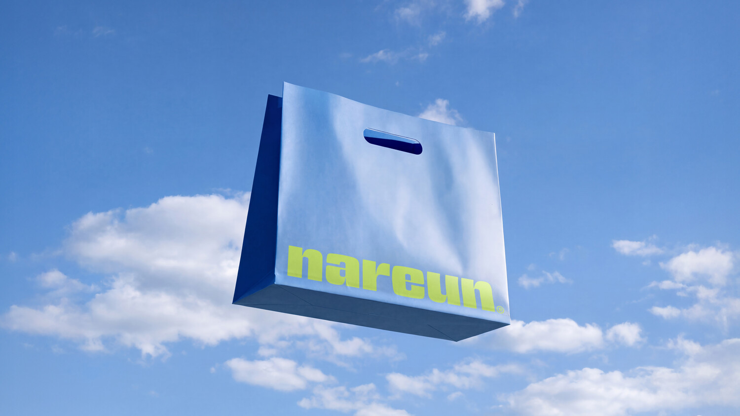
The Support Line embodies the value of “More Breath,” offering products that introduce moments of ease into various aspects of everyday life. It includes items such as reusable bags and bedding that propose comfort across daily routines, and serves to naturally extend nareun’s brand world around the Core Line.
서포트 라인은 ‘More Breath’의 가치를 담아 일상 속 다양한 순간에 여유를 더하는 제품군입니다. 리유저블 백, 베딩 등 삶의 전반에서 편안한 경험을 제안하는 아이템들로 구성되며, 코어 라인을 중심으로 나른의 세계관을 자연스럽게 확장하는 역할을 합니다.
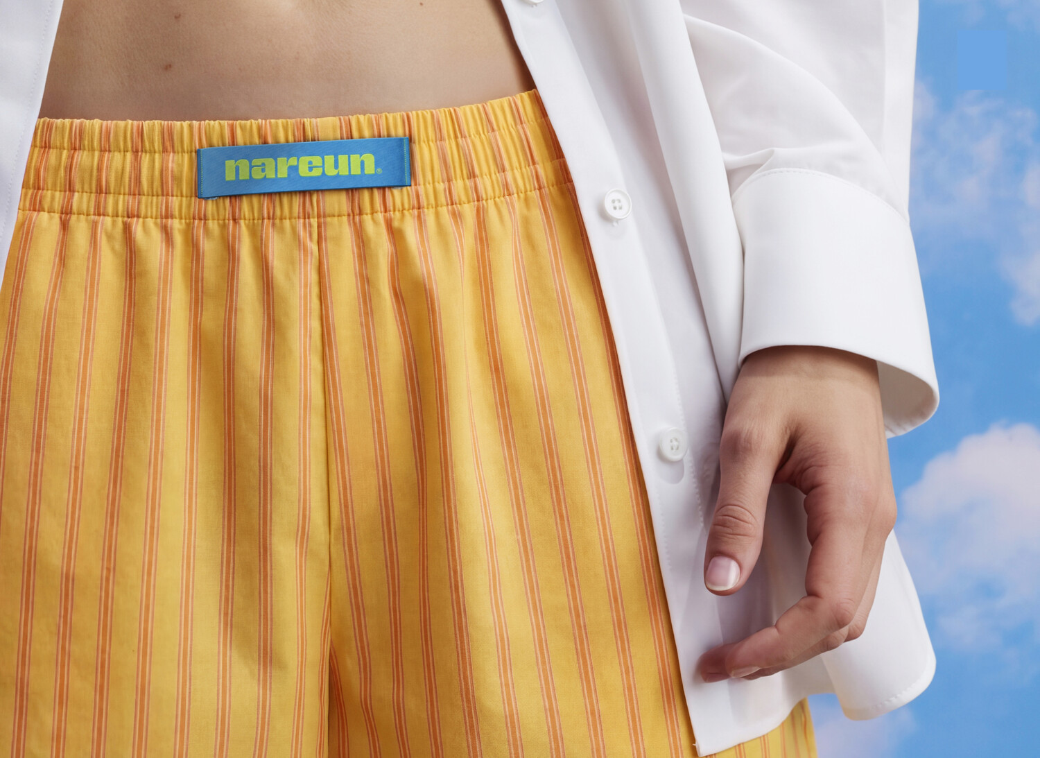
Typographic & Color System
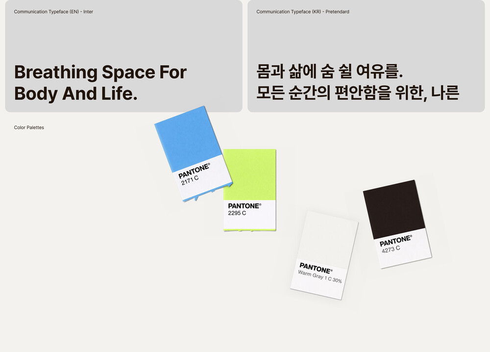
The brand typeface was selected for its strong visual pairing with the wordmark while maintaining clear and comfortable readability. The color palettes is composed of green and blue tones that metaphorically convey a sense of liberation and ease. Together, these brand assets were designed under the principle of effectively communicating nareun’s core message.
브랜드 서체는 워드마크와의 조화를 고려해 시각적 페어링이 뛰어나면서도 편안한 가독성을 제공하는 서체로 선정했으며, 컬러 역시 해방감과 편안함의 이미지를 은유적으로 전달할 수 있는 그린과 블루 계열로 구성했습니다. 이러한 브랜드 자산들은 나른의 코어 메시지를 효과적으로 전달하기 위한 기준 아래 설계되었습니다.
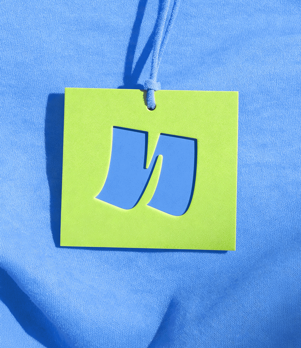
Graphic System
nareun’s graphic system originates from visualizing the movement of breathing, inhale and exhale. Forms that expand as breath is drawn in and contract as it is released serve as the brand’s distinctive graphic motifs. Through various expressions, these elements maintain a consistent visual language while creating a rich and dynamic visual experience.
나른의 그래픽은 호흡을 들숨과 날숨의 움직임으로 시각화하는 데서 출발했습니다. 여유로운 순간에 숨을 들이쉬며 부풀어 오르는 팽창의 형태와, 내쉬며 자연스럽게 수축하는 형태를 브랜드 고유의 그래픽 모티프로 활용했습니다. 이러한 요소들은 다양한 표현 방식 속에서도 일관된 흐름을 유지하며, 풍부한 시각적 경험을 만들어냅니다.
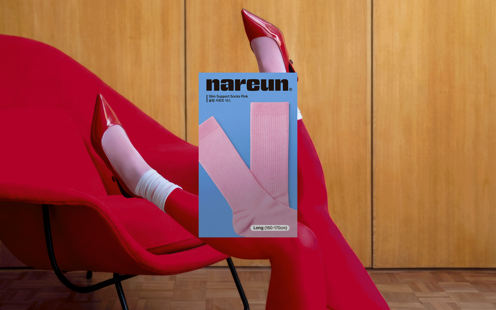
Packaging System
nareun’s packaging system is designed to present a consistent visual identity across both the Core Line and Support Line, ensuring a unified look throughout a diverse range of products. Each line is distinguished through the use of color combinations drawn from nareun’s color palette, allowing for clear differentiation while maintaining overall cohesion. In addition, the system applies a consistent layout across varying package proportions, enabling visual continuity regardless of format and delivering a cohesive brand experience across all product types.
나른의 패키지 시스템은 코어 라인부터 서포트 라인까지 다양한 제품군이 하나의 일관된 룩으로 보일 수 있도록 설계되었습니다. 라인 간의 구분은 나른의 컬러 팔레트를 활용한 배색으로 명확히 구분되며, 전체적인 시각적 통일성을 유지합니다. 또한 패키지의 비율이 변화하더라도 동일한 레이아웃 시스템을 적용하여, 다양한 제품군과 규격 속에서도 일관된 브랜드 경험을 제공합니다.

Brand Identity Development
Client
CJ ENM
BX Design
Tom&Nick Inc.
Strategy Director
Kim Dong Wan [Tom]
Creative Director
Hong Hyun Doo [Nick]
Brand Designer
Jo Hye Min [Joe]
An Ye Seul [Anne]