'밀크터치'는 2019년 인플루언서를 통한 클러스터 마케팅으로 시작한 '올리브 인터내셔널'의 자사 브랜드로 스킨케어부터 메이크업 영역까지 다양한 카테고리에서 킬링 아이템을 보유하고 있는 종합 코스메틱 브랜드입니다.
순환 주기가 극도로 빠르고 냉철한 한국 뷰티 시장에서 소비자의 의견에 적극적으로 귀기울이고, 유의미한 피드백을 적극적으로 수용하는 제품들로 소비자들에게 호평을 받으며 아시아 뷰티 시장에서 명확한 포지션을 선점하고 있는 밀크터치는 일본,중국 등 아시아를 시작으로 미국, 유럽까지 광범위한 글로벌 확장을 고려하고 있습니다.
다만 현재까지 사용중이던 공급자 중심의 메세지와 일관된 코어 그래픽 시스템의 부재를 인지하게 되어, 기존보다 명료하고 뚜렷한 커뮤니케이션 키워드 도출과 이를 시각화하는 코어 그래픽 시스템을 통해 일관된 브랜드 정의를 재정립하고 정체성과 패키지 디자인을 통해 감도 높은 브랜드로 새롭게 자리잡고자 합니다.
‘Milk-Touch’ is a comprehensive cosmetics brand under ‘Olive International.Inc’, launched in 2019 through influencer-driven cluster marketing. It boasts killer items across diverse categories, from skincare to makeup.
In the extremely fast-paced and ruthless Korean beauty market, Milk Touch earns high praise from consumers by actively listening to their opinions and incorporating meaningful feedback into its products. Having secured a clear position in the Asian beauty market, Milk Touch is now considering extensive global expansion, starting with Asia (Japan, China, etc.) and extending to the US and Europe.
However, recognizing the limitations of its current supplier-centric messaging and the absence of a consistent core graphic system, Milk Touch aims to redefine its brand identity. This involves deriving clearer, more distinct communication keywords and establishing a core graphic system to visualize them. Through this, Milk Touch seeks to reposition itself as a sophisticated brand, defined by its identity and package design.
Brand Definition
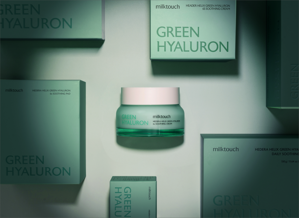
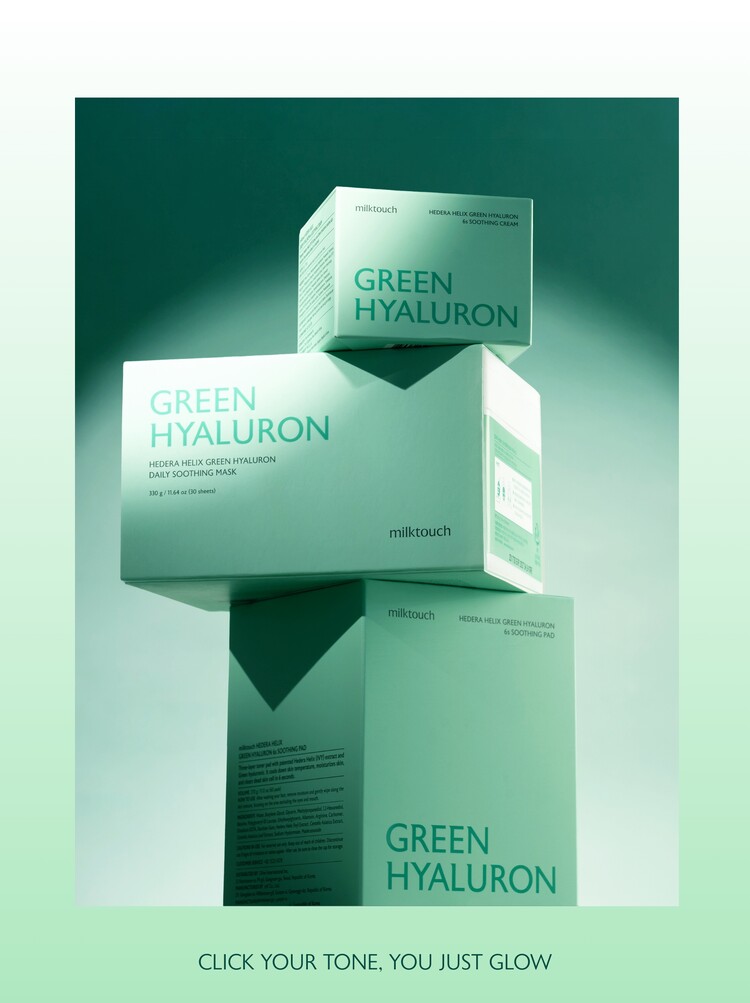
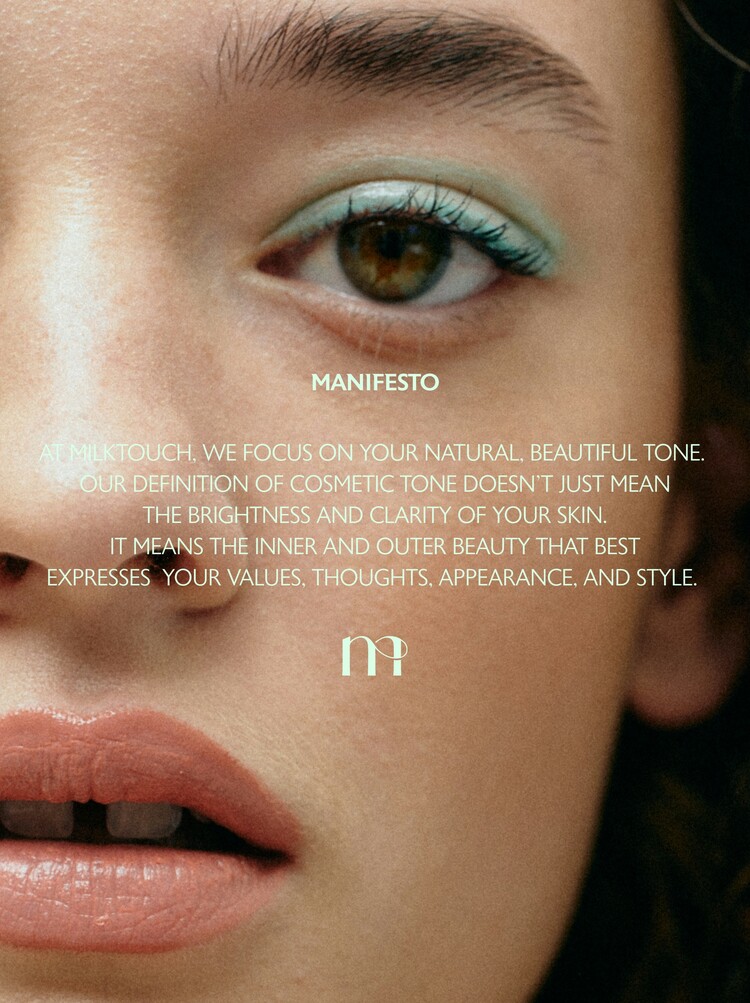
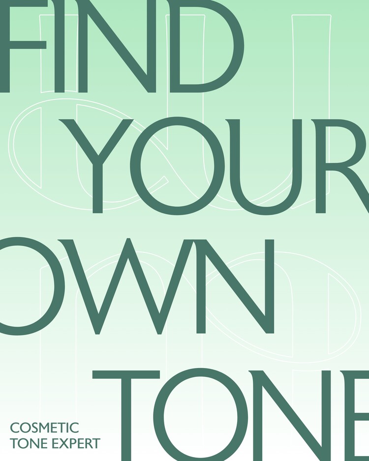
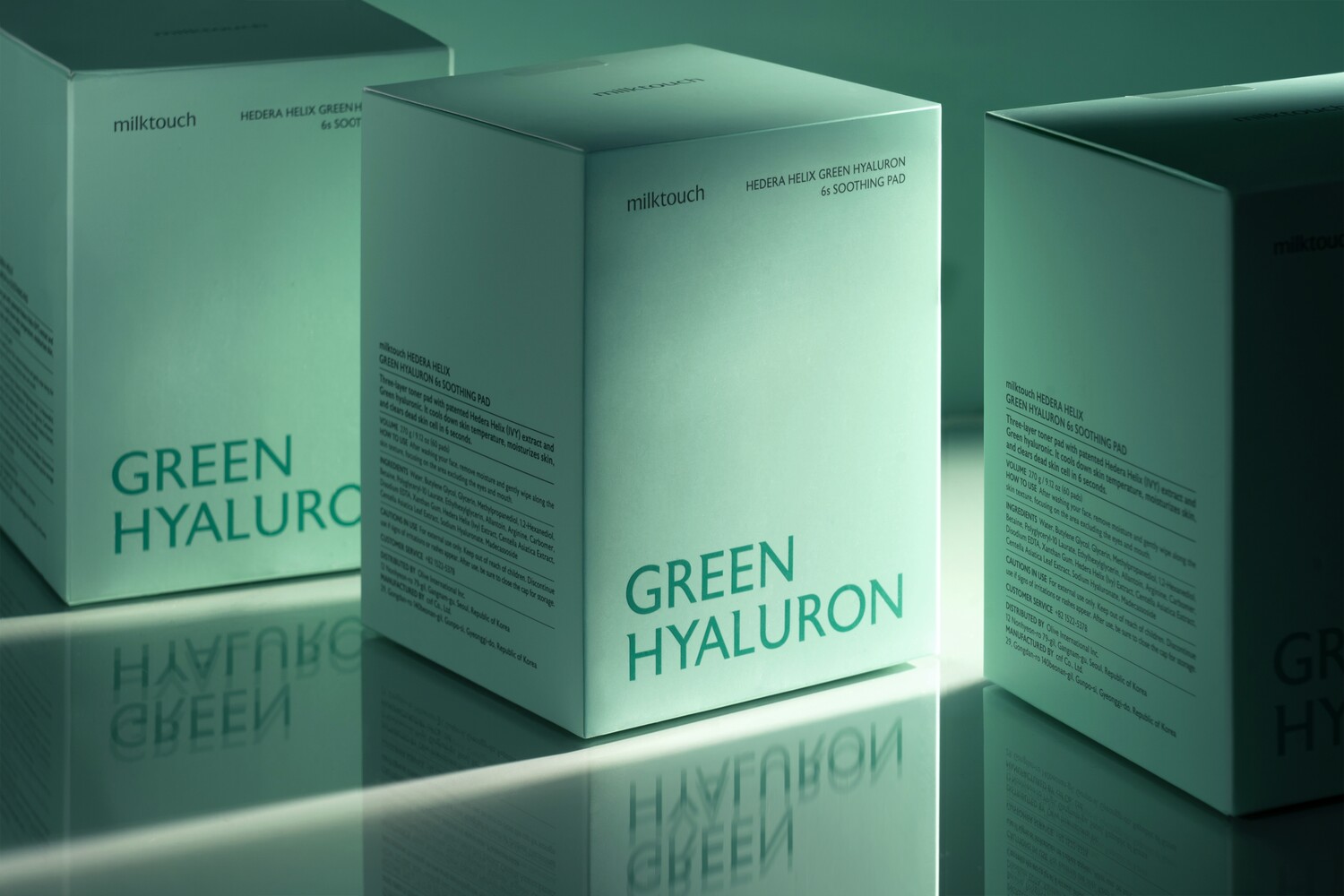
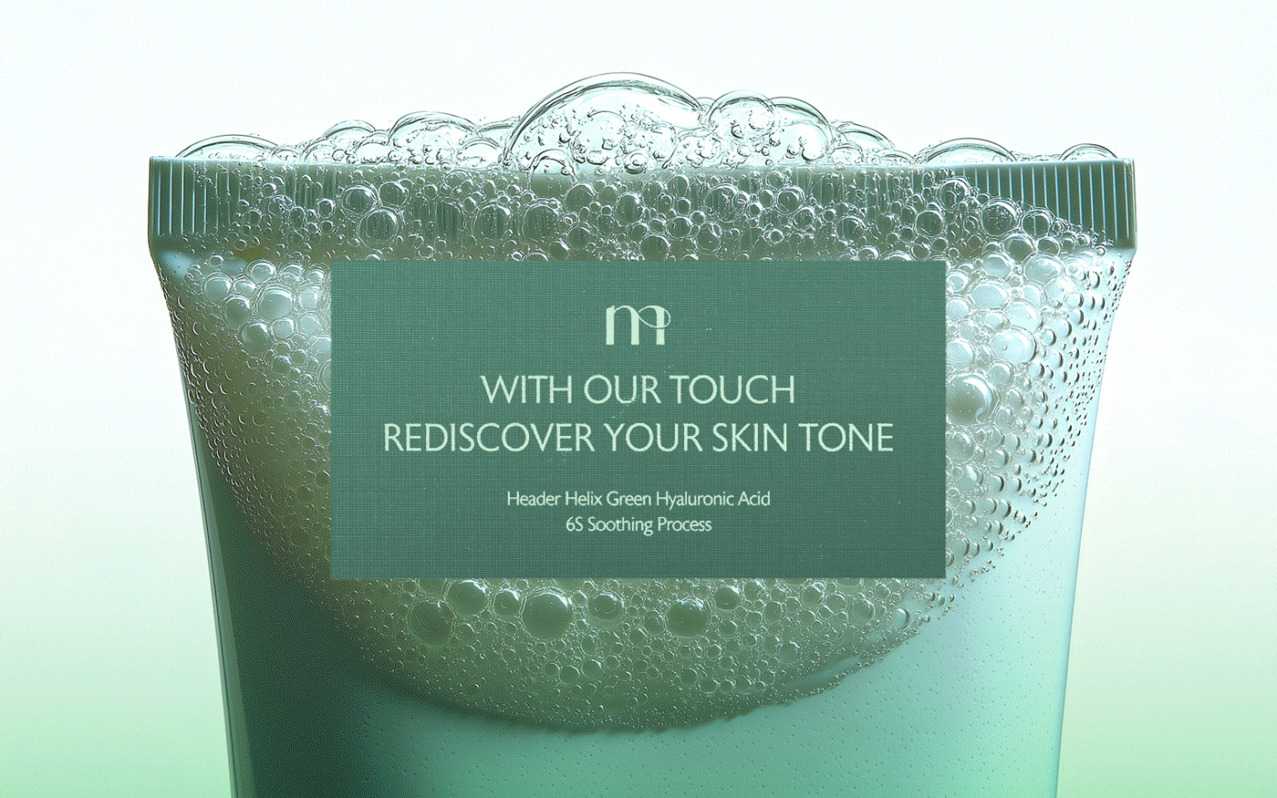
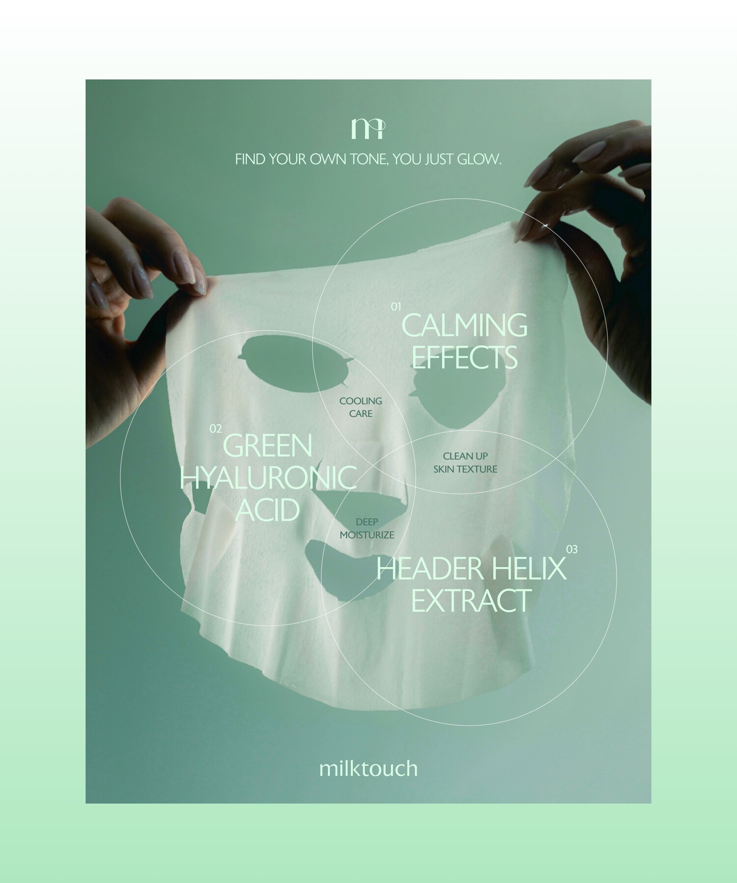
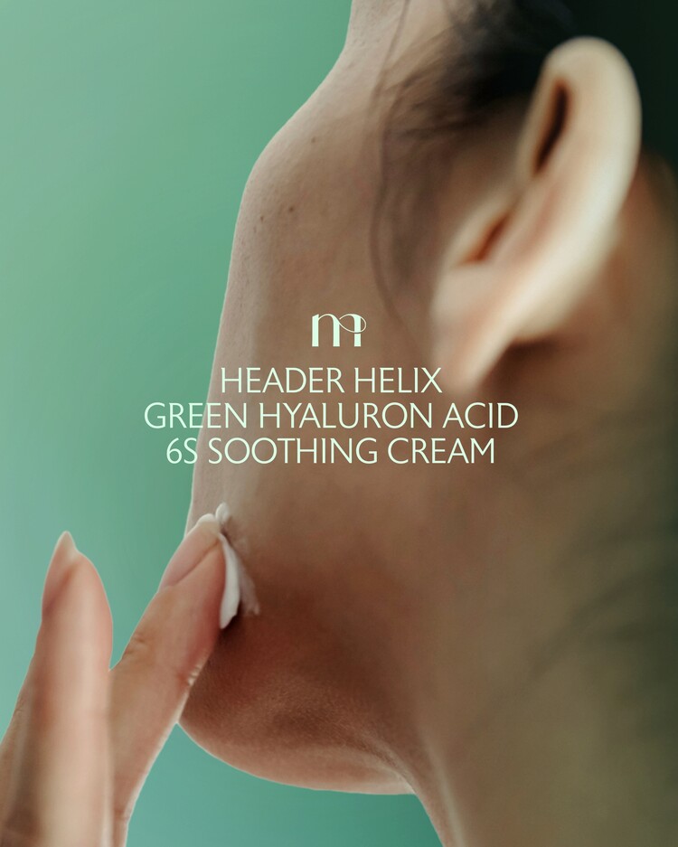
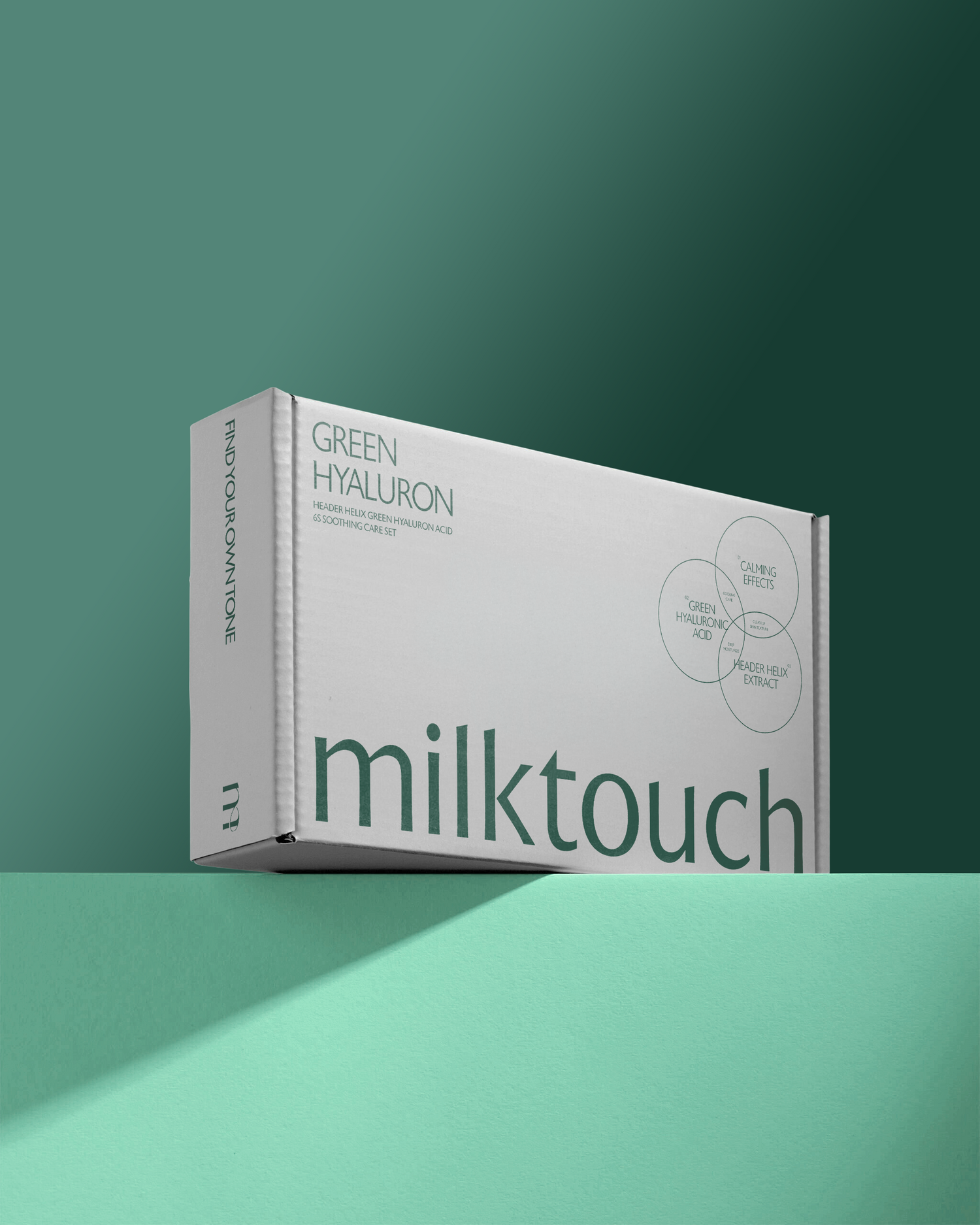
밀크터치는 공급자 중심의 브랜드 정의와 키 메세지 등으로 인해 뚜렷한 브랜드 보이스가 부재한 상황이었으며, 이로 인해 광범위한 카테고리에서 브랜드의 일관된 정체성을 표현하기에 제한적이었습니다. 밀크터치가 스킨케어와 메이크업을 수용하는 종합 코스메틱 브랜드인 만큼 범용적으로 브랜드를 감싸 안을 수 있는 코어 키워드가 필요한 상황에서 우리는 피부건강과 아름다움의 본질인 ‘Tone’이라는 키워드를 추출하여 새로운 브랜드 정의를 재정립했습니다.
기존 공급자 중심으로 설정되었던 브랜드 정의에서 벗어나 브랜드를 찾는 소비자에게 필요한 명확한 솔루션을 제시하는 베네핏 키워드를 ‘TONE’으로 정의하며, 브랜드를 마주하는 소비자에게 내면과 외면의 건강한 아름다움에 대한 메세지를 일관되게 정립합니다.
MilkTouch lacked a clear brand voice due to a supplier-driven brand definition and key messaging, which limited the brand’s ability to express a cohesive identity across a wide range of categories. Given that MilkTouch is an all-encompassing cosmetics brand that embraces skincare and makeup, we needed a core keyword that could universally wrap around the brand, so we extracted the keyword “Tone” - the essence of skin health and beauty - and redefined a new brand definition.
Moving away from the existing provider-centered brand definition, we defined ‘TONE’ as a benefit keyword that provides a clear solution for consumers who encounter the brand, and consistently establishes a message of healthy beauty from the inside out.
Visual Languages
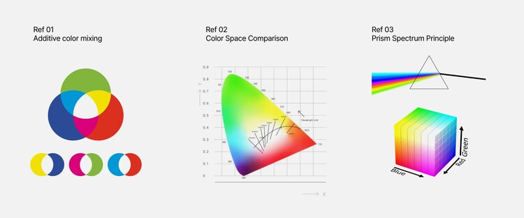
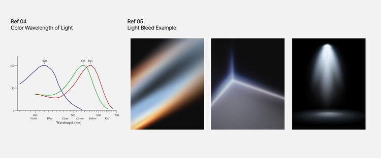
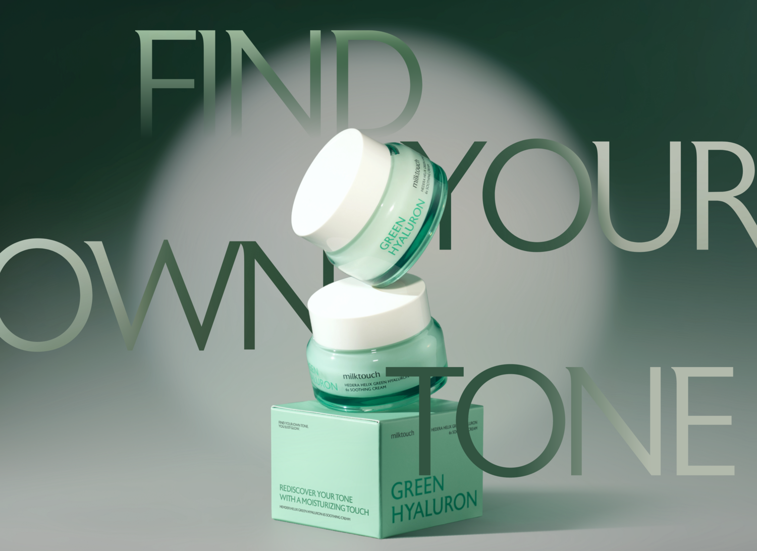
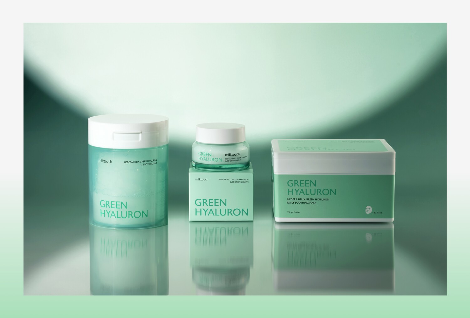
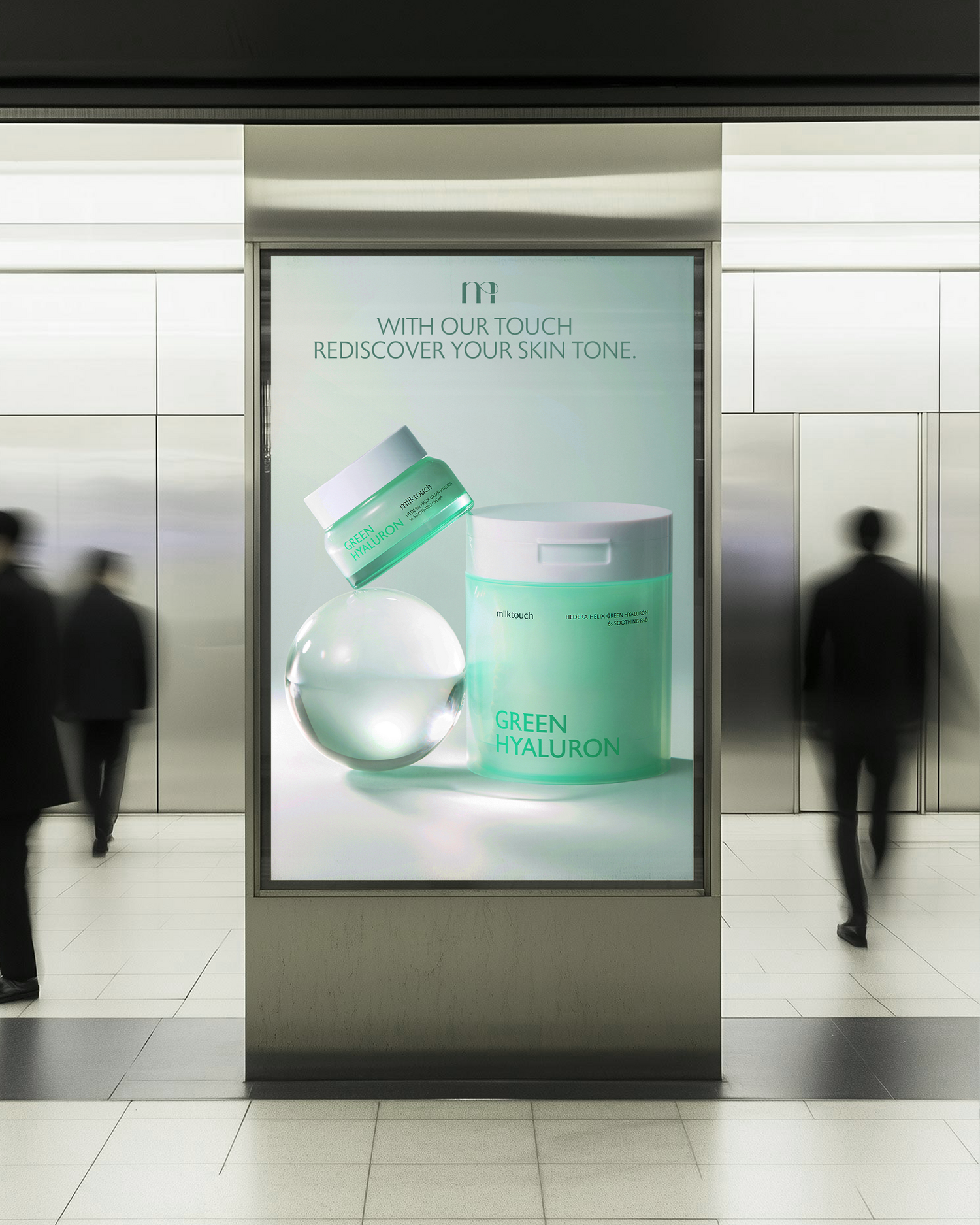
브랜드의 핵심 가치를 새롭게 정의하며, ‘Tone’라는 복합적인 단어를 효과적으로 전달하기 위해 다양한 상황에 범용적으로 적용이 가능한 시각 언어를 개발합니다. 스킨케어와 메이크업을 모두 포괄하고, 아름다운 피부의 본질적 기반이 되는 건강한 ‘Tone’을 효과적으로 전달 할 수 있도록 ‘빛의 3원색’이 가진 시각 구조 그래픽 모티프로 활용합니다.
겹쳐질수록 밝아지는 ‘빛의 3원색’의 시각적 특성을 활용하여, 다양한 원료의 혼합이 제공하는 효능이나 상황별 제품의 조합 활용 등 실질적으로 활용성이 높은 브랜드만의 시각언어를 설계합니다. 또한 대상과 배경에 따라 유연하게 퍼져나가는 빛의 시각적 속성을 현대적으로 활용하여, 일관되고 차별화된 제품 연출컷 및 모델컷, 키비주얼을 개발 할 수 있습니다.
Redefine the brand’s core values and develop a visual language that can be universally applied in a variety of contexts to effectively communicate the complex word ‘Tone’. To encompass both skincare and makeup, and effectively communicate the healthy ‘Tone’ that is the essential foundation of beautiful skin, we utilized the ‘three primary colors of light’ as a visual structure graphic motif.
By utilizing the visual characteristics of the ‘three primary colors of light’ that become brighter as they are layered, we design a visual language for the brand that is highly practical, such as the efficacy of blending various ingredients and the use of combinations of products for different occasions. We also develop consistent and differentiated product production cuts, model cuts, and key visuals by modernizing the visual properties of light that spreads flexibly depending on the target and background.
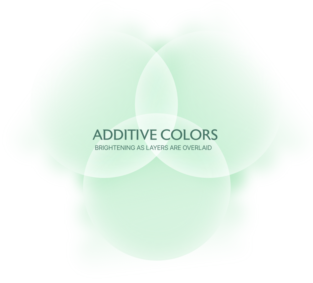
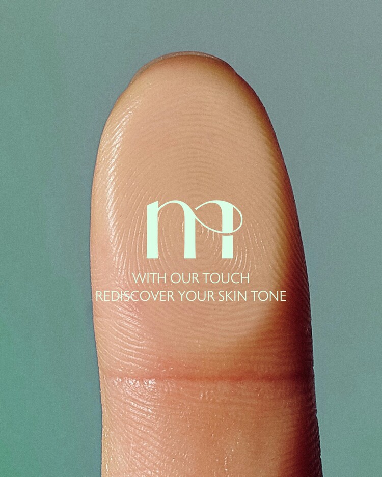
Graphic Motif : Additive Colors
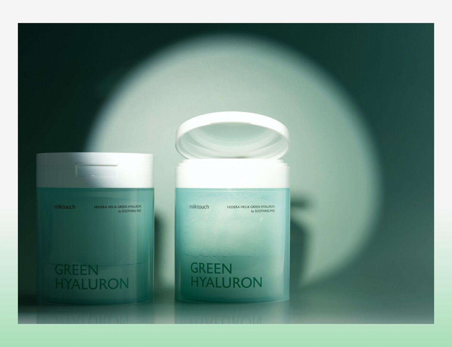
Visualizing the concept of “additive blending”- where different colors of light merge to create pure white - we develop a visual language unique to the brand that helps people find their natural skin tone.
다양한 색의 빛들이 합쳐질 수록 순수한 화이트에 가까워지는 ‘가산혼합’ 개념을 시각화하여, 본연의 피부톤을 찾을 수 있도록 돕는 브랜드 고유의 시각 언어를 개발합니다.

Client
Olive International.Inc [Milktouch]
Brand Experience
Tom&Nick.Inc
Strategy Director
Kim Dong Wan [Tom]
Creative Director
Hong Hyun Doo [Nick]
Brand Design
Jung Chan Hee [Dan]
Jo Hye Min [Joe]
Kim Sol Hee [Sol]
An Ye Seul [Anne]