※ 본 프로젝트에 첨부된 모든 비주얼은 컨셉 안내를 위해 제작되었으며, 실물이 아닙니다.
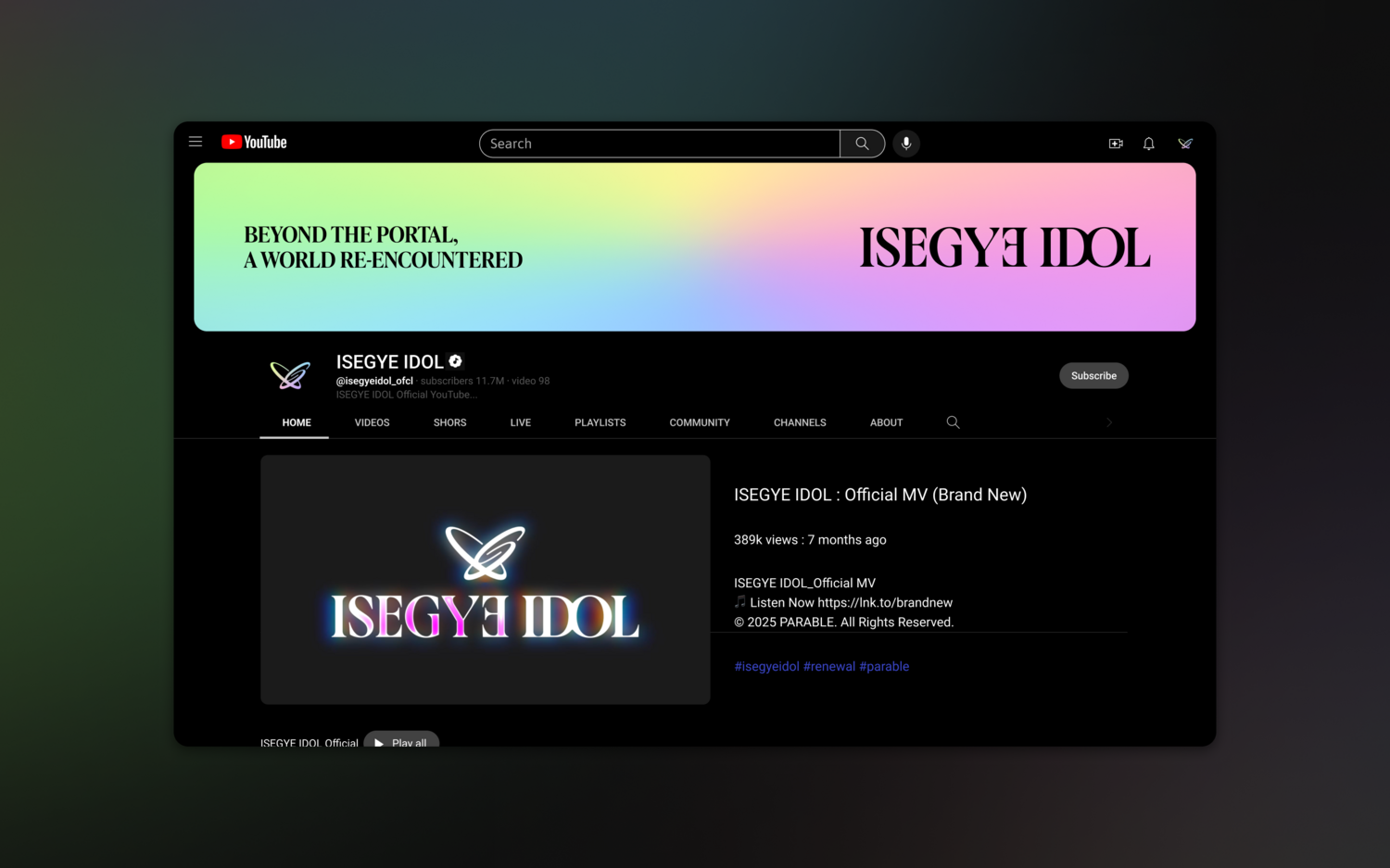
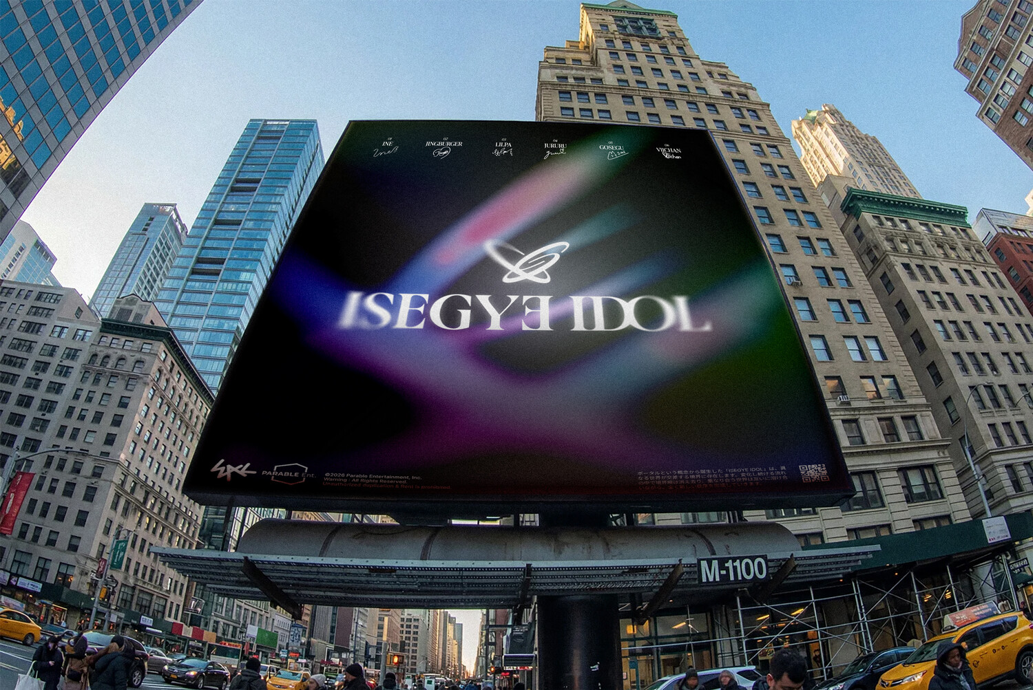
ISEGYE IDOL is a global virtual artist group that represents a new era of entertainment culture, built upon a distinctive narrative that transcends the boundaries between reality and virtuality, as well as those between individual identities and collective experiences. The concept of “members from different worlds coming together as a single group” functions as a core storytelling framework, fostering audience immersion while shaping the group’s unique identity.
Inspired by these defining characteristics, this project reimagines ISEGYE IDOL’s brand identity through a contemporary perspective. Centered on the mission of developing a distinctive and scalable visual language, the new identity system bridges the group’s narrative universe and brand experience, creating a cohesive framework that delivers a consistent and recognizable presence across all audience touchpoints.
이세계아이돌은 버추얼 아티스트라는 새로운 형태의 엔터테인먼트 문화를 대표하는 글로벌 그룹으로, 버추얼 기술을 통해 현실과 가상의 경계, 나아가 개인과 집단의 경계를 넘나드는 독창적인 세계관을 기반으로 성장해 왔습니다. 특히 ‘각기 다른 세계에서 온 멤버들이 모여 결성된 하나의 그룹’이라는 설정은 팬들의 몰입을 이끄는 핵심 서사 장치로 기능하며, 아티스트만의 고유한 정체성을 구축하는 중요한 요소로 자리 잡고 있습니다.
이러한 특성을 반영하여 이세계아이돌의 브랜드 아이덴티티를 현대적인 관점에서 재해석하며, 아티스트만의 독자적이고 확장 가능한 시각 언어를 구축하고 이를 통해 그룹의 세계관과 브랜드 경험을 유기적으로 연결하는 미션을 중심으로 삼아 다양한 접점에서 일관된 정체성을 유지하는 새로운 아이덴티티 시스템을 제안합니다.
Artist Core Copcept
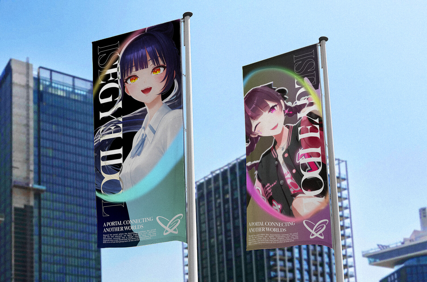
: A Portal Connecting Another Worlds
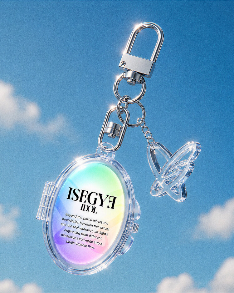
While the term Isegye (異世界, “Another World”) has effectively served as the core concept defining both the artists and their narrative universe, the brand lacked a cohesive visual system capable of translating this identity into a consistent brand experience. To address this challenge, the concept of a Portal was introduced as a new brand motif—serving both as a symbolic device that articulates the artists’ unique characteristics and as a visual mechanism for expressing the brand’s identity.
그룹의 이름이자 세계관을 관통하는 핵심 키워드인 ‘이세계(異世界)’는 아티스트와 서사를 설명하는 개념으로서 효과적인 역할을 수행해 왔습니다. 그러나 이를 일관된 브랜드 경험으로 연결하고 정체성을 전달할 수 있는 시각적 체계는 부재한 상황이었으며, 이를 개선할 수 있도록 아티스트의 특성을 정립하는 장치이자 상징적인 개념인 ‘포털(Portal)’을 새로운 브랜드 모티프로 설정했습니다.
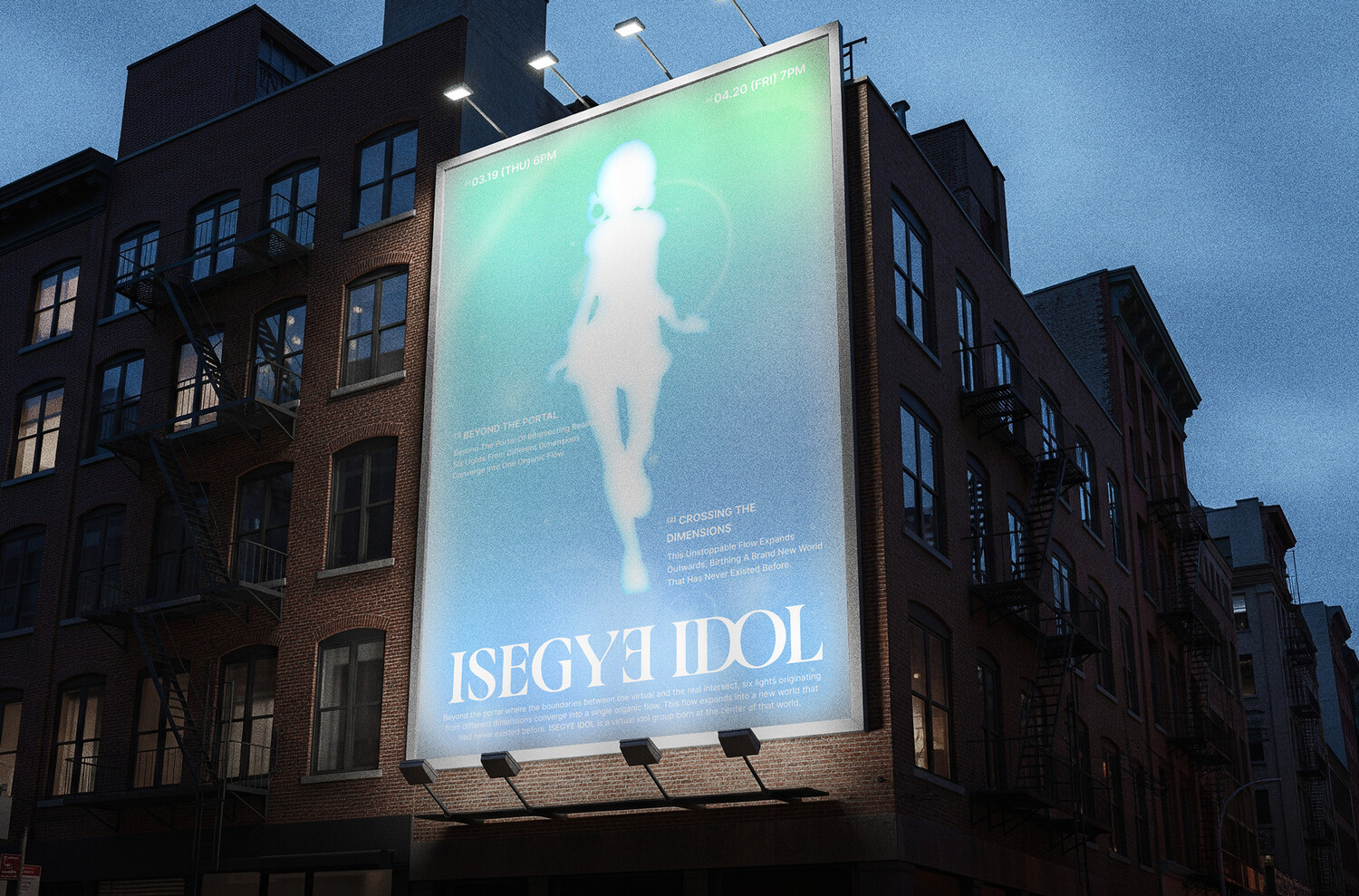
A portal, as a gateway that connects different dimensions and worlds while enabling entry into new experiences, embodies the essence of ISEGYE IDOL’s identity. It reflects the group’s journey of bridging reality and virtuality, artists and fans, and multiple worlds through shared experiences. More than a means of transportation, the portal symbolizes connection, expansion, intersection, and entry—values that naturally align with the experiential vision of the brand. Through this reinterpretation, ISEGYE IDOL is positioned not simply as “idols from another world,” but as a brand that connects diverse worlds, experiences, and people.
서로 다른 차원과 세계를 연결하는 매개체이자, 새로운 경험으로 진입하는 관문을 의미하는 포털은 이는 현실과 가상, 아티스트와 팬, 각기 다른 세계를 연결하며 성장해 온 이세계아이돌의 정체성이자 앞으로의 활동 방향성을 일관되게 전달합니다. 또한 포털은 단순한 이동 수단을 넘어 연결, 확장, 교차, 진입이라는 의미를 내포하고 있어 브랜드가 지향하는 경험적 가치와도 자연스럽게 연결됩니다. 이를 통해 이세계아이돌을 단순히 ‘이세계에서 온 아이돌’이 아닌, 다양한 세계와 사람들을 연결하는 브랜드로 재해석하고자 하였습니다.
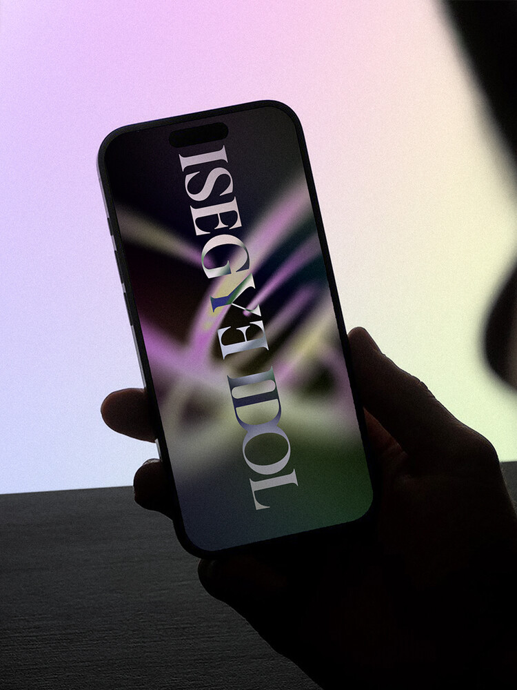
Graphic Motif
Portal, the core concept symbolizing the artist’s identity, represents a gateway that connects different worlds and enables entry into new experiences. It encapsulates ISEGYE IDOL’s unique identity, shaped through the connection of reality and virtuality, artists and fans, and multiple intersecting worlds. The overall brand identity is built around the motif of the Portal, with a graphic system that visually expresses the boundaries and connections between dimensions, enhancing immersion in the brand’s universe. This approach preserves the brand’s distinctive narrative while establishing a clearer and more scalable visual language. It is designed to deliver a consistent brand experience across diverse media and touchpoints, ensuring both coherence and flexibility as the brand continues to grow.
아티스트의 정체성을 상징하는 핵심 개념인 포털(Portal) 은 서로 다른 세계를 연결하고 새로운 경험으로 진입하게 하는 관문을 의미합니다. 이는 현실과 가상, 아티스트와 팬, 각기 다른 세계를 연결하며 성장해 온 이세계아이돌의 정체성을 함축적으로 표현합니다. 브랜드 아이덴티티 전반은 포털을 중심 모티프로 구축되었으며, 차원의 경계와 연결성을 시각적으로 표현하는 그래픽 시스템을 통해 세계관의 몰입도를 강화하였습니다. 이를 통해 브랜드의 고유한 서사를 유지하면서도 보다 명확하고 확장성 있는 비주얼 언어를 구축하고, 다양한 매체와 접점에서 일관된 브랜드 경험을 제공할 수 있도록 설계하였습니다.
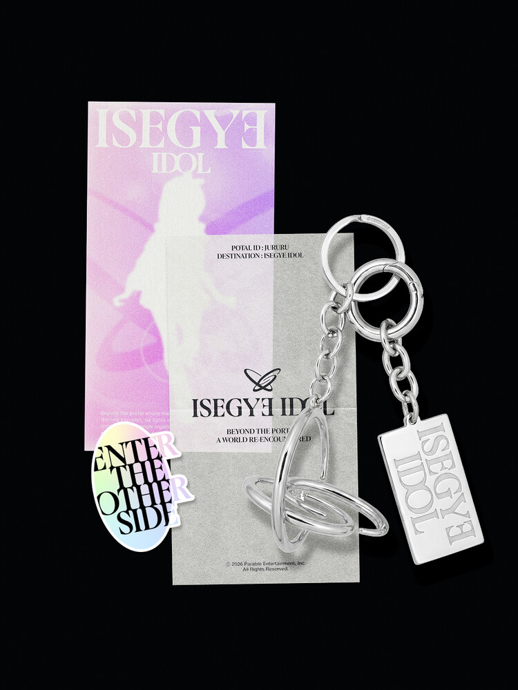
Worldmark & Symbol
: Facing Egos Through a Portal
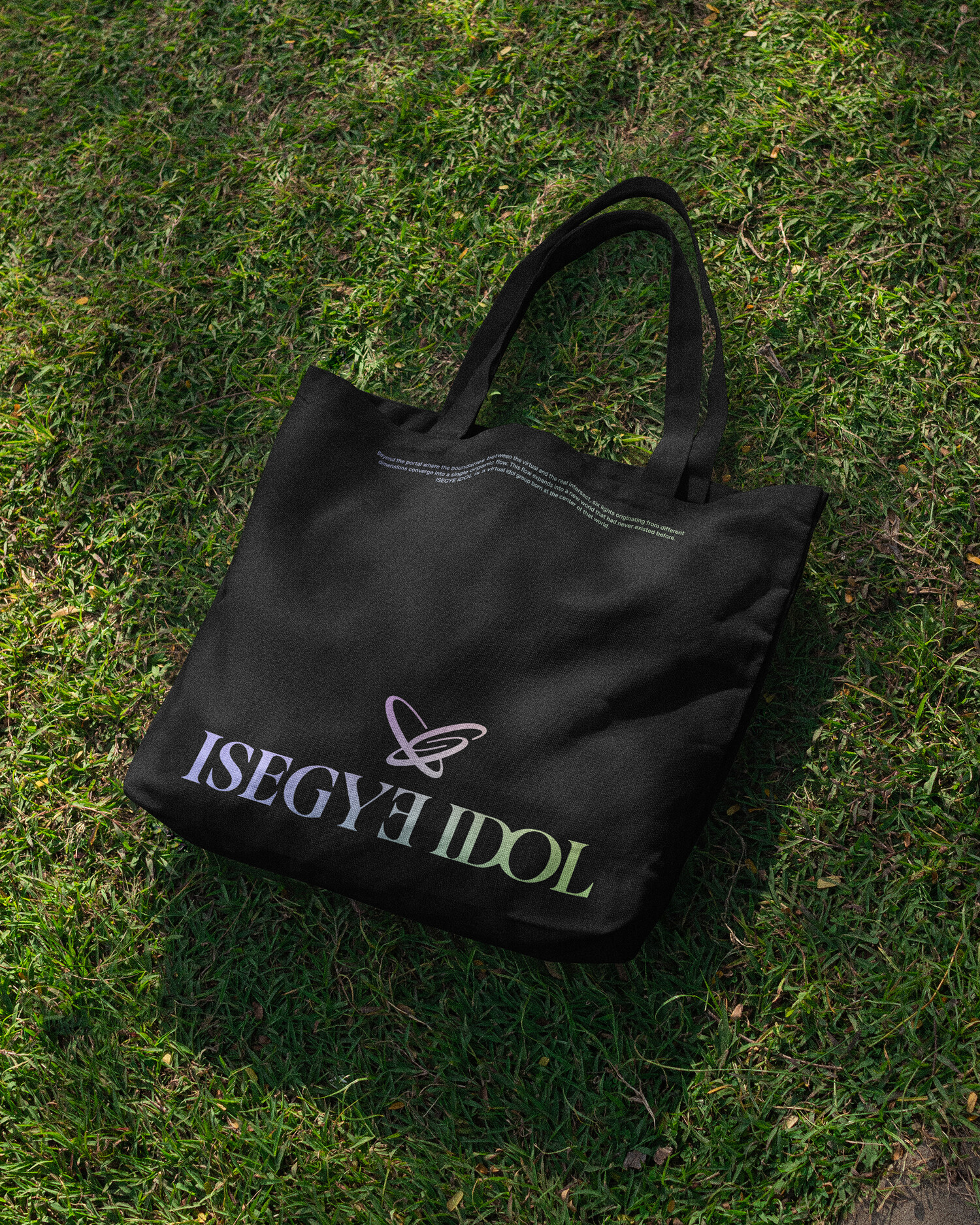
The overall brand identity was built around the concept of the Portal as its central motif, utilizing a graphic system that visually expresses dimensional boundaries and the connections between artists to further strengthen the immersive nature of the group's narrative universe. The newly developed BI emerges from the organic motion of the portal itself, taking shape through the core initials of the brand name [I, S, G] Complemented by an ornamental symbol system and a wordmark featuring mirrored “E” forms that represent Ego, the identity preserves the brand’s unique narrative while establishing a clearer, more scalable, and distinctive visual language.
브랜드 아이덴티티 전반은 포털을 중심 모티프로 구축되었으며, 차원의 경계와 아티스트간의 연결성을 시각적으로 표현하는 그래픽 시스템을 통해 세계관의 몰입도를 강화하였습니다. 포털의 유기적인 움직임 끝에 탄생하는 새로운 BI는 네이밍의 핵심 이니셜이 되는[I,S,G]의 조형을 활용해 완성되었으며, 오너먼트 형태의 심볼과 마주보는 E(Ego)의 의미를 더한 워드마크를 통해 브랜드의 고유한 서사를 유지하면서도 보다 명확하고 확장성 있는 시각 언어를 개발했습니다.
Color Identity
: From Individuality to Unity
The color identity of ISEGYE IDOL begins with the individuality of each artist. Every member is represented by a distinct color that reflects their unique personality, story, and presence. Over time, these colors have evolved beyond simple visual identifiers, becoming a shared language that connects the artists and their fans. Fans naturally expressed their support and affection through colored heart emojis associated with each member, creating a vibrant culture across comments, chats, and online communities. This organically formed behavior gradually became a symbolic representation of each member’s identity, laying the foundation for a unique color system shaped together by both the artists and the fandom.
이세계아이돌의 컬러 아이덴티티는 각 아티스트의 개성에서 시작됩니다. 각 멤버는 고유의 색으로 표현되며, 이는 각자의 성격과 서사, 그리고 존재감을 상징합니다. 이러한 색은 단순한 시각적 구분을 넘어 아티스트와 팬을 연결하는 하나의 언어로 발전해 왔습니다. 팬들은 각 멤버를 상징하는 컬러의 하트 이모지를 사용해 응원과 애정을 표현했고, 이는 댓글과 커뮤니티 전반에 자연스럽게 자리 잡았습니다. 자발적으로 형성된 이 문화는 각 멤버의 정체성을 상징하는 요소로 발전하며, 아티스트와 팬덤이 함께 만들어낸 고유한 컬러 아이덴티티의 기반이 되었습니다.