

PROJECT OVERVIEW
The gym wear market, except for global-scale brands, has been structured in a way that makes it difficult to differentiate products based on performance. Early indie brands primarily focused on creating trends through celebrity and influencer marketing, and the market was driven by brands reflecting the image and culture admired by highly engaged health customers such as professional bodybuilders. Although the market size is small, it consists of solid lead brands competing to appear grander and more impressive. In this environment, BYSEC relied relatively more on product-based marketing for sales. Their products mainly targeted low-engagement customers who are just starting to exercise, offering items that correct body silhouette issues like excess fat and shoulder alignment, rather than customers deeply interested in bodybuilding culture. Additionally, the relatively low price point made it difficult for the brand to gain recognition.
짐웨어 시장은 글로벌 스케일의 브랜드를 제외하면 제품의 성능을 통한 차별점 형성이 어려운 구조였습니다. 초기 인디 브랜드는 연예인과 인플루언서 마케팅을 통한 대세감 형성을 주요 전략으로 삼았고, 현직 프로 보디빌더 선수 등 헬스 고관여 고객이 선망하는 이미지와 문화를 투영하여 브랜드가 판매되는 시장이었습니다. 시장 규모는 작지만 견고한 리드 브랜드들이 서로 더욱 웅장하고 거대한 이미지로 보이기 위해 경쟁하고 있는 시장에서, 바이젝은 상대적으로 제품 자체의 마케팅에 의존한 판매 구조를 가지고 있었습니다. 보디빌딩 문화에 관심이 있는 고객보다는 상대적으로 운동을 시작하는 단계의 저관여 고객에게 군살 및 어깨 보정 등 신체 실루엣을 교정해 주는 제품들이 주요했고, 또한 비교적 낮은 가격대로 형성되어 브랜드로서 인지되기 어려웠습니다.
CHALLENGE
BYSEC had a clear USP of body silhouette correction, or 'Fit,' but this strength neither translated into brand identity nor was recognized as a unique differentiating value of the brand. It was developed more in the context of everyday consumer goods rather than sports, resulting in a blurred identity as a gymwear brand and unclear criteria for product expansion.
바이젝은 신체 실루엣 보정, 즉 '핏(Fit)'이라는 분명한 USP를 보유하고 있었으나, 이 강점이 브랜드 정체성으로 연결되지 못할 뿐만 아니라 브랜드 고유의 차별화된 가치로 인지되지 않았습니다. 운동보다는 일상적인 소비재의 맥락으로 전개되어 짐웨어 브랜드로서 정체성이 흐릿했고, 제품 확장의 기준 또한 모호했습니다.
SOLUTION
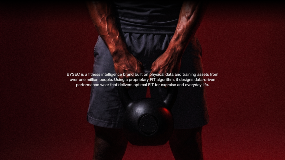
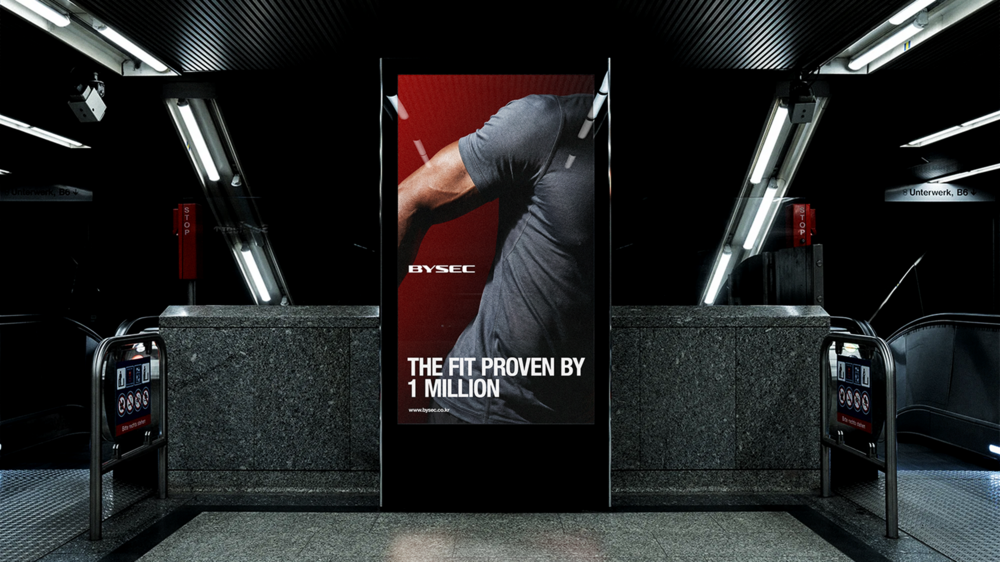
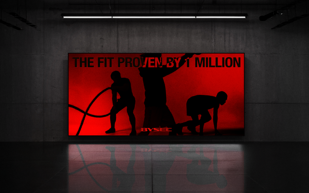
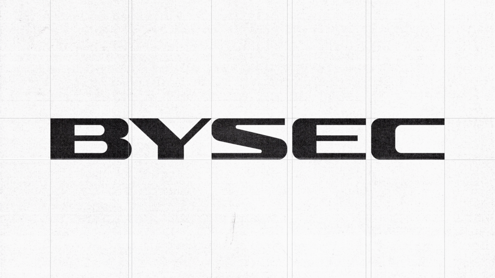
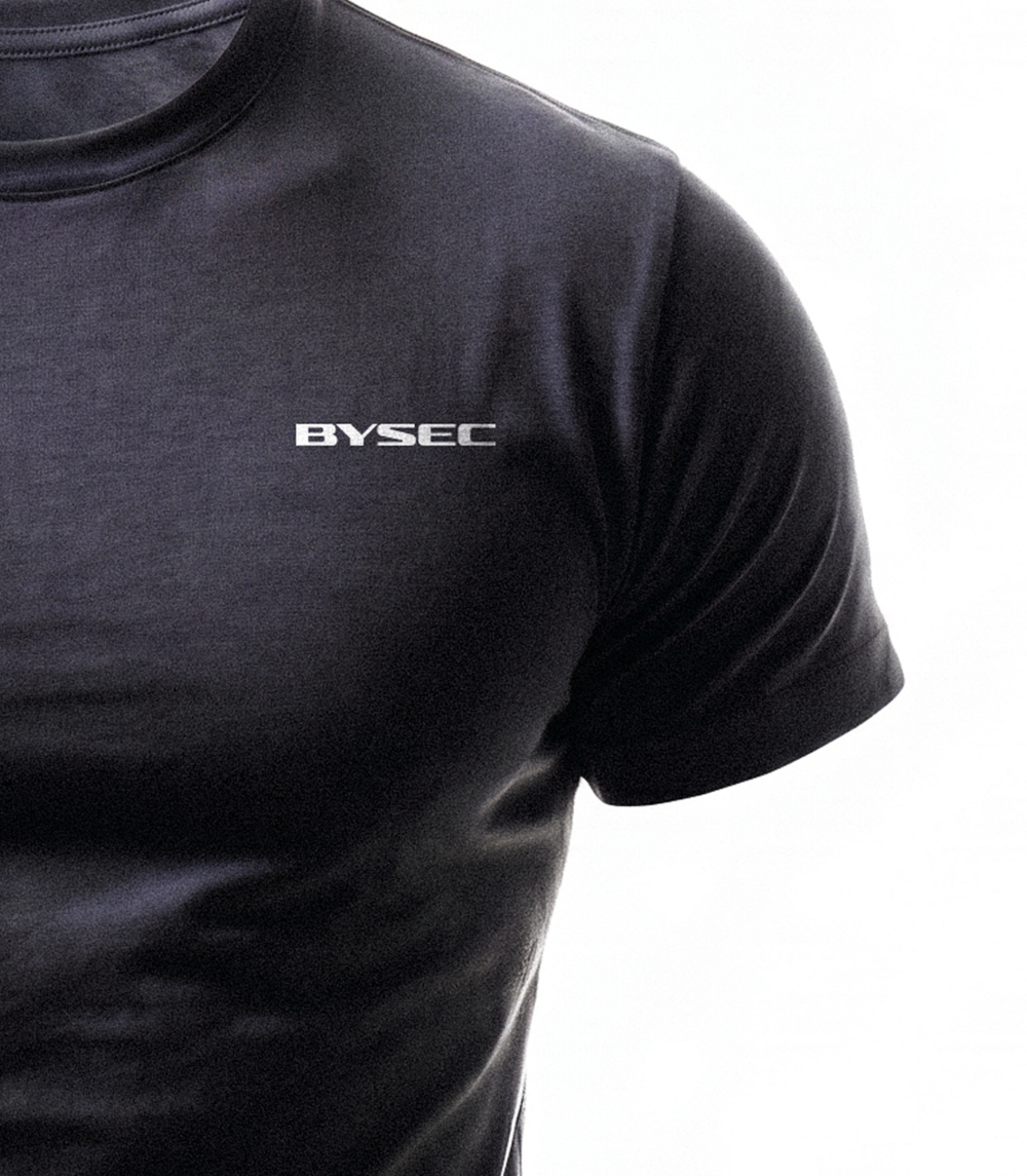
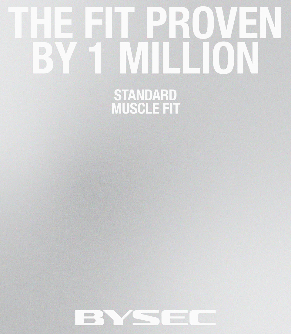
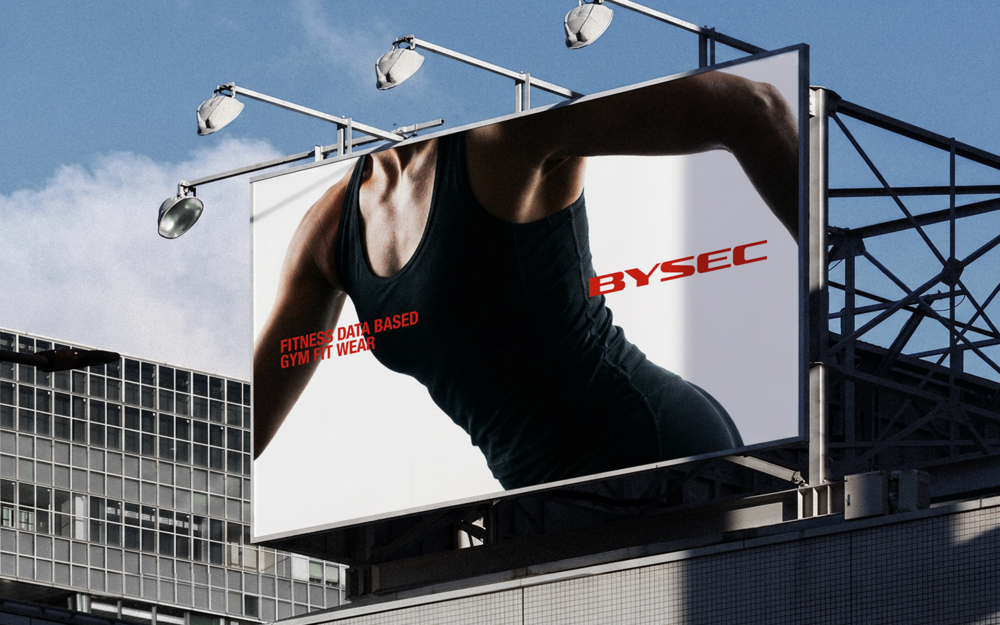
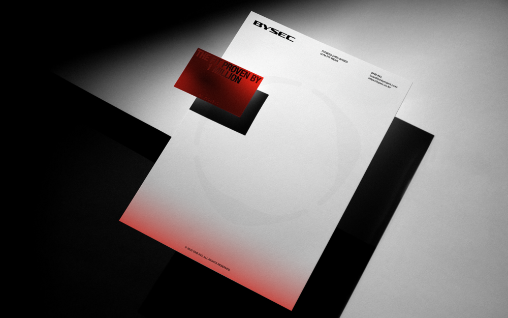
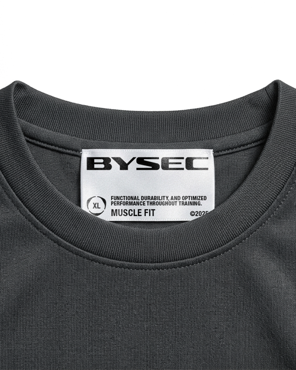
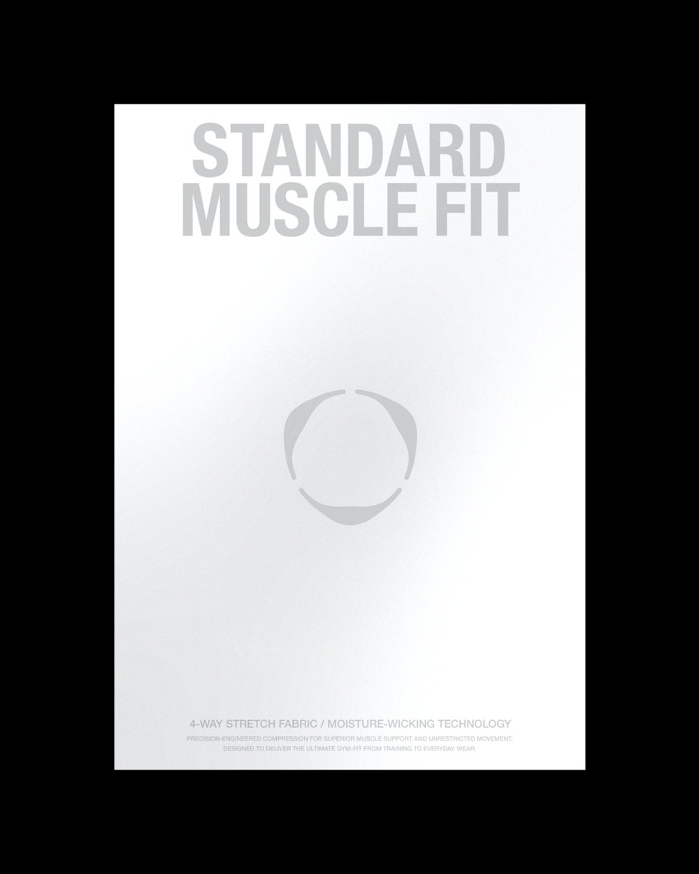
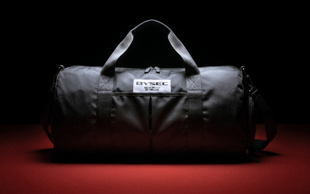
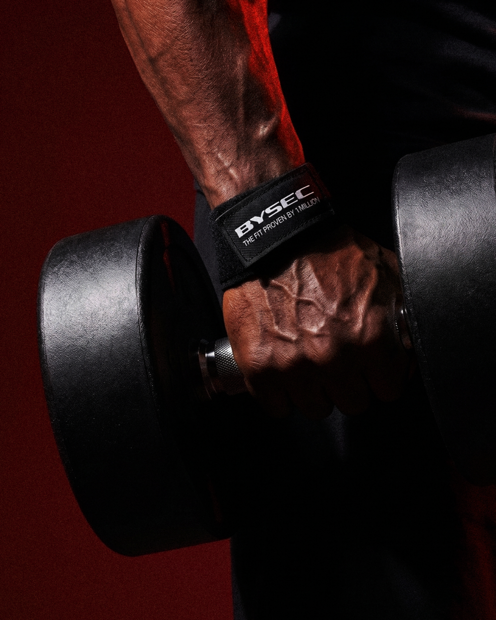
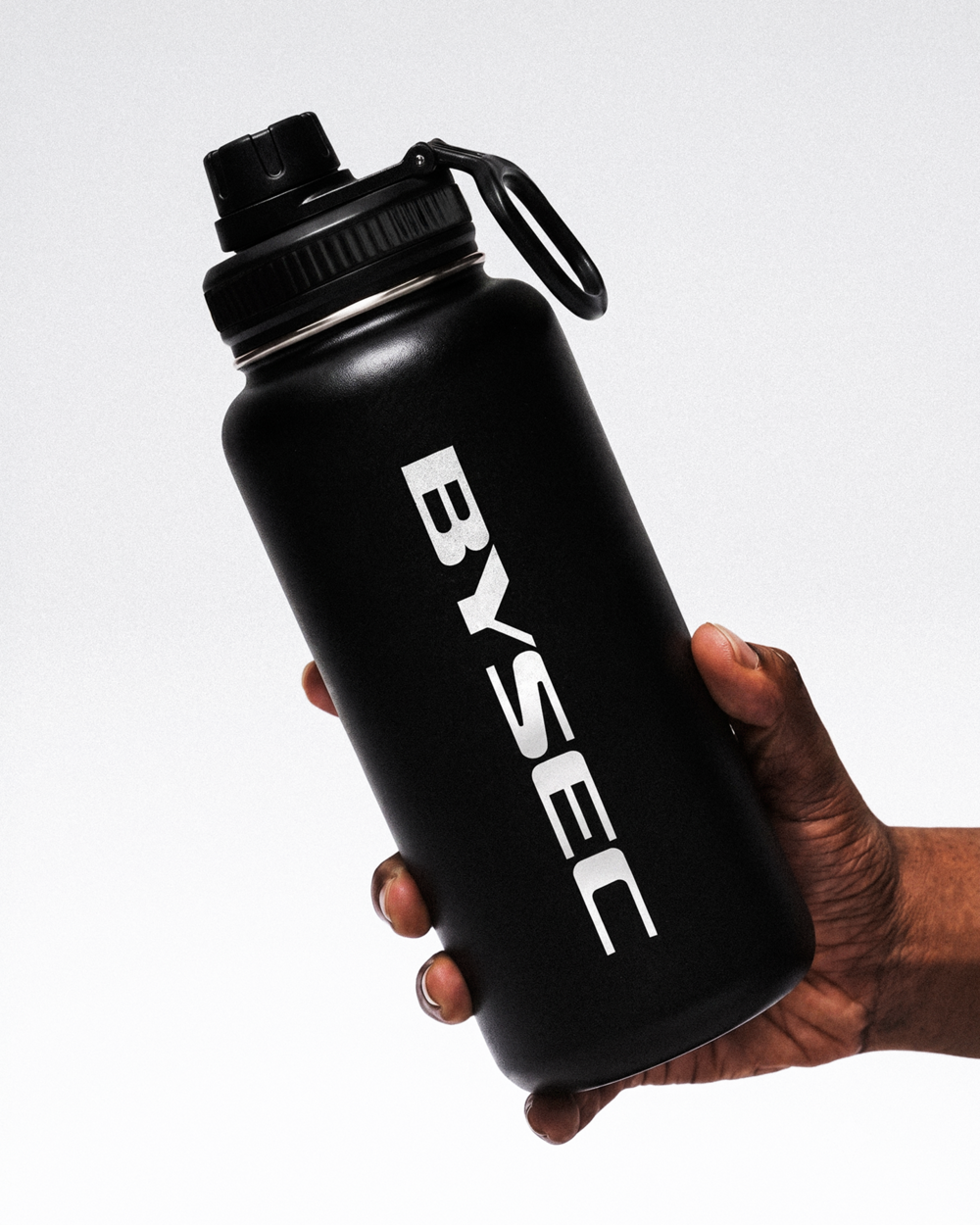
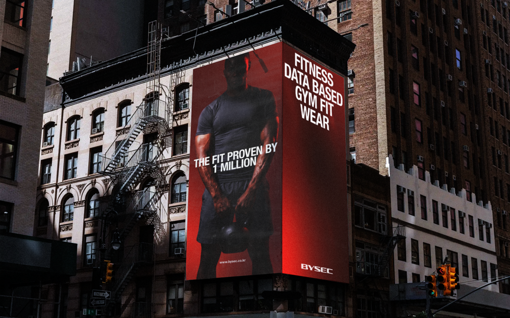
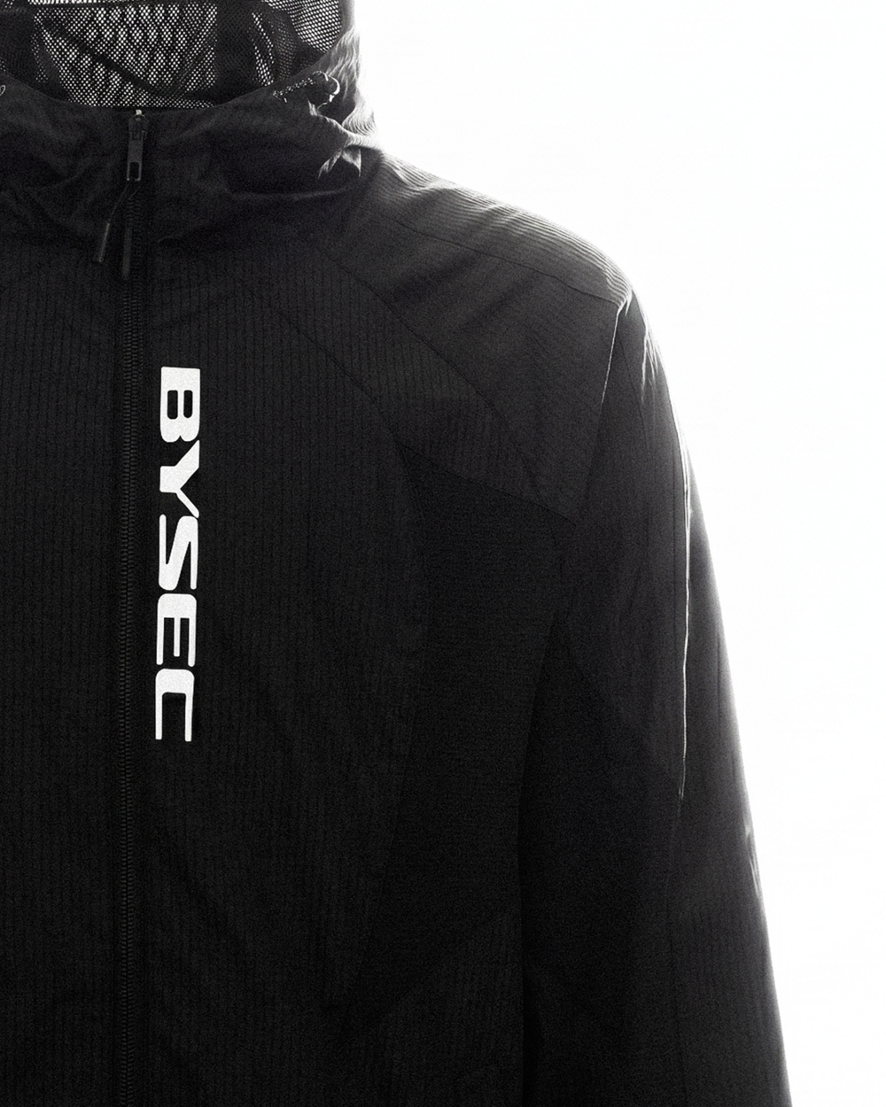
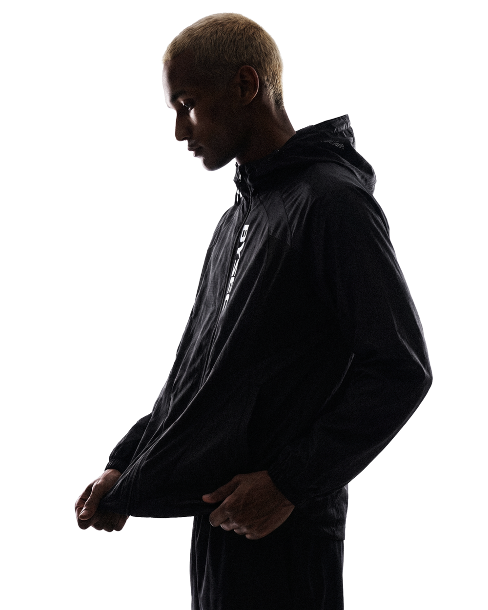
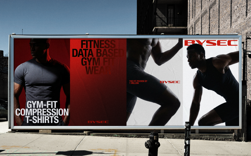
The solution to the problem was found at 'BYSEC World Fitness,' which BYSEC operated separately from its gym wear line. Located in the heart of Gangnam, Seoul, this major fitness center spans 1,300 pyeong, has over 6,000 members, and welcomes 20,000 monthly visitors. Since its opening, it has accumulated over one million body measurement data points and training metrics, making it a unique asset exclusive to BYSEC. We focused on the fact that 'fitness' is a word formed by adding the suffix 'ness' to 'fit.' Fitness can be interpreted not only in the bodybuilding context as 'the most suitable physical condition' but also as 'a state that fits the body well,' which aligns with the fit and silhouette emphasized by BYSEC gym wear. This connection unified the previously separate concepts of fitness and gym wear into a single brand context and became a powerful differentiation point in a market where the aspirational nature of bodybuilding culture translates into purchasing power. Accordingly, we developed a category strategy called 'Gym-Fit Wear,' meaning gym wear designed based on gym data to create the most suitable fit by linking BYSEC's infrastructure and product assets. We also established BYSEC's unique brand assets by combining the brand message 'The Fit Proven by 1 Million' with a brand mark and visual language inspired by muscle movement.
문제의 해답은 바이젝이 짐웨어와 별도로 운영하던 ‘바이젝 월드 피트니스’에서 도출되었습니다. 서울 강남 중심부에 위치한 이곳은 1,300평 규모, 6천 명 이상의 회원, 2만 명의 월간 방문자를 보유한 메이저 헬스장으로, 오픈 이후 축적된 1백만 명 이상의 신체 계측 데이터와 트레이닝 지표는 바이젝만의 차별적 자산이었습니다. 우리는 ‘fitness’가 ‘fit’에 접미사 ‘ness’가 결합된 단어라는 점에 주목했습니다. 피트니스는 ‘가장 적합한 몸의 상태’라는 보디빌딩의 맥락으로 해석될 수 있을 뿐 아니라, ‘몸에 잘 맞는 상태’, 즉 바이젝 짐웨어가 강조해온 핏과 실루엣의 의미로도 연결됩니다. 이는 분리되어 있던 피트니스와 짐웨어를 하나의 브랜드 맥락으로 묶고, 보디빌딩 문화의 선망성이 구매력으로 이어지는 시장에서 강력한 차별화의 출발점이 되었습니다. 이에 바이젝이 보유한 인프라와 제품 자산을 연결해, Gym 데이터를 기반으로 가장 적합한 Fit을 설계하는 짐웨어라는 의미의 ‘Gym-Fit Wear’ 카테고리 전략을 수립했습니다. 또한 ‘The Fit Proven by 1 Million’이라는 브랜드 메시지와 근육의 움직임에서 출발한 브랜드 마크, 시각 언어를 결합해 바이젝만의 고유한 브랜드 자산을 구축했습니다.
SOLUTION
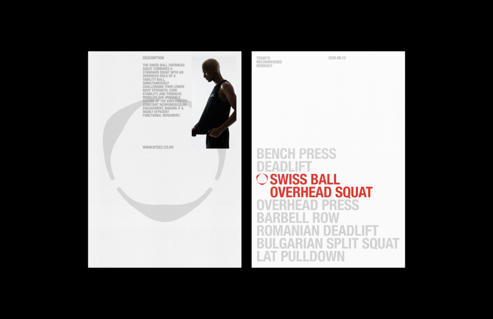
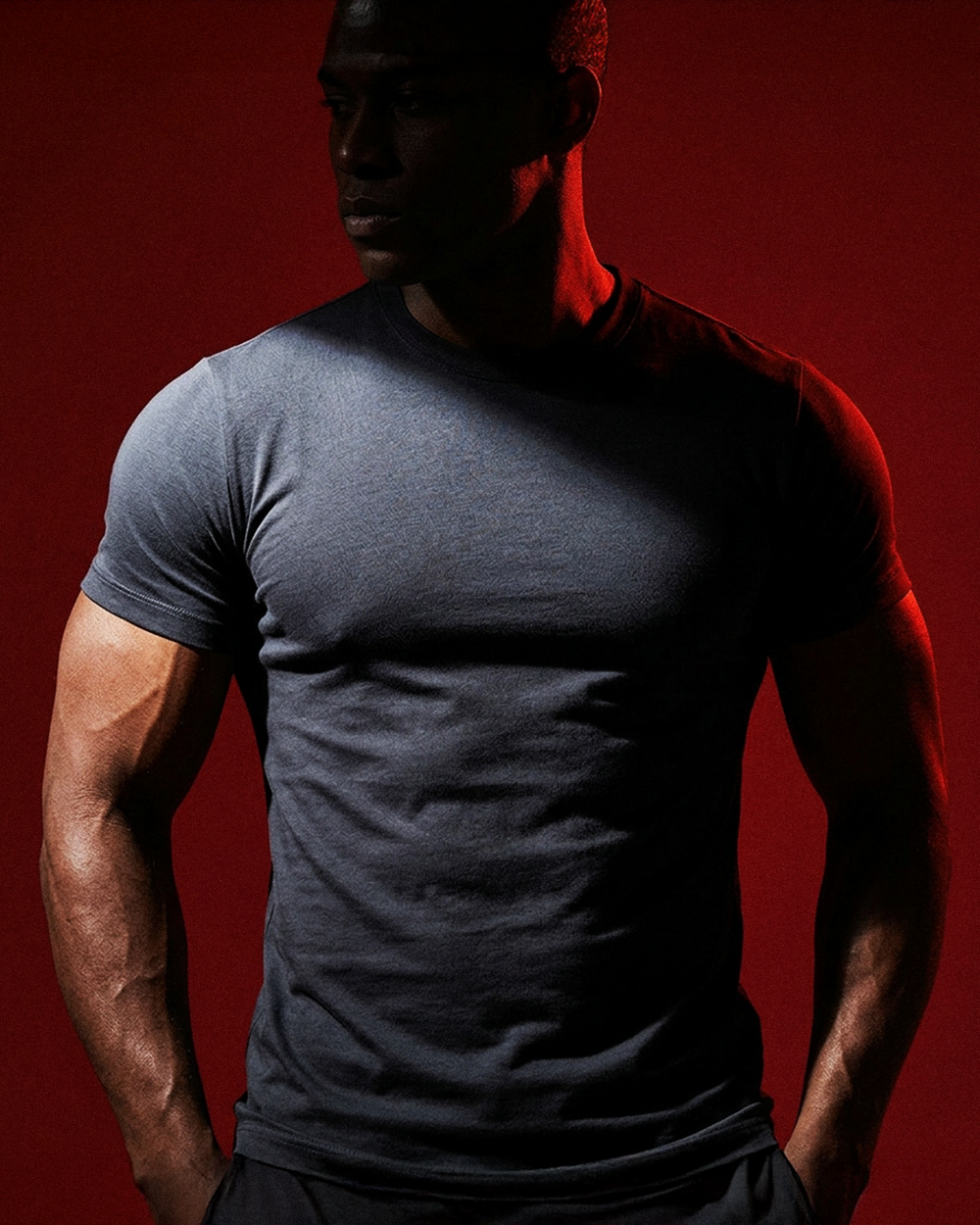
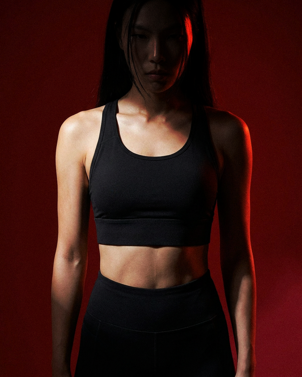
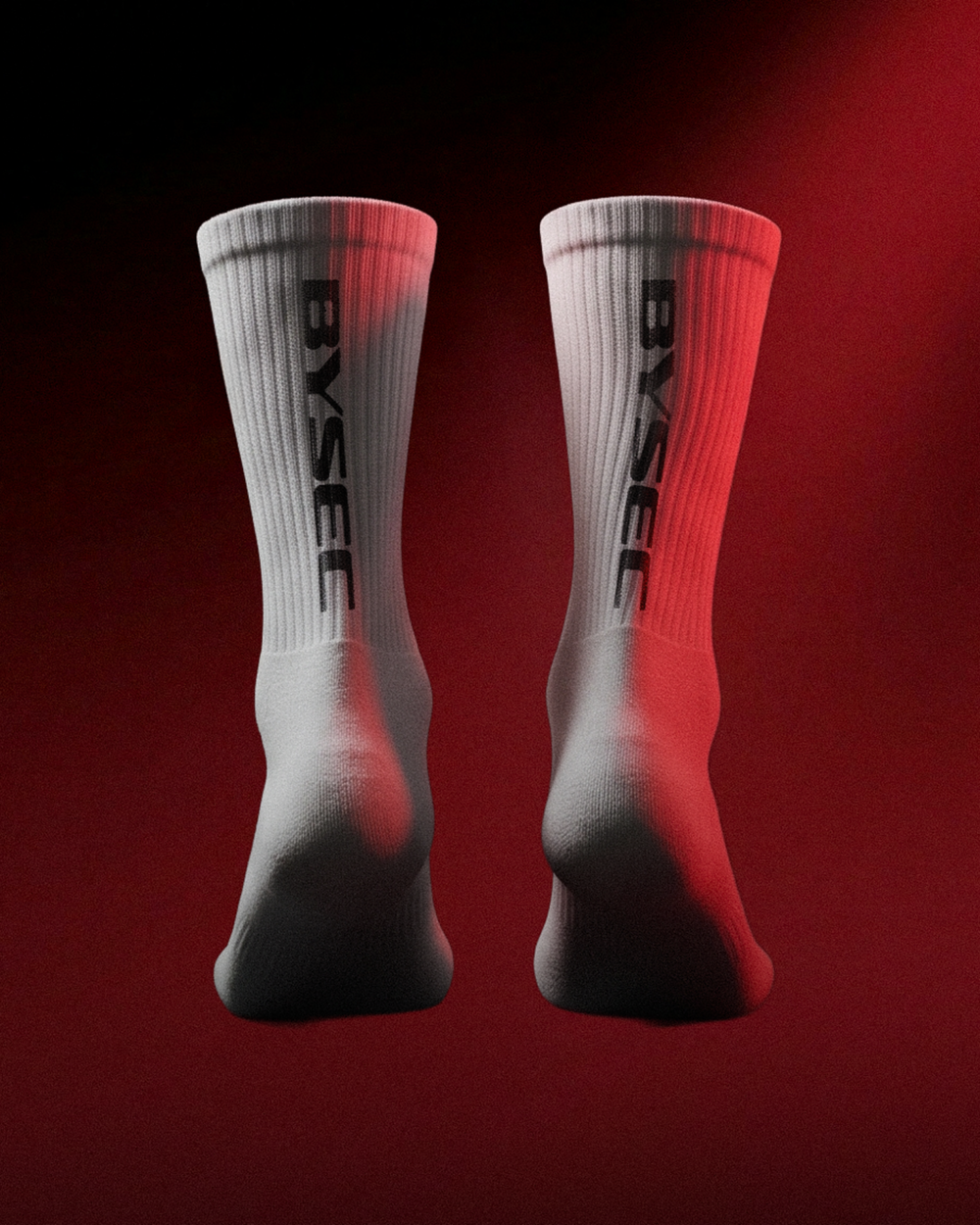
The visual concept of BYSEC is a red gradient. It translates the heat and temperature changes that occur in the body during exercise into a color language, serving as a key visual asset that sensibly conveys the brand philosophy of data-driven performance. This helps intuitively position the brand as a performance-oriented sporty fashion label.
바이젝의 비주얼 컨셉은 레드 그라디언트입니다. 운동 중 신체에서 발생하는 열감과 온도 변화를 색채 언어로 번역한 것으로, 데이터 기반 퍼포먼스라는 브랜드 철학을 감각적으로 전달하는 핵심 비주얼 자산입니다. 이를 통해 브랜드를 퍼포먼스 중심의 스포티한 패션 브랜드로 직관적으로 인식시킵니다.
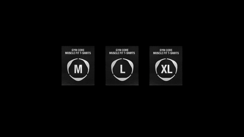
MUSCLE MECHANISM
The brand symbol structurally reflects the mechanism of muscle contraction and relaxation in its form. By visually expressing the essential movement of exercise and the rhythm of tension and release, it creates a brand impression of performance, dynamism, and energy.
브랜드 심볼은 근육의 수축과 이완 메커니즘을 형태적으로 반영한 구조입니다. 운동의 본질적인 움직임과 긴장–완화의 리듬을 시각적으로 표현함으로써 퍼포먼스와 역동성, 에너지 있는 브랜드 인상을 형성합니다.

CLIENT
DNB Inc.
Brand Identity Design
Tom&Nick Inc.
Strategy Director
Kim Dongwan [Tom]
Creative Director
Hong Hyundoo [Nick]
Brand Strategy
Jung Chanhee [Dan]
Jang Hayoon [Yoon]
Brand Design
Hwang Sunwook [Sun]
An Yeseul [Anne]
Mun Dasom [Som]
Kang Seungmo [Mo]