BIBLIAN Identity Development
March – July 2026
BIBLIAN is a haircare brand launched in 2023 with the vision of delivering “Hair-Wellness for Urban Life.” Founded on the expertise of its co-founder, who previously worked at Italian premium haircare brand Davines, BIBLIAN had established strong product performance. However, its brand language and positioning lacked clarity, limiting its ability to effectively communicate its value to consumers and ultimately constraining further growth.
Building on BIBLIAN’s product strengths and core brand values, we redefined its positioning and developed a new brand identity that communicates its distinctive value and message in a clearer, more intuitive way.
비블리안은 ‘도시인을 위한 헤어 웰니스’를 지향하며 2023년 론칭한 헤어케어 브랜드입니다. 이탈리아 프리미엄 헤어케어 브랜드 다비네스(Davines)에서의 실무 경험을 보유한 코파운더의 전문성을 기반으로 탄생해 우수한 제품력을 갖추고 있었지만, 이를 소비자에게 전달하는 브랜드 언어와 포지셔닝이 명확하지 않아 성장에 한계가 있었습니다.
이에 비블리안이 가진 제품 경쟁력과 브랜드의 본질을 바탕으로 모호했던 포지셔닝을 재정립하고, 브랜드의 차별화된 가치와 메시지를 보다 직관적으로 전달할 수 있는 아이덴티티를 개발했습니다.
Positioning
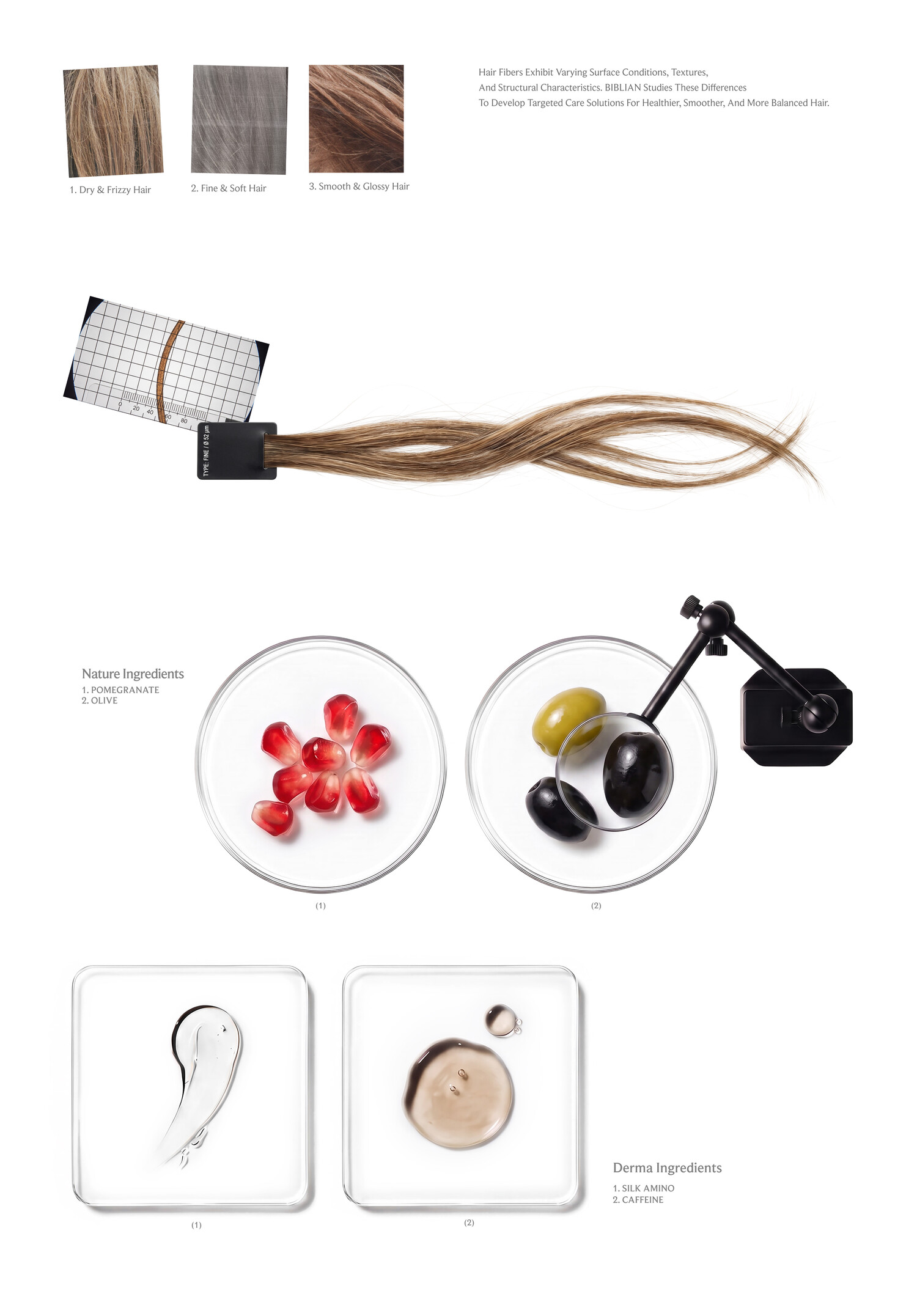
The premium haircare market has traditionally been divided into two categories: cosmetic and derma. Cosmetic haircare has focused on naturally derived ingredients, while derma has centered on functional ingredients for hair loss care. Despite their distinct brand positioning, products increasingly combine natural and derma ingredients, blurring the boundaries between the two. BIBLIAN saw an opportunity in this gap and sought to establish an integrated position that brings cosmetic and derma together.
프리미엄 헤어케어 시장은 크게 코스메틱과 더마의 두 영역으로 구분되어 왔습니다. 코스메틱은 자연 유래 원료를, 더마는 탈모 케어 중심의 기능성 성분을 핵심 소구점으로 각자의 영역을 발전시켜 왔습니다. 그러나 뚜렷한 브랜드 포지셔닝과 달리, 실제 제품에서는 자연 유래 원료와 더마 성분을 함께 활용하며 두 영역의 경계가 점차 흐려지고 있습니다. 비블리안은 이러한 시장의 간극에서 기회를 발견하고, 어느 한쪽에 한정되지 않는 코스메틱과 더마의 통합적 포지션을 선점하고자 했습니다.
Brand Direction
BIBLIAN’s brand definition, shaped by its strategic direction, can be summarized as follows. Starting with the concerns BIBLIAN aims to address, it connects the product USPs that provide the solution with the tangible results consumers experience, creating one coherent logic. At the core is BIBLIAN’s unique approach to designing synergy between natural ingredients and derma science.
전략 방향성에 따른 비블리안의 브랜드 정의는 다음과 같이 정리됩니다. 비블리안이 해결하고자 하는 문제에서 출발해, 해결의 근거가 되는 제품 USP와 소비자가 실질적으로 체감하는 변화까지 하나의 일관된 논리로 연결합니다. 그 중심에는 자연 원료와 더마 성분의 시너지를 설계하는 비블리안만의 접근 방식이 자리합니다.



Brand Slogan
To communicate the Brand Definition more clearly to consumers, we developed a slogan that distills BIBLIAN’s key differentiation into a single message. It intuitively conveys the brand’s strategy and direction, serving as an official communication element that is used consistently across various touchpoints to reinforce BIBLIAN’s distinctive value.
앞서 정립한 Brand Definition을 소비자에게 보다 명확하게 전달하기 위해, 비블리안의 핵심 차별점을 하나의 메시지로 압축한 Slogan을 개발했습니다. 브랜드가 지향하는 전략과 방향성을 직관적으로 전달하며, 다양한 접점에서 일관되게 사용되어 비블리안만의 차별화된 가치를 각인시키는 공식 커뮤니케이션 요소로 기능합니다.

Brand Symbol & Wordmark
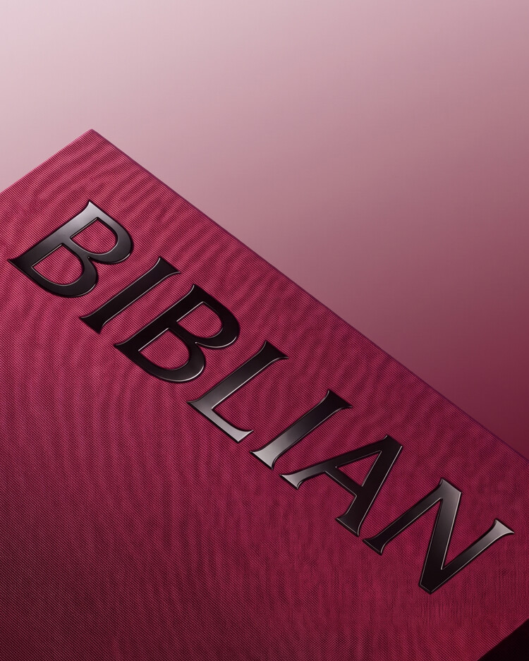
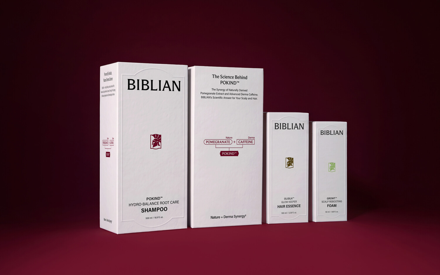
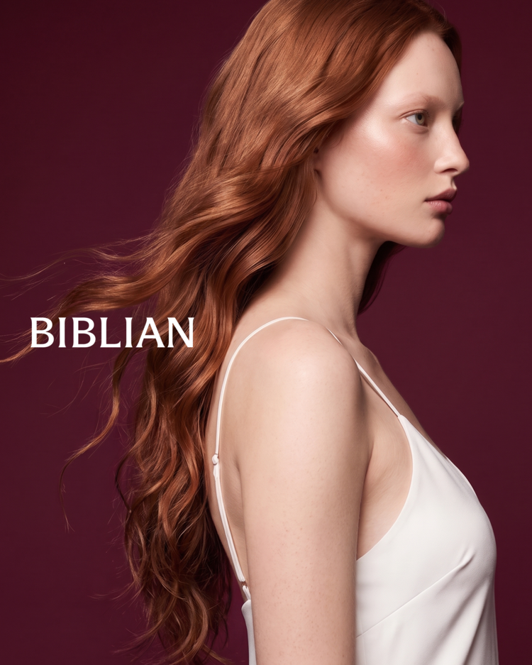
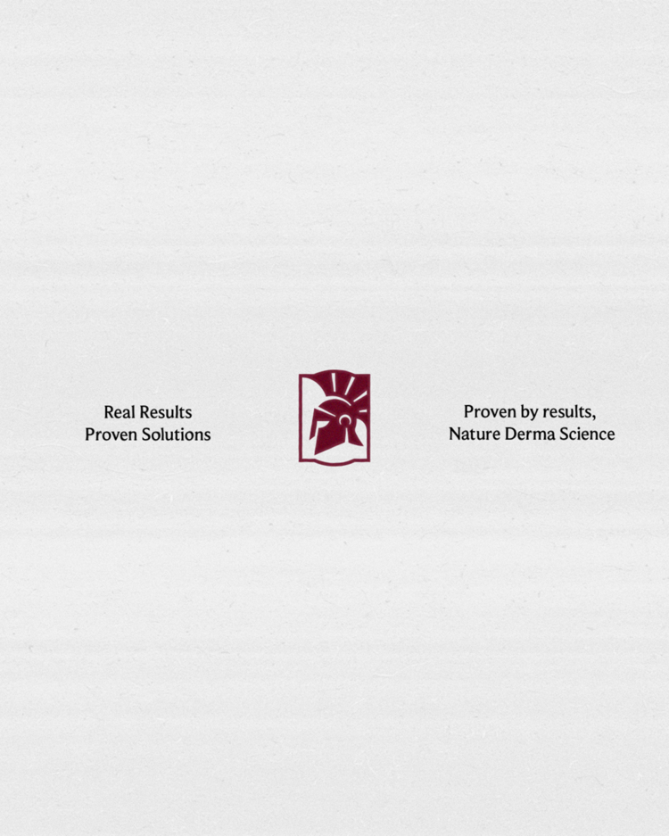
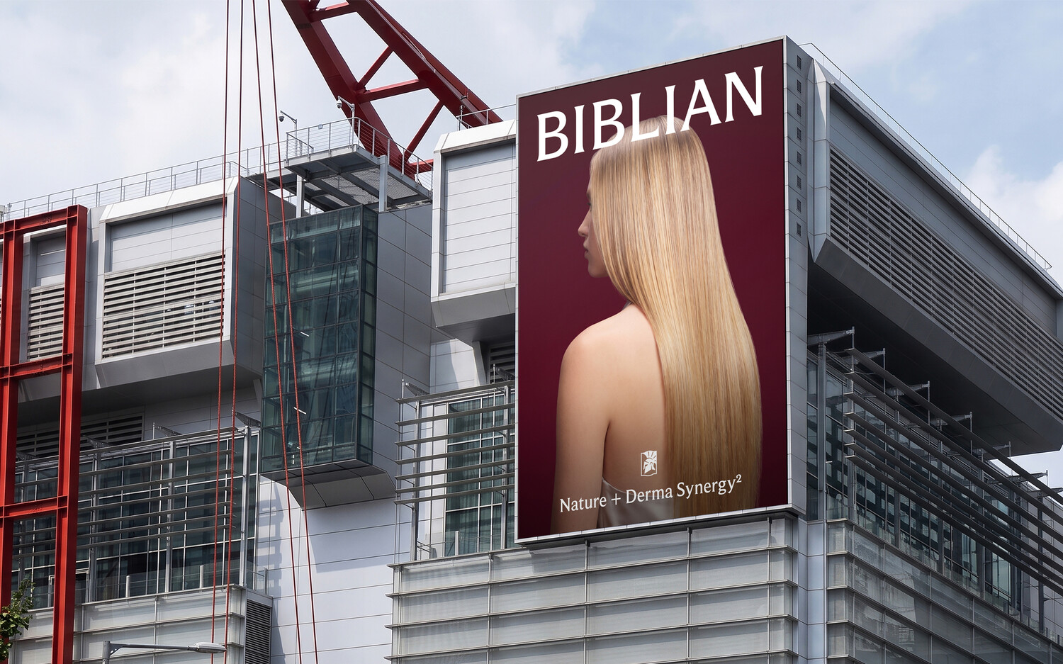
The brand symbol and wordmark build on BIBLIAN’s existing identity while refining its decorative and emotional elements into a more restrained visual language. This evolution translates the brand’s new direction of Nature + Derma Synergy into a clearer, more functional identity while preserving BIBLIAN’s premium character.
브랜드의 심볼과 워드마크는 기존 비블리안의 정체성을 계승하되, 장식적이고 감성적인 조형 요소를 절제하고 정제하는 방향으로 발전시켰습니다. 이를 통해 Nature + Derma의 시너지라는 새로운 브랜드 방향성을 보다 기능적이고 명확한 인상으로 구현하는 동시에, 비블리안이 지향하는 프리미엄 무드를 유지합니다.
Typeface & Color System
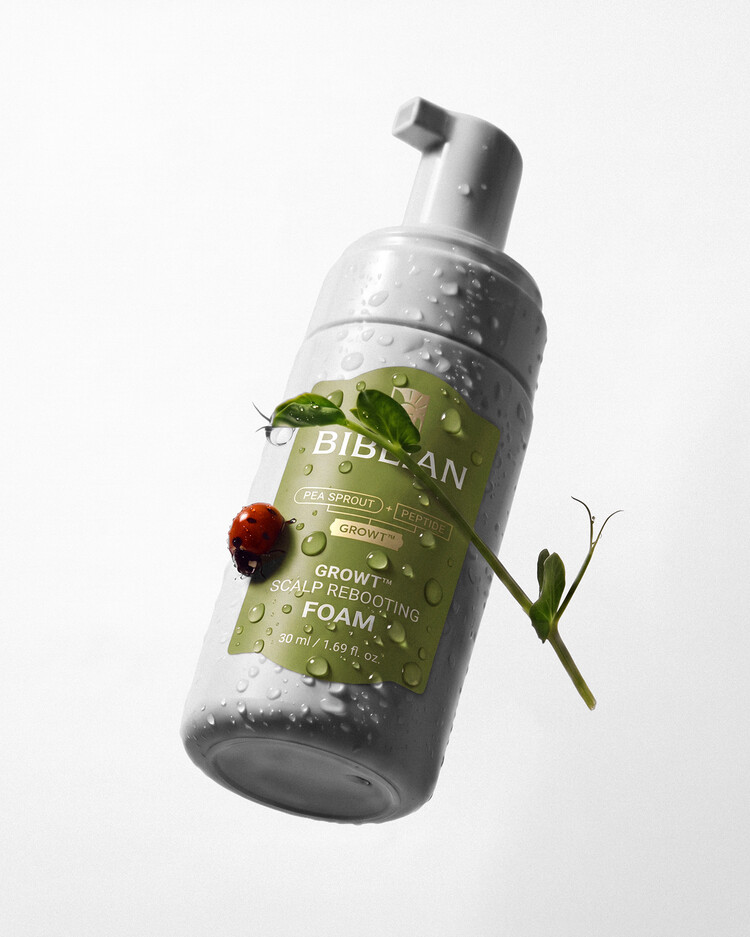
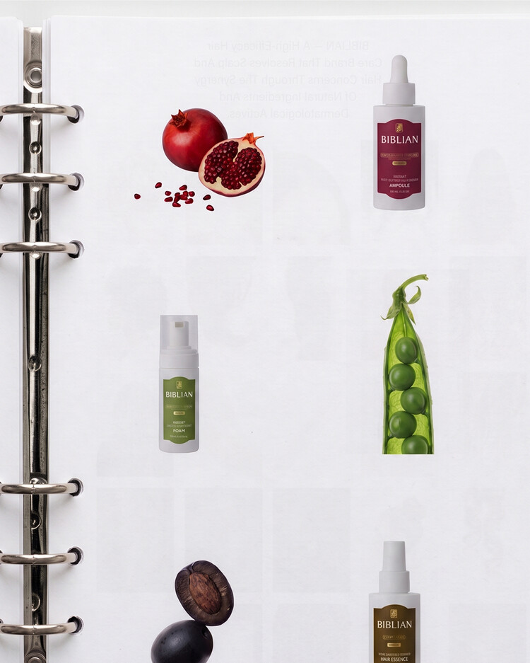
BIBLIAN’s brand typeface builds on visual characteristics that harmonize with the wordmark, creating a consistent typographic identity across the brand. The brand color palette is derived from the key natural ingredients of each product line, creating an intuitive connection between product and ingredient. The color of Pokind, the main product line, is extended as the primary brand color to strengthen BIBLIAN’s visual consistency.
비블리안의 브랜드 서체는 워드마크와 조화를 이루는 조형적 특성을 바탕으로, 브랜드 전반에 일관된 타이포그래피 인상을 구축합니다. 브랜드 컬러 팔레트는 각 제품 라인의 핵심 자연 원료에서 추출한 컬러로 구성해 제품과 원료 간의 직관적인 연상을 유도합니다. 이 중 메인 제품군인 Pokind의 컬러를 브랜드 메인 컬러로 확장해 비블리안의 시각적 일관성을 강화합니다.
Graphic Language
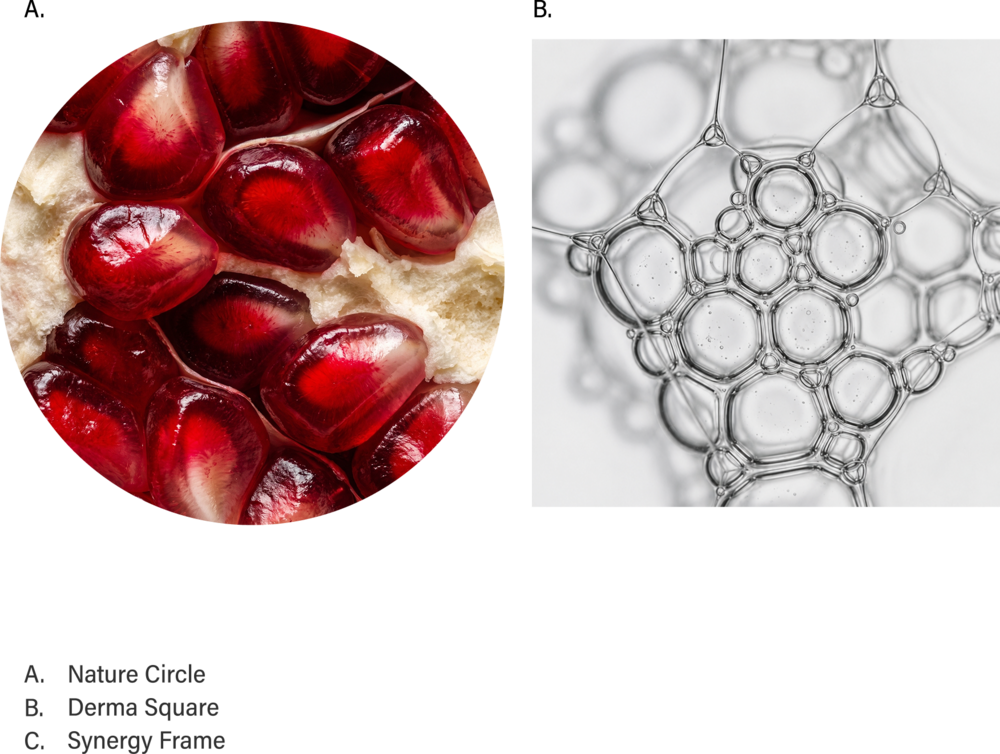
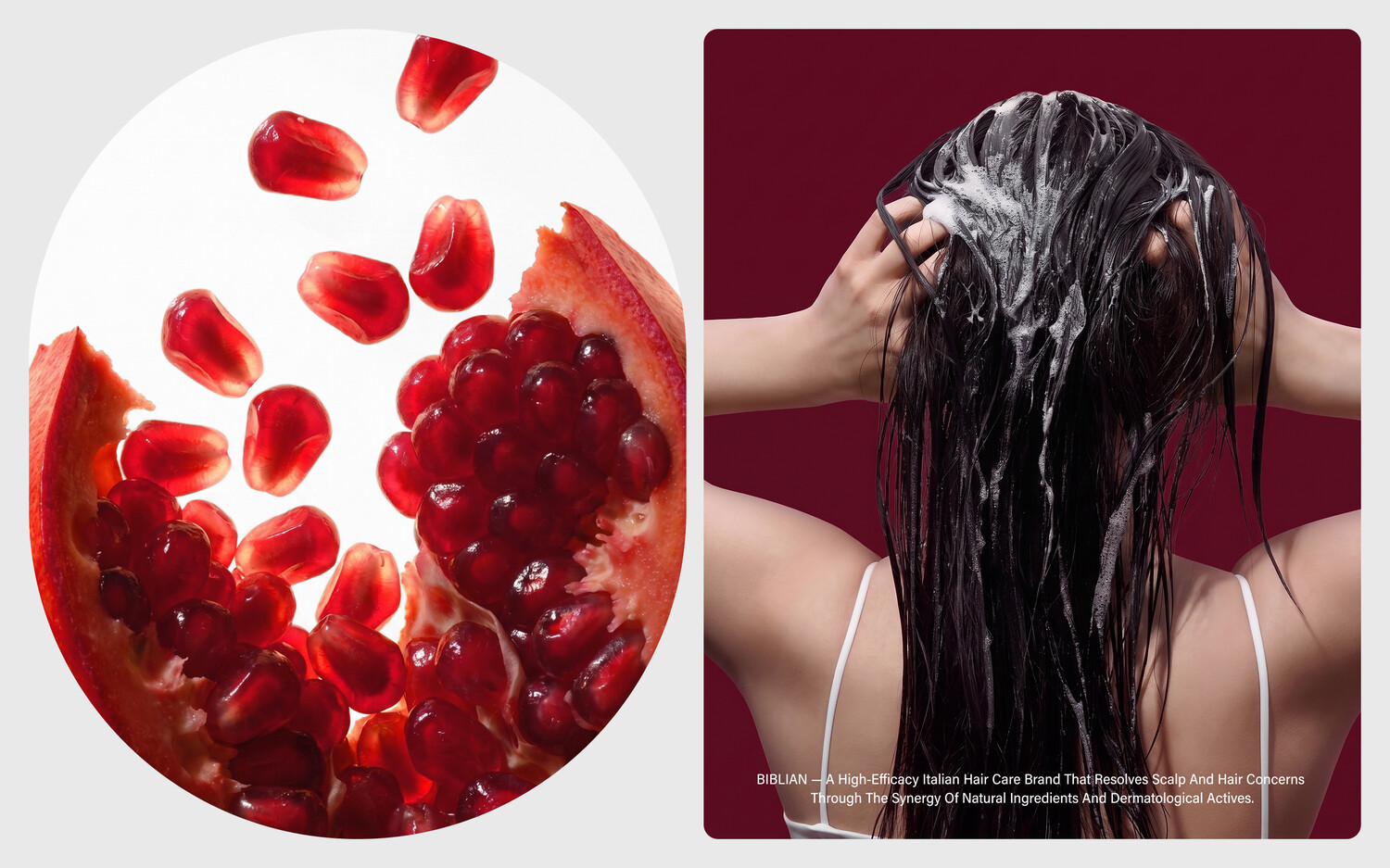
The brand’s Graphic Language originates from its slogan, Nature + Derma Synergy². The organic qualities of nature and the refined precision of derma science are visualized through the Circle and Square, respectively. By combining these two visual languages, Synergy Frame, Biblian’s signature graphic element, is created.
브랜드의 Graphic Language는 브랜드 슬로건인 Nature + Derma Synergy²에서 시작됩니다. 자연의 유기성과 더마 사이언스의 정제된 특성을 각각 원형(Circle)과 사각형(Square)으로 시각화하였으며, 두 조형 언어의 결합을 통해 비블리안만의 시그니처 그래픽인 Synergy Frame이 완성됩니다.