

BESTIAN Cosmetic
Visual Identity Development
CLIENT
PCG Derma Science Corp.
BRAND IDENTITY DESIGN
Tom&Nick.Inc
STRATEGY DIRECTOR
Kim Dong Wan [Tom]
CREATIVE DIRECTOR
Hong Hyun Doo[Nick]
BRAND DESIGN
Kim Sol Hee [Sol]
Jung Chan Hee [Dan]
Gong Hyun Min [Peter]
Brand Overview
2025 May-July
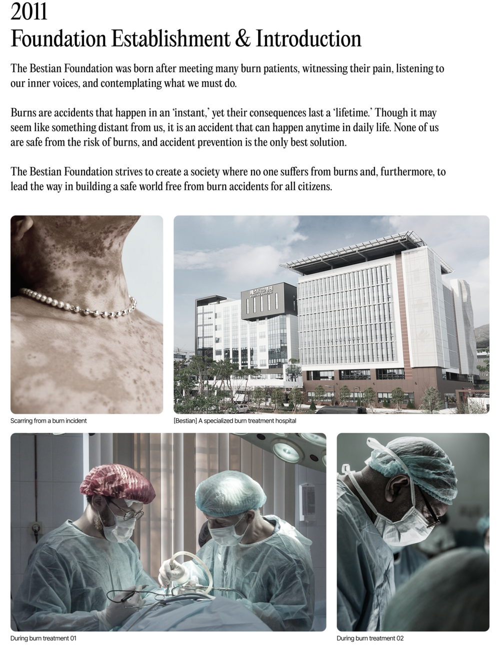
BESTIAN is a cosmetic brand born from specialists with advanced expertise in regenerating skin damaged by thermal burns and improving the basement membrane, based on over 30 years of clinical research and expertise in burn treatment.
By forming a task force with the technical research team at COSMAX, which operates Korea's largest cosmetic technology research institute, we aim to provide consumers with the value of more fundamental skin rehabilitation, differentiated from existing derma cosmetics.
BESTIAN presents solutions derived from a pathological perspective, built upon accumulated clinical cases gained through treating actual burn patients. It aims to deliver expertise in rebuilding the basement membrane that supports skin structure, based on 30 years of know-how and diverse insights. This project seeks to establish a clear, consistent brand story and build an authentic K-DERMA brand that addresses consumer demands and needs.
BESTIAN은 지난 30여 년간의 화상치료 임상 연구와 전문성을 바탕으로, 열 화상에 의해 훼손된 피부 재생 및 기저막 개선에 대한 고도화된 전문성을 가진 스페셜 리스트들이 모여 탄생한 코스메틱 브랜드입니다.
국내 최대 규모의 코스메틱 기술 연구소를 보유한 COSMAX의 기술 연구진들과의 TF를 구성하여 기존의 더마 코스메틱과의 차별화된 보다 근원적인 피부 재활의 가치를 소비자에게 제공하고자 합니다.
BESTIAN은 실제 화상 환자들을 치료하며 누적된 임상 사례들을 통해 도출된 병리학적 관점으로 솔루션을 제시하며, 30년간의 노하우와 다양한 인사이트를 기반으로 피부 구조를 지지하는 기저막 재건을 위한 전문성을 전달하고자 하며, 이번 프로젝트를 통해 명확하고 일관된 브랜드 스토리 및 소비자의 요구와 필요를 공략한 진정성 있는 K-DERMA 브랜드 구축을 목적에 두고 있습니다.
· Brand Origin
· Brand Story

Brand Logo & Symbol
Brand Identity Design
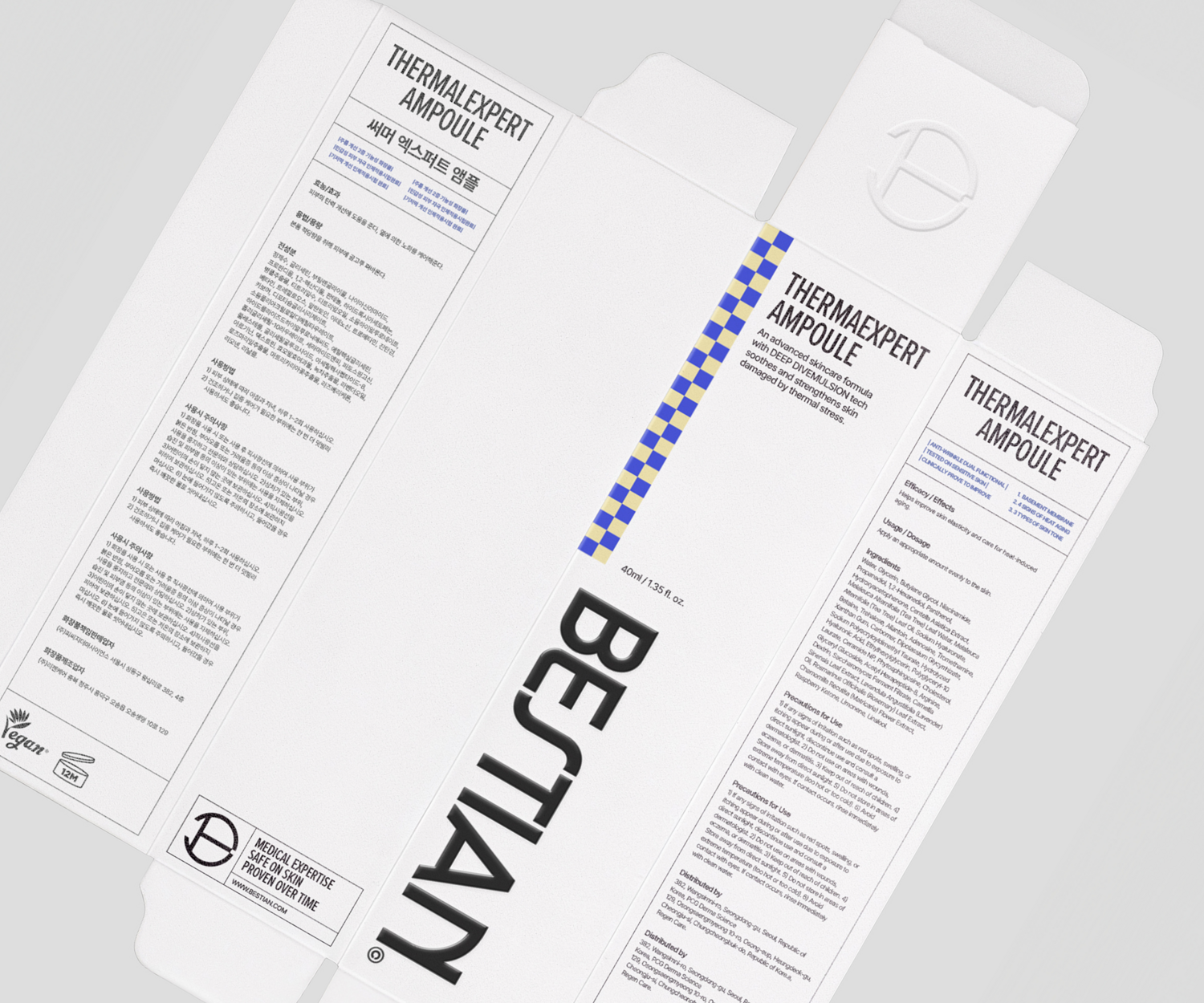
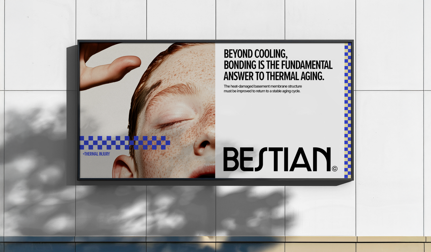
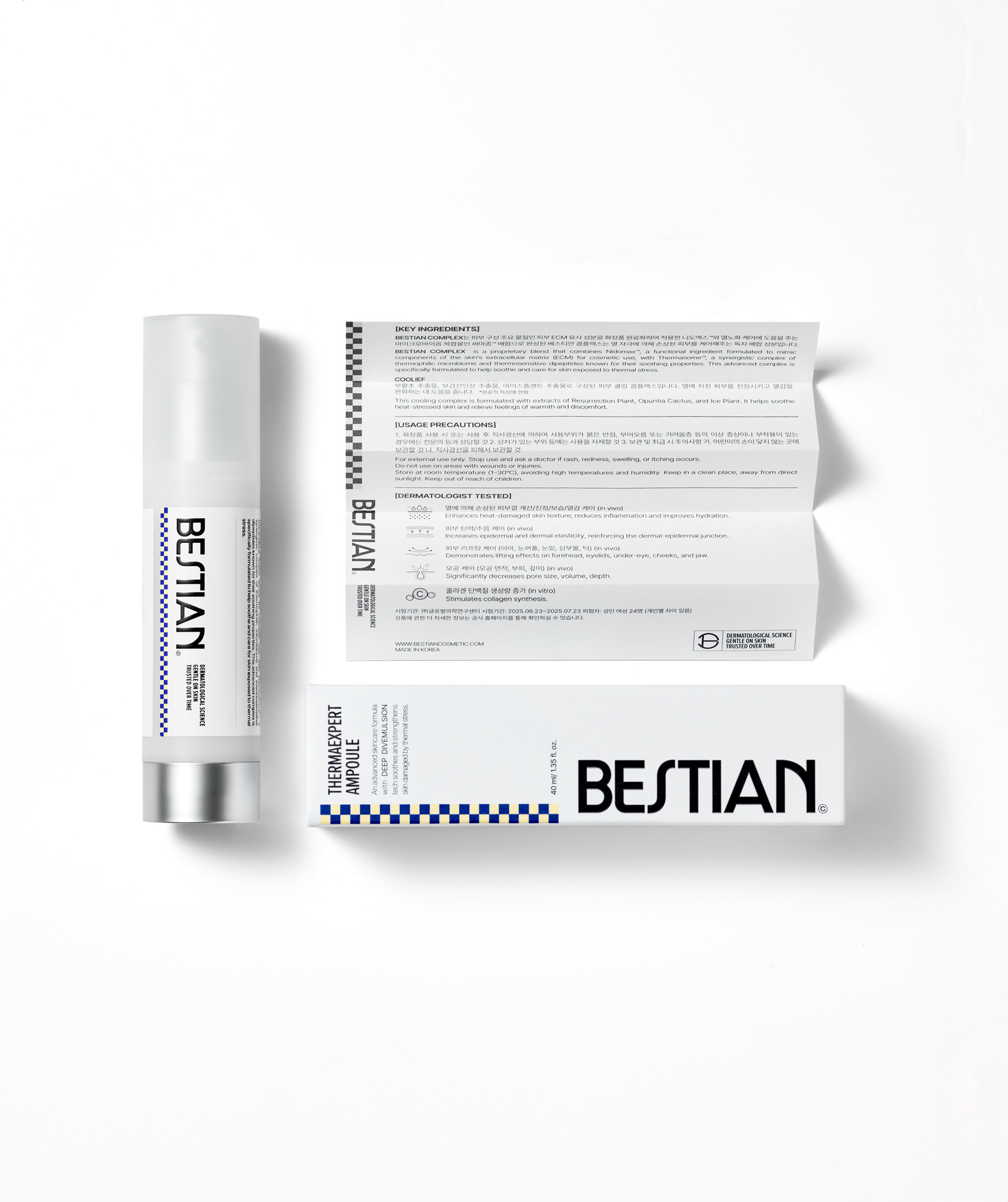
BESTIAN’s wordmark combines refined sans-serif typography with subtle curves and geometric structure, balancing feminine sensibility with scientific credibility. The gradation bar signifies the brand’s technological range and scalability.
The symbol, derived from the initial “B,” integrates the formal qualities of the brand’s signature pattern, conveying product efficacy and the brand’s medical expertise in thermal aging care.
베스티안의 워드마크는 정제된 산세리프 구조에 유연한 곡선과 기하학적 조형을 더하여 브랜드의 이성적인 전문성과 뷰티 브랜드로서의 페미닌한 무드를 동시에 담아내며, 상단의 그라데이션 바를 통해 브랜드의 기술적 스펙트럼과 확장성을 시각화합니다.
또한 브랜드 이니셜 ‘B’를 기반으로 한 베스티안의 심볼은, 제품 라인업의 효능을 상징하는 시그니처 패턴의 구조를 내포한 형태로 개발 되었으며, 이는 단순한 알파벳의 형상을 넘어, 브랜드의 의료적 전문성과 열노화 케어의 통합적 솔루션을 상징하는 시각적 언어로 기능합니다.
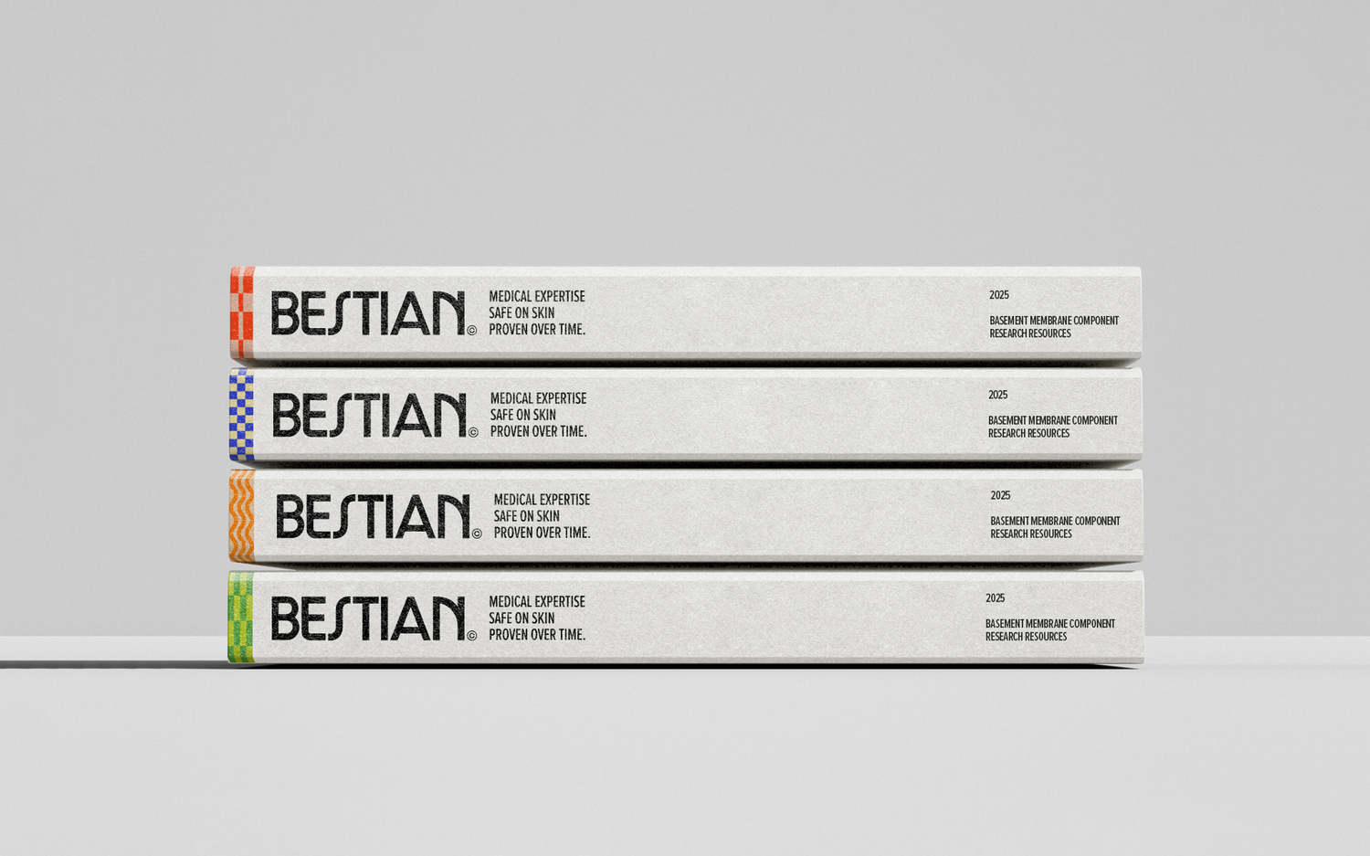
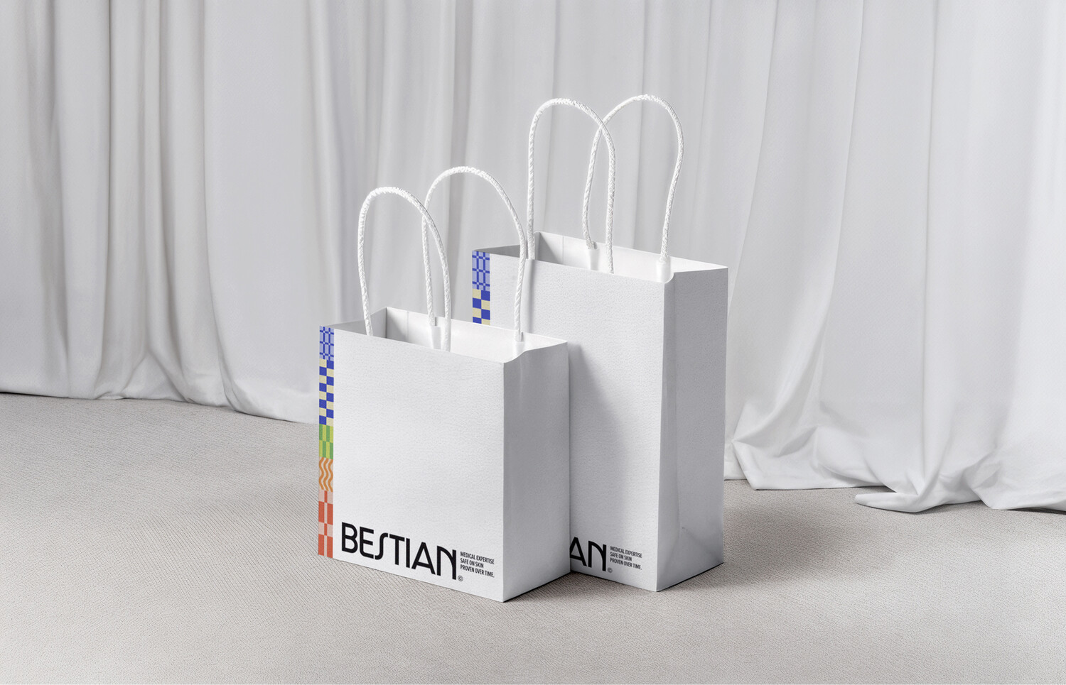
Brand Color
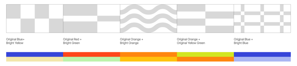
BESTIAN’s tone is grounded in neutral white, complemented by a vibrant main color palette used to reinforce the brand’s identity. The color system comprises an original palette and a high-brightness bright palette, allowing for flexible application across touchpoints.
베스티안의 전체적인 톤은 뉴트럴 화이트를 중심으로 안정적이고 정제된 인상을 전달하며, 다채로운 컬러감의 메인 팔레트를 포인트 요소로 활용해 브랜드의 아이덴티티를 강화합니다. 메인 팔레트는 기존 명도의 오리지널 팔레트와 이를 기반으로 개발된 고명도 팔레트로 구성되어, 다양한 접점에서 유연하게 확장·적용될 수 있습니다.
Graphic System
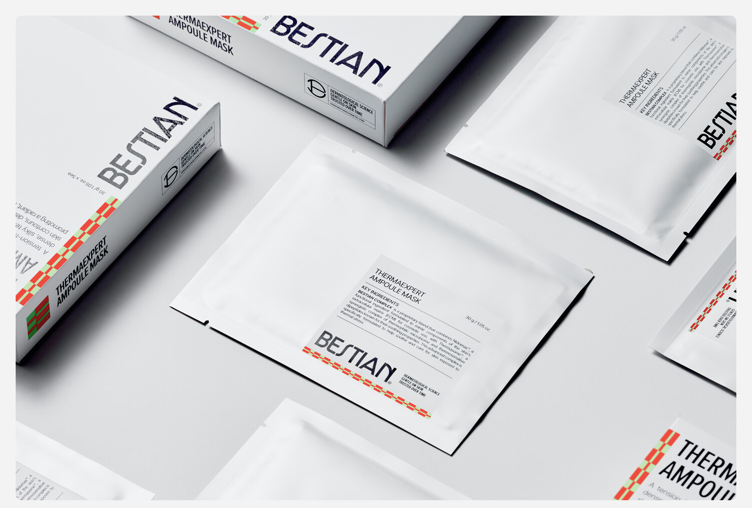
BESTIAN’s graphic system visualizes product efficacy to enable intuitive consumer recognition. Each pattern symbolizes a key benefit, clearly conveying the intended message while facilitating differentiation across the product lineup. This approach extends beyond visual expression, embodying the brand’s philosophy of fundamental solutions and efficacy-driven communication.
베스티안의 그래픽 시스템은 제품의 효능을 소비자가 직관적으로 인식할 수 있도록 시각화 하였습니다. 각 패턴은 주요 효능을 기호화한 형태로, 전달하고자 하는 메시지를 명확히 표현하는 동시에, 라인업 간의 구분을 보다 용이하게 합니다. 이러한 접근은 단순한 비주얼 요소를 넘어, 브랜드가 지향하는 ‘근본적 솔루션’과 ‘효능 중심 커뮤니케이션’이라는 브랜드 철학을 구현합니다.
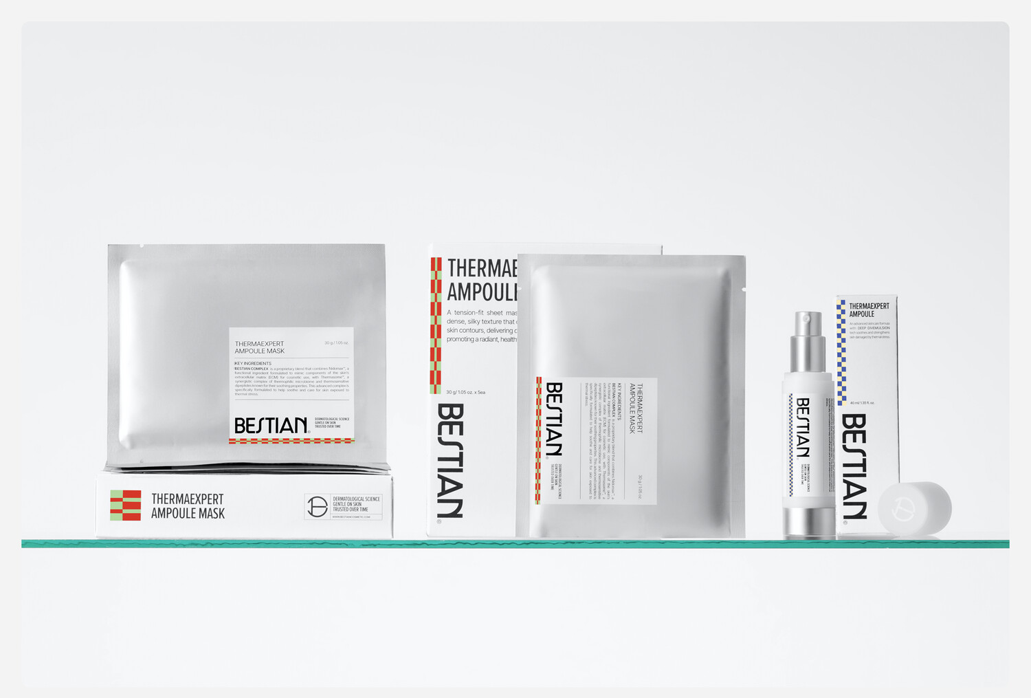
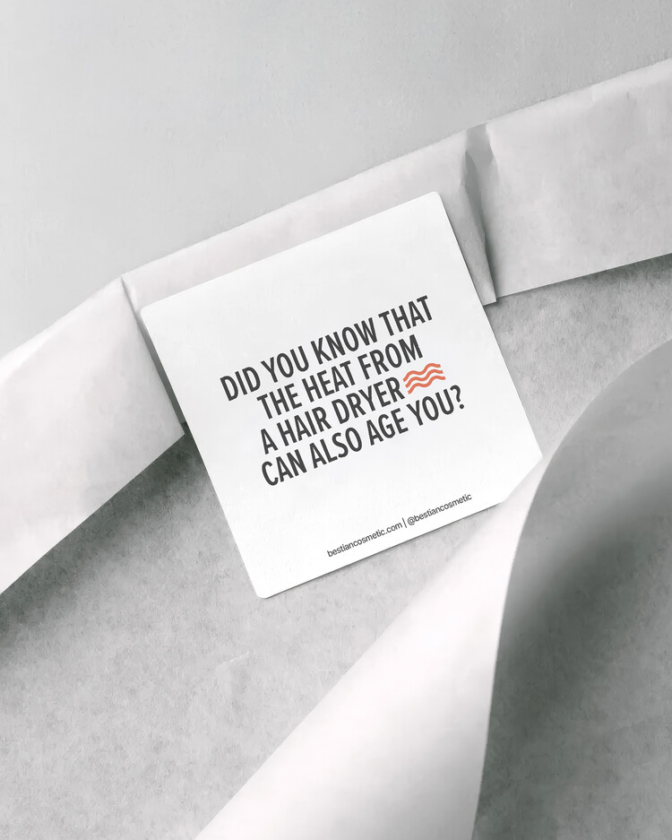
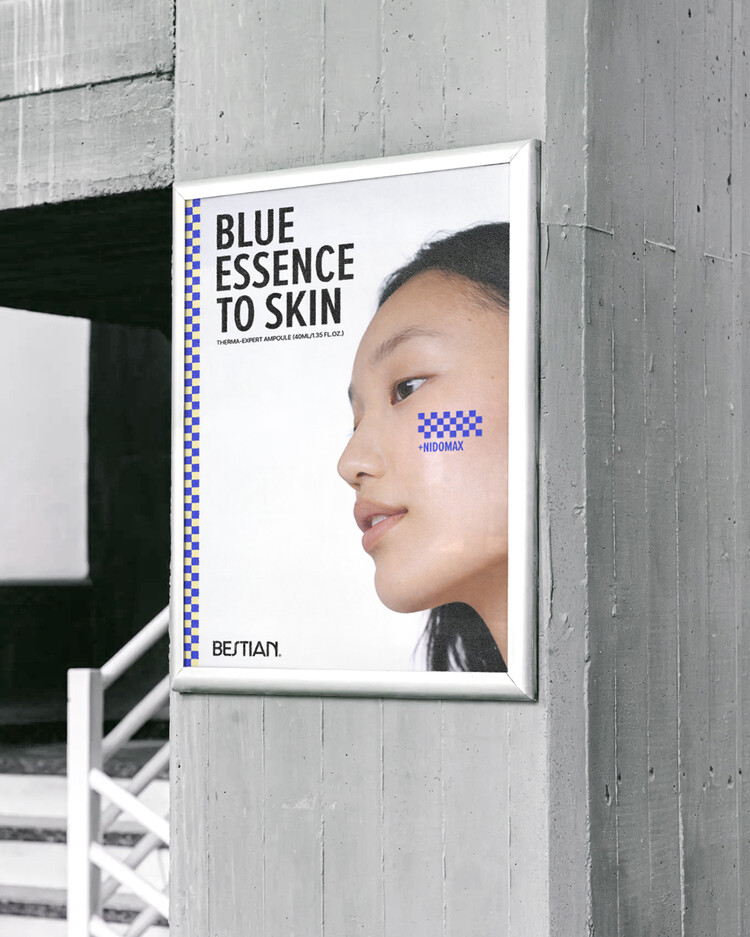
Application
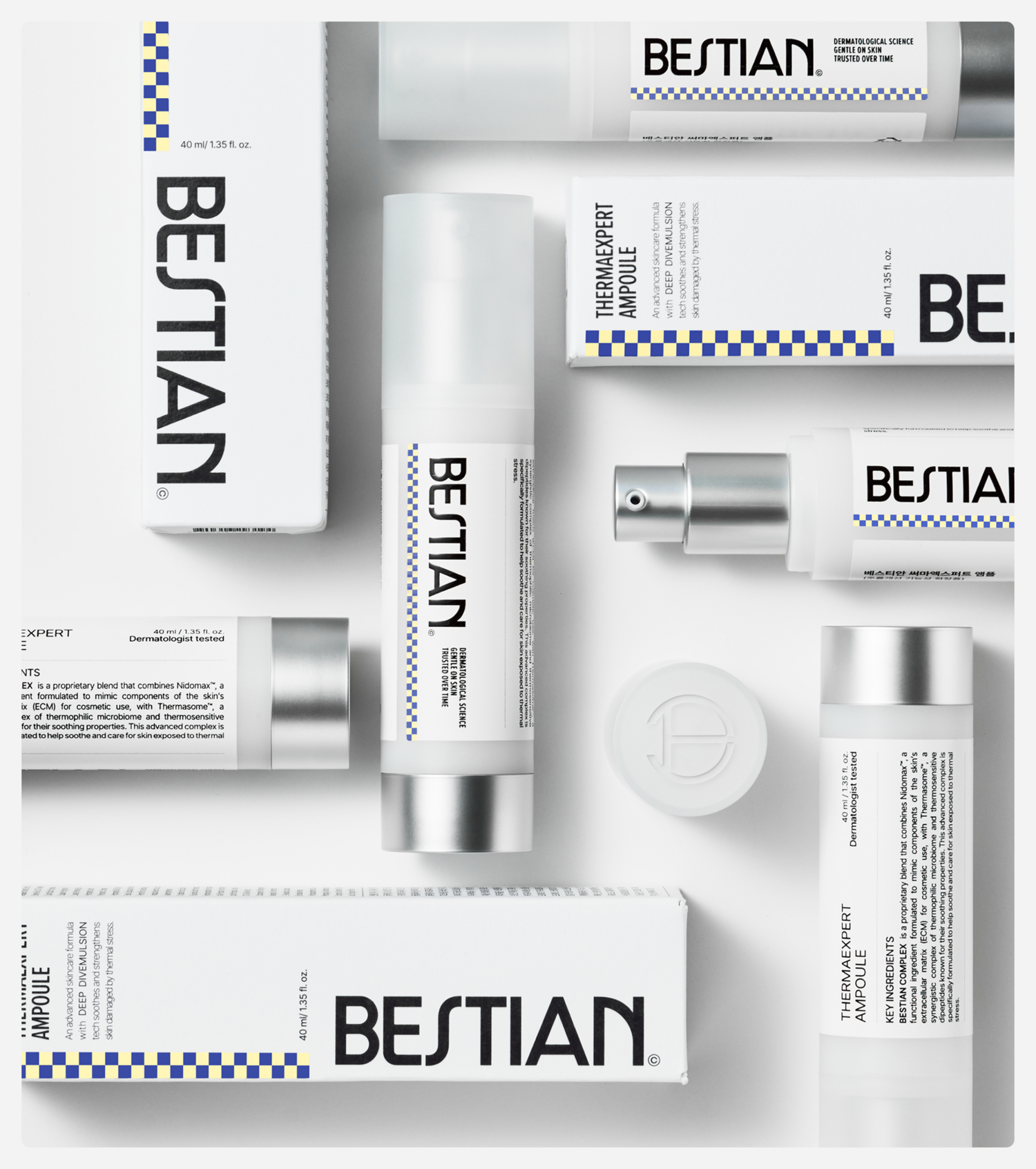
BESTIAN's brand application revolves around signature patterns and applies the previously defined layout, typography, and color system together to consistently convey the mood of the brand in various media.
베스티안의 브랜드 어플리케이션은 시그니처 패턴을 중심으로 전개되며, 앞서 정의된 레이아웃, 타이포그래피, 컬러 시스템 등을 함께 적용해 다양한 매체에서도 브랜드가 지향하는 무드를 일관되게 전달할 수 있도록 합니다.
BESTIAN Cosmetic
Visual Identity Development
BRAND IDENTITY DESIGN
Tom&Nick.Inc
CLIENT
PCG Derma Science Corp.
STRATEGY DIRECTOR
Kim Dong Wan [Tom]
CREATIVE DIRECTOR
Hong Hyun Doo[Nick]
BRAND DESIGN
Kim Sol Hee [Sol]
Jung Chan Hee [Dan]
Gong Hyun Min [Peter]
